Fresh From The Field — Hidden Honey – By Onfire Design
Fresh from the Field is a weekly article series sharing the fresh and inspiring work of our Aotearoa Design Assembly community.
Inspired by the insistence of doing things right and foraging for what was previously Hidden, Onfire Design take us behind their brand strategy and packaging design for Hidden Honey.
Want to submit your own work to Fresh From The Field? Fill out the FFTF form here.
The brief
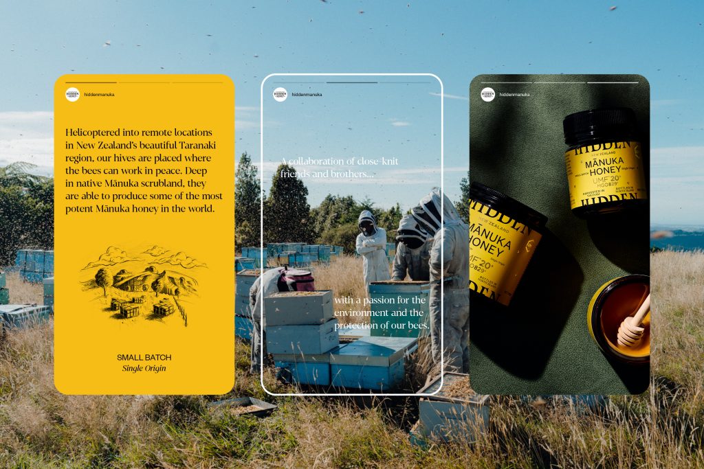
In a remote location of New Zealand’s North Island – away from the pesticides and modern agriculture – beekeepers work in harmony with their bees. As a collaboration of close-knit friends and brothers, Hidden is about family and sustainability. In a few precious hot summer weeks, the purest raw Mānuka honey in the world is harvested in small batches.


The Design Response
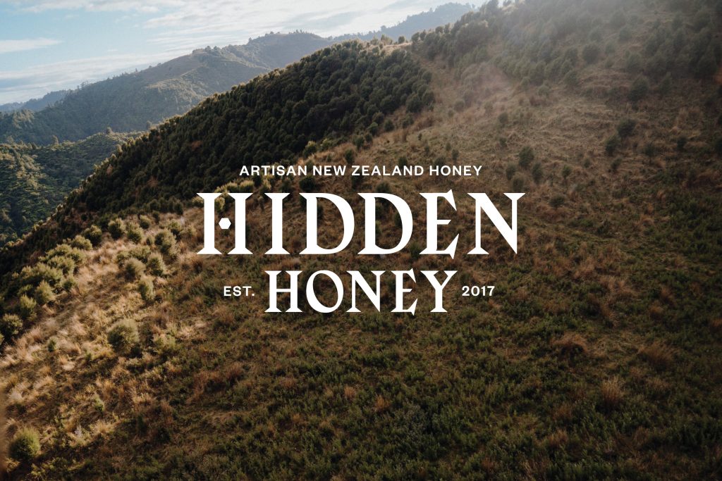
Our naming for the brand was inspired by the teams insistence on doing things right and going the extra-mile to find and forage what was previously Hidden. Typographically traditional yet edgy with oversized serifs, the wordmark reflects the young family doing the work and the age-old methods they use to care for the bees and extract the honey.
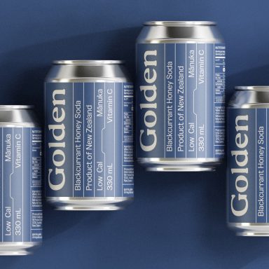
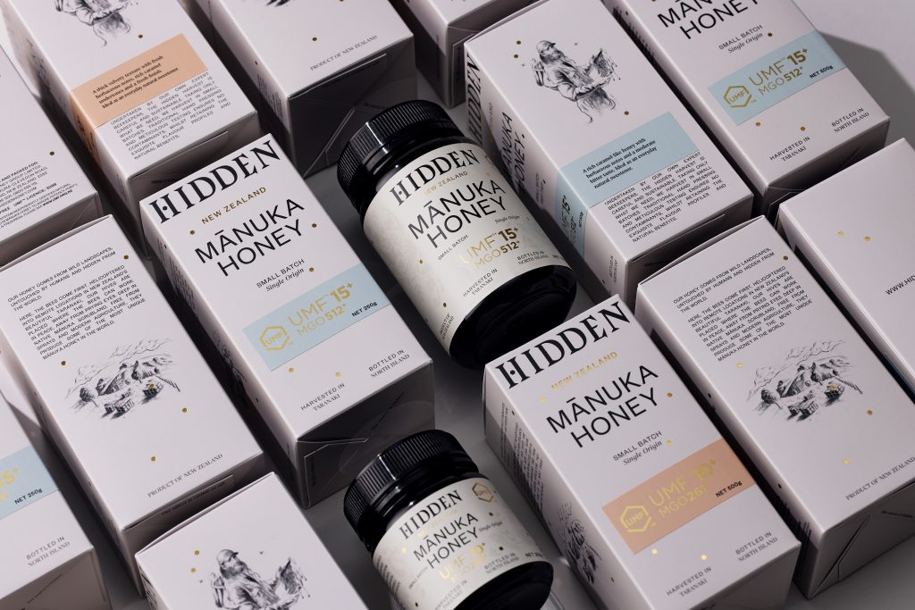
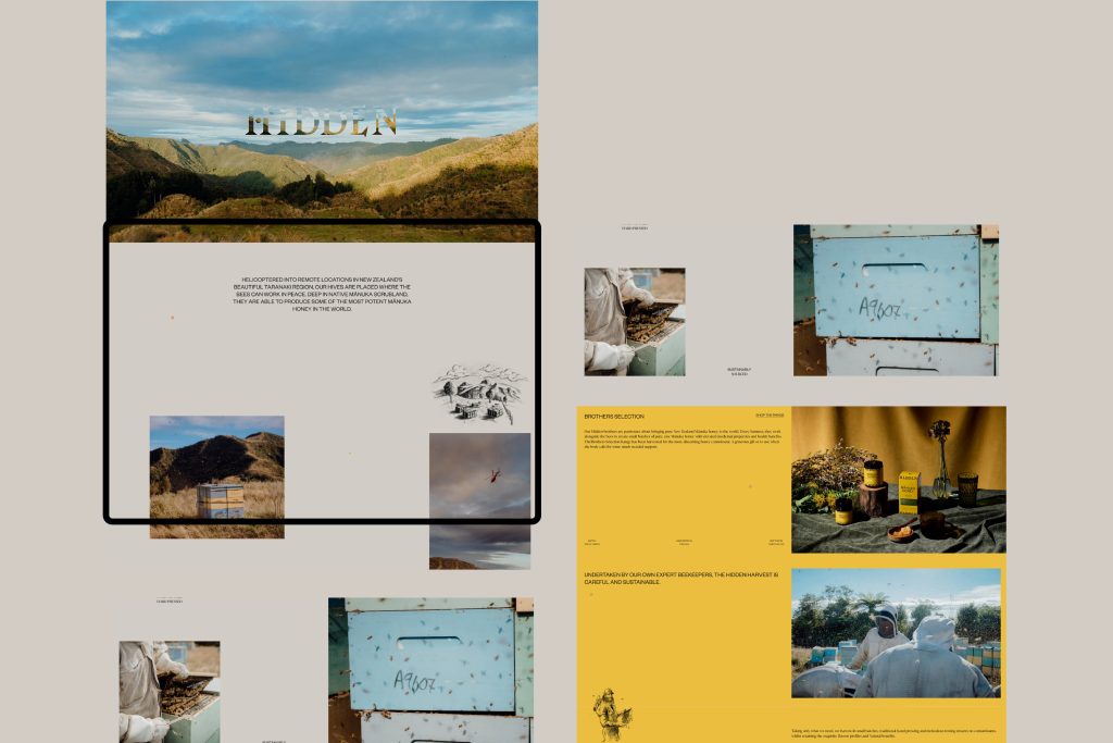
The range is split into two price points and purchasing occasions. The Brothers’ super premium range exudes warmth with a warm yellow colour palette. The wordmark is cropped on packaging, waiting to be discovered when boxes are stacked. The premium discovery range utilises the same design language with an easily identifiable wordmark. The wider typographic layout uses a common grid for continuity, this is mechanical in nature to reference the agrarian nature of the business. Soft pencil sketches are used to add visual context to the story and contrast to the stark typography. MGO factors are shown with a simplistic stickering system, colour coded to denote flavour profiles.
Designed for export, Hidden has launched its first harvest in department stores and boutiques in Europe, the Middle East and America.
Deliverables included Strategy, Tone-of-voice, Naming, Brand Identity, Packaging Design, and more.

The Design Team
Matt Grantham
Sam Allan
Alice Ferner
Michael Nicholls
https://www.weareonfire.co.nz/
https://www.linkedin.com/company/onfire-design/
https://www.facebook.com/onfiredesign/
https://www.instagram.com/onfiredesign/
The Client Team
Hidden Honey
Client details
https://www.facebook.com/HiddenManuka
https://www.instagram.com/HiddenManuka/
https://hiddenhoney.com/

