Fresh From The Field — Mint – Brand Identity Design – By Studio Nine
Fresh from the Field is a weekly article series sharing the fresh and inspiring work of our Aotearoa Design Assembly community.
With a customised bold and contemporary typeface and subtle shapes inspired by toothpaste swirls, Studio Nine walk us through their brand identity work for Mint.
Want to submit your own work to Fresh From The Field? Fill out the FFTF form here.
The brief
Studio Nine was approached by Mint to design their visual brand identity. Mint is a unique dental hygiene clinic offering personalised holistic treatments, without the need to see a dentist first. They offer state of the art services like, teeth cleaning, stain removal, teeth whitening, treatment of periodontal disease, diet advise, x-rays and home care coaching. Their intention is to provide high quality dental hygiene treatments, in a spa like atmosphere.
The brief was to design a contemporary visual brand identity to help them stand out as a unique alternative to traditional dental hygienists that work along side dentists. We were asked to highlight Mint’s approach which is all about the synergic relationship between oral health and overall wellness.


The Design Response
For the logo we have customised a bold and contemporary typeface and added subtle shapes that were inspired by toothpaste swirls that work seamlessly together – perfectly complementing the brand’s visual style and language. A colour palette composed of three core colours is used throughout the identity, giving a sense of freshness, well being and professionalism. Roboto Mono, a monospaced typeface was selected to complement the visual brand identity. The fonts are optimised for readability on screens across a wide variety of devices and reading environments.
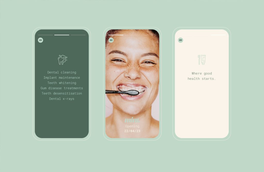
A series of playful images convey the brand’s core belief, that oral hygiene is the first step to good healthy and overall well being. A set of cohesive, minimal and friendly icons was created to support their print and digital content.


The Design Team
https://studionine.co.nz/
https://www.instagram.com/studio_____nine/
The Client Team
Mint Dental Hygiene
Client details
http://mintdentalhygiene.co.nz/
Collaborators
Photography: Studio Firma


