Between the Pages with Dialog Studio – Rheem Brand Book
In this interview series we sit down with some of the illustrators and designers behind some of Aotearoa NZ’s self published books to learn more about their illustration processes, book print designs, and tips for self publishing.
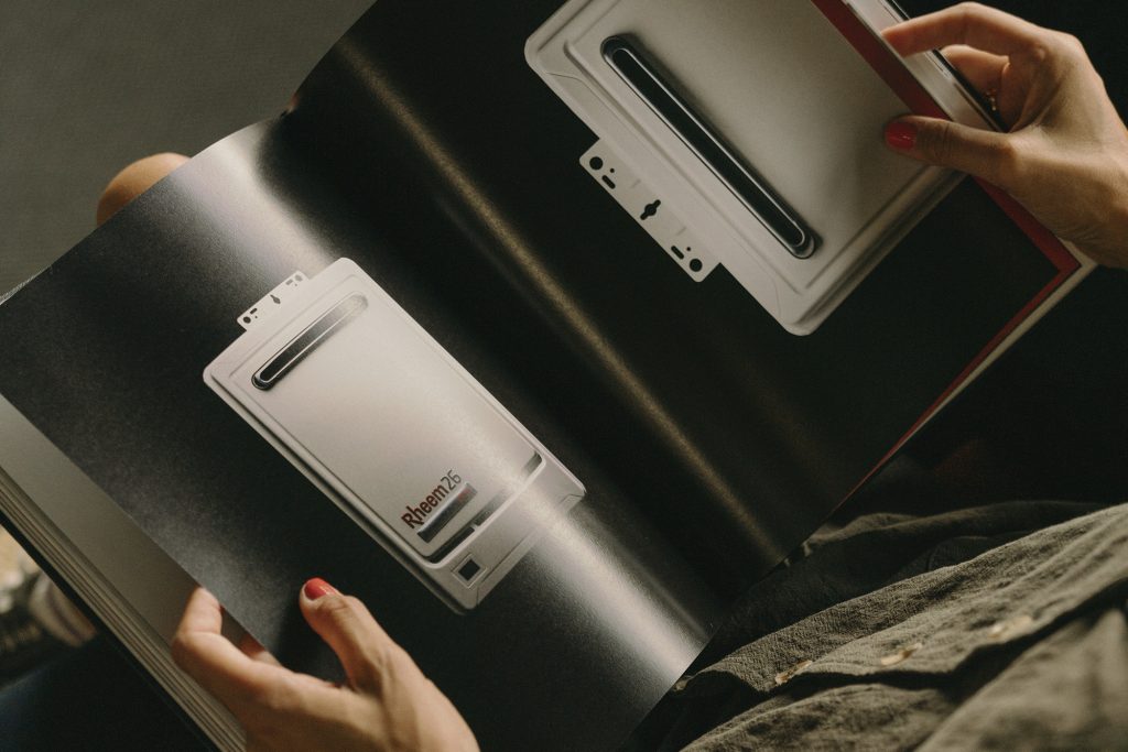
Taking inspiration from the classic editorial format and coffee table books, Dialog studio share their recent brand book design for Rheem.
This series is proudly sponsored by Bookprint.

Ask for the Bookprint DA Designer Service, to receive an extra copy of proofs (one to keep and and for your client), and an extra copy of the final book for your design office.
Kia ora Dialog. Can you walk us through the brief for the Rheem brand book?
We wanted to create a book that showcases the work we’ve done with Rheem over the last
year. It’s a way to give them something concrete and visual that captures our collaborative
accomplishments to date and gives them inspiration for what’s still to come.
Where and what did you take inspiration from during your design process?
We took inspiration from the classic editorial format and coffee table books, making use of
stunning photography, hand-drawn illustrations that remind us of the ’60s, and sleek Swiss
graphic design. Our creative vision was fueled by Rheem’s rich brand history and updated
brand guidelines, which acted as our guiding light throughout the design process.
For the print nerds, can you share the print tech specs for this project:
As we required only a small quantity, we opted for digital printing. We were stoked to have
David from Book Print around, who helped us identify the perfect solution for the project. The
book was eventually printed on thick GSM paper, which gave it a significant sense of depth and
substance.


Reem brand book print specs:
- Binding: Hardcover, Casebound, Section Sewn
- Covers: Hardcover Boards 2.5mm wrapped with black Buckram cloth. Title matt black foiled, and debossed.
- Text Pages: A4, portrait orientation, 150gsm uncoated art stock, digitally printed CMYK.
- Endpapers: White uncoated 150gsm art stock
Talk to us about your binding choice and any print embellishment that went into this
book.
We wanted the book to feel like a classic product that’s both elegant and friendly, so we opted
for a hardcover case bound with section sewing, incorporating hardcover boards, black
buckram-type cloth, and matte black foiling on the cover in Helvetica font. Our goal was to
create a sense of familiarity and accessibility, while also arousing curiosity and inviting people to
explore its pages. Instead of going for flashy and loud designs, we aimed for something calm
and comforting. And since Rheem has such a rich heritage, the classic and handcrafted cover
design complements the content perfectly.
What did you consider when choosing the paper stock for this project?
Our main focus for the book was making sure it felt amazing in your hand – something you’d
want to keep flipping through again and again. We originally wanted to use sustainable paper,
but unfortunately it didn’t quite give us the depth we were after, and the dark and moody photos
just weren’t as crisp as we’d hoped. Since the book wasn’t super long (just 150 pages), we also
needed paper that had some weight to it, so it had that classic book feel rather than feeling like
a flimsy magazine.
Impact of having a brand book that’s printed and tactile rather than keeping it solely
digital?
There’s something different about holding a handmade book in your hands. The images are far
more alive, and the feel and scent of the paper inevitably give readers a sense of nostalgia. And
the more you flip through it and really get into it, the more beautiful and familiar it becomes.


Why did you ultimately opt to print this book within Aotearoa, rather than overseas?
Printing overseas was not an option for us. Our core motivation for being in this industry is our
relationships with locals who share our passion for creating beautiful things. Our values are
central to everything we do, and book printing is a natural extension of this ethos. Design is all
about the feeling, and that’s just not something you can get from some faceless supplier
overseas.
For anyone new to the publishing or print scene, any tips you can share on finding the
right printer?
When it comes to working with printers, there’s just no substitute for face-to-face engagement.
It’s all about building a genuine relationship and enjoying real, collaborative dialogue. That’s why
we teamed up with David and the team from bookprint.co.nz – they’re great! It’s such a privilege
to work with anyone who’s been in the business for years and has all the skills and expertise
that come with that. And we’re so lucky to be surrounded by so many talented people here in
Aotearoa – it just makes everything that much more meaningful!


