Fresh From The Field — JONI – By makebardo
Fresh from the Field is a weekly article series sharing the fresh and inspiring work of our Design Assembly community.
‘It is non a wine or a simple grape juice; it is a Verjus’. Makebardo take us behind their recent brand design and strategy for Joni which plays off the concept of ‘duality’s and utilises a perfect crossover between Pointillism and the Swiss Style.
Want to submit your own work to Fresh From The Field? Fill out the FFTF form here.
The brief
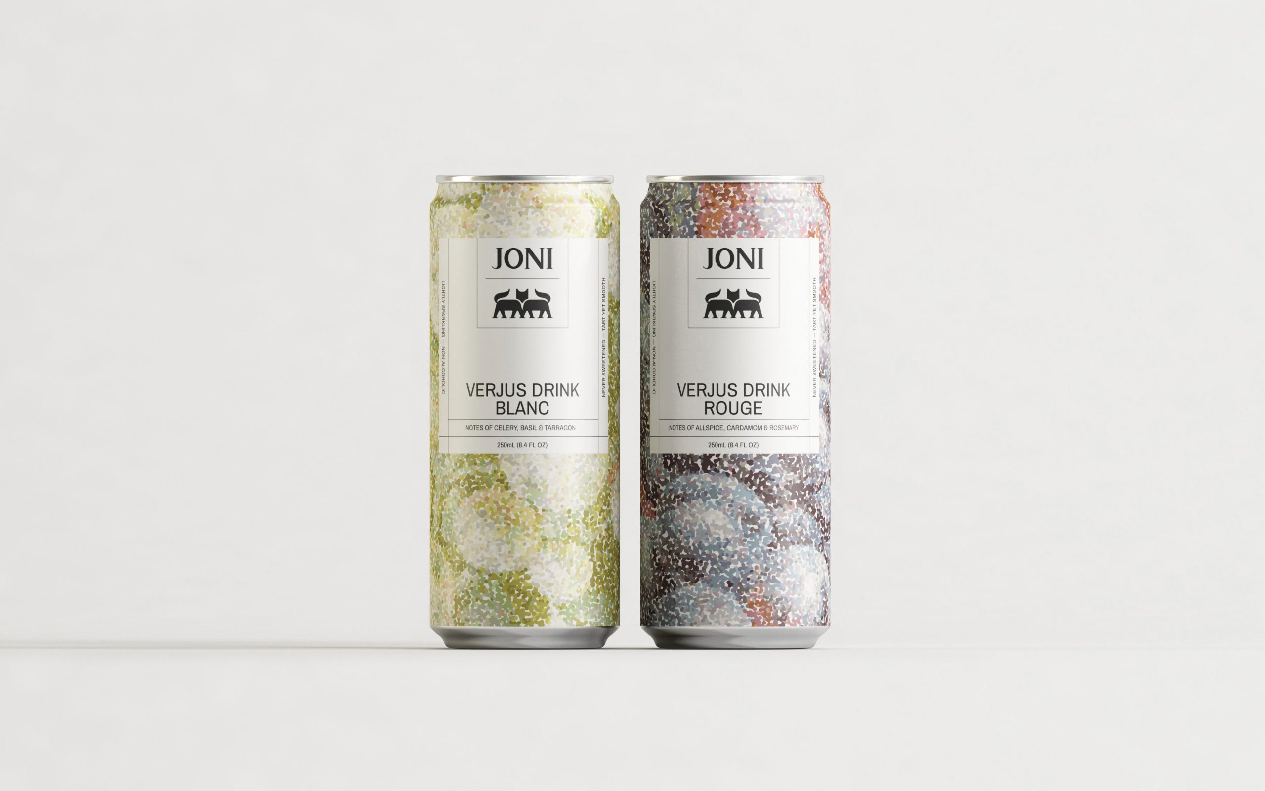
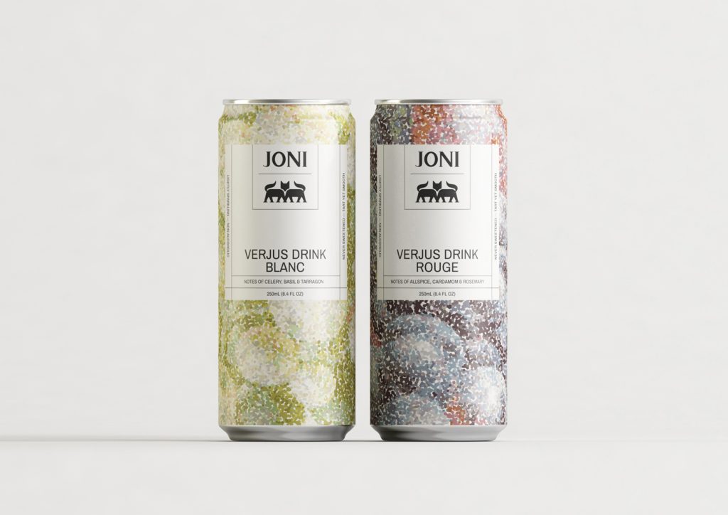
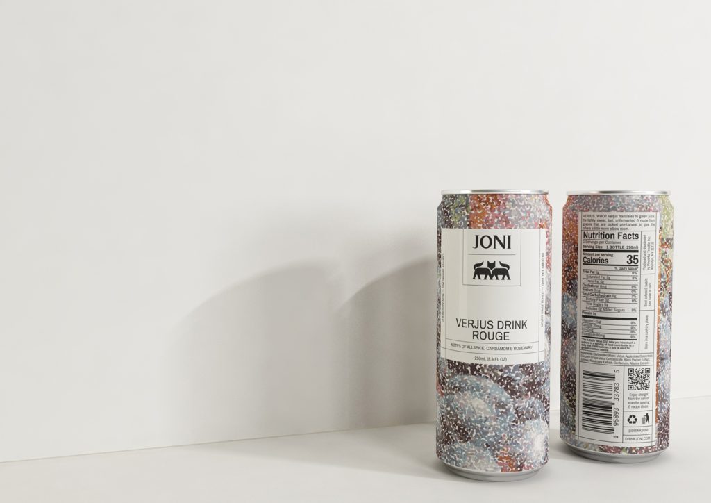
Joni is a Verjus drink — Verjus, who? Verjus translates to green juice. It’s lightly sweet, tart, unfermented & made from grapes that are picked pre-harvest to give the others a little more elbow room. Joni is a multipurpose drink, Non-alcoholic and with 0g added sugar. It comes in two flavours; Blanc and Rouge.
The goal was to find a balance between a design that evokes tradition and heritage but with a more minimal/cleaner and not too trend-driven look.


The Design Response
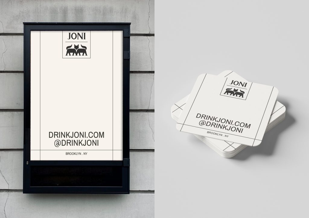
To achieve the goal, we root the design strategy in this phrase: Embrace the duality. Why? Because this drink is a game-changer. It is non a wine or a simple grape juice; it is a Verjus. Responding to this strategy, we found a perfect crossover between Pointillism and the Swiss Style. Bunches of grapes inspired us to Pointillism. We like this technique because it has a hint of sophistication but is not pretentious, and they share, with grapes, the same morphology: the dot. We were also inspired by the Swiss Style for its minimalist design ethos and stylish simplicity. Over the pictorial mark, you can also see the concept of ‘duality’. The foxes symbolise Joni’s spirit: cleverness, independence, playfulness, strength and power. It is also a beautiful, wild, and mysterious animal.
We craft an elegant and timeless wordmark, avoiding any trendy typeface. With this decision, we not only followed the brand’s values but also gained a unique approach. A detail we grabbed from the bespoke typography was their endings; we used them to create the foxes (pictorial mark) legs.
The square and the lines evoke a grid (Swiss Style) and reflect the spirit of old classic labelling. We try to mix two different worlds through simple morphologies.
Regarding colours, instead of pure tones for the brand colours, we prefer to use off-white and off-black to achieve a subtle and sophisticated approach. On the other hand, for the palette of each product, we intended to represent the essence of the flavour. We used a greenish colour palette for the Blanc to create a fresh, herbal feeling. For the Rouge, we choose a palette that evokes a cosy and warm feeling.
To finalise, Joni’s brand identity celebrates provenance and elevates the familiar with an identity full of personality.

The Design Team
Creative Directors: Bren Imboden & Luis Viale
https://www.makebardo.com/
https://www.instagram.com/makebardo/
The Client Team
JONI
Client details