How to be a content-conscious designer
Comfort in web design is a wonderful thing. As a visitor, comfort makes it easy and enjoyable to experience the website. The biggest threat to comfort in website design is the unfiltered supply of badly formatted text content, applied to the design verbatim. The designer’s job may or may not be to write all of the content, but if you don’t have the mandate to shape how the content is laid out on the page, you’re vulnerable to some common issues. The tips below will help set you on a course for comfort in your designs:
1. Break up text content into bite-sized pieces

Having lots of content is fine across a whole page, but break it up into sections with punchy headings that clearly describe what each paragraph is about. If you’re not deleting any content, it should be easy to get the copywriter or client onboard with the change—you may even be able to use some of the existing text for the headings. If your paragraph sections are too long, you’ll find yourself trying to use an uncomfortable paragraph type size to fit it in without scrolling and visitors will get bored.
2. Use headings

Most website visitors are scanners, give them the hooks that draw them deeper into your design. The reality is most people won’t read every sentence on the page, so make sure that if people only read the headings they still get a good understanding of who your business is, what you do, and why they should choose you.
3. Keep lists and grid sections of content consistent in length

Multi-column layouts are a common way to display a range of related messages in a grouped area of the design but if each piece of text is varied in length, it will appear uneven and messy in the design. Try proposing adjusted versions of each block of text so that they’re the same length—but do this visually in the context of the design so the client can see the benefit of your proposed change.
4. Keep headings short

In some instances, a paragraph in a larger font size can be really striking as a standalone piece of content—almost like a pull-out quote in a magazine or a larger introductory paragraph to an article. However, generally 1–2 lines is preferable for a heading that’s directly above a paragraph. Try suggesting a shorter, more punchy heading for the client. Big type for headings is also striking, so the longer your headings are, the more constrained you are on type size.
5. Use call to actions

While calls to action can be overdone, remember that people will be ready to take action at different points on the page. If you only have a button at the top and the end of the page, you may have people drop out without clicking on either. For a call to action to be effective, it needs to be relevant—relevant to the heading and the paragraph (or even the image) it appears with.
6. Use minimal text in buttons

Try to keep the button text to 2–3 words. Any more than that and you’re probably better off displaying the content as a text link. Multi-line buttons are an absolute no-no as they no longer look like buttons.
7. Use informative headlines

In his article 113 Design Guidelines for Homepage Usability, usability expert Jakob Nielsen outlines why informative headings are more effective than vague marketing lingo “Don’t use clever phrases and marketing lingo that make people work too hard to figure out what you’re saying…Every time you make users ponder the meaning behind vague and cutesy phrases, you risk alienating or losing them altogether. Users quickly lose patience when they must click on a link just to figure out what it means. This isn’t to say that homepage text should be bland, but it must be informative and should be unambiguous.”
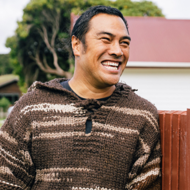
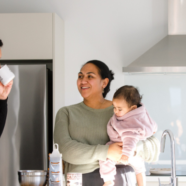
8. Use a professional photographer for high quality and relevant images

When photography is used on a website, it is often a key component that helps visually communicate a product, service, personality or vibe. A beautifully designed website can often be let down by poor quality photography or stock photography. Low resolution phone images or stock images that lack authenticity will handbrake the overall feel of the design. Using a professional photographer to take custom photos for a website allows you to get beautiful images that complement the rest of the content in a design. This creates a link of communication between text content and visual content, which ultimately makes for a stronger overall design.
Conclusion — be proactive in how content is displayed on the page
Being conscious about the content for a website design and understanding it in great depth will make for more informed design decisions, leading to a better design overall. Putting these simple yet effective practices to use can help turn a website design from good to great. Creating a website that feels comfortable, is easy to digest and looks beautiful, will not only delight your clients but will look great in your portfolio.