Fresh From The Field – Prep By White Rabbit
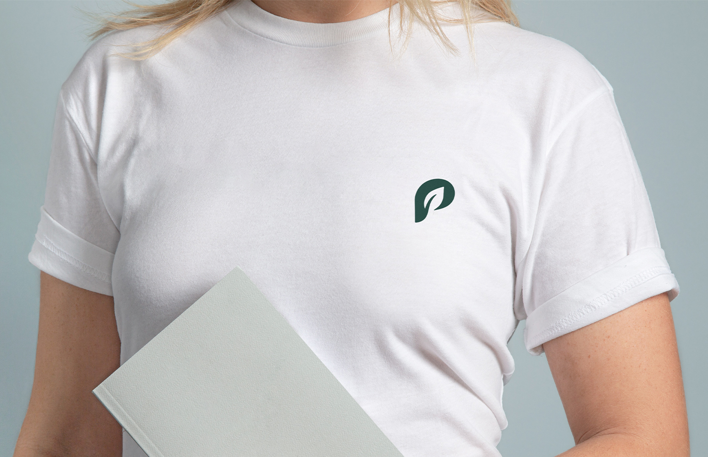
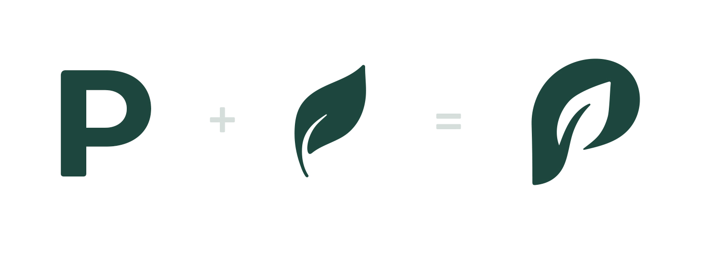
Prep were looking for a more professional brand identity and a clean, modern and user-friendly website, so White Rabbit were tasked with a brief to redesign their logo and developing an ecommerce website with increased usability, which was user-friendly. The end result is a well-crafted, clean and organic aesthetic, while reflecting a slight handcrafted look, providing a slight nod to the homely style meals that Prep offers.
Want to submit your own work to Fresh From The Field? Fill out the FFTF form here.

The Brief / project Kaupapa:
As the name suggests, Prep Plant Based Meals supplies ready-to-prepare meals with plant-based ingredients. It competes in a market showing impressive growth, so it needed a brand identity that would resonate with customers, and a website that ensured a smooth and hassle-free purchasing process. Their existing website and brand identity were not reflecting the quality of Prep’s food and service. The Prep team were eager to establish a more professional brand identity, along with a clean, modern and user-friendly website. We were tasked with a brief to redesign their logo and develop an e-commerce website that would draw new customers, retain existing customers and lead to an increase in sales. We conducted thorough research, including sampling their delicious meals – hey, it’s a hard job, but somebody’s got to do it.
The Design Response/what was created:
We were excited to jump down the rabbit hole on this one as it meant using the diverse range of skills that our team have here at White Rabbit. Branding, Illustration and Web Design were all required to bring this project to life.

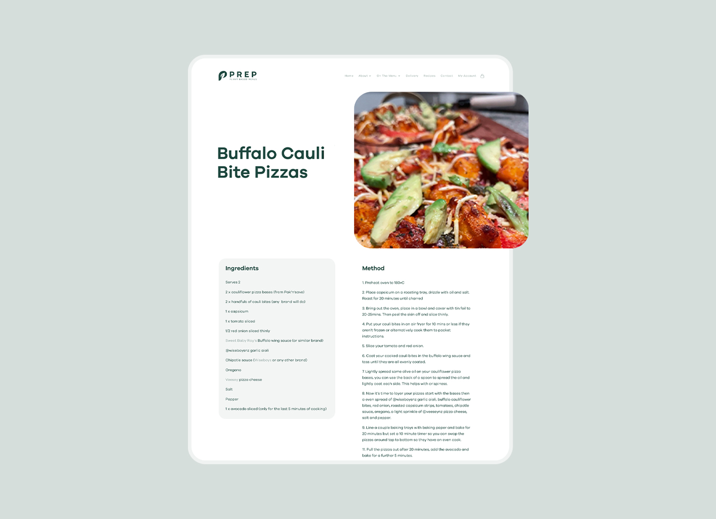
We achieved this with a modern, fresh design style, rounded corners to soften the look and custom illustrations and icons to enhance the brand. We also added functionality like subscriptions, a DIY pack maker and after pay.
The main goal behind the Prep website is to encourage meal kit sales to both existing and new customers. Achieving this required a high level of UX and UI design. In order to further increase conversions, we added strong calls to action along with other best practises. Our team optimised the checkout process with a sleek design and intuitive steps that make the purchase both easy and enjoyable.
- Simon Ellery
- Nicole Wong