
Fresh From The Field – The Art of Letters by Kris Sowersby
Be in to win a free copy of The Art of Letters! Simply tell us what custom typeface was used to typeset the book, then email janelle@designassembly.org.nz with the subject line “Kris Sowersby Book Entry” and put your answer in the body to enter the draw.
Formist Editions is proud to announce the release of the publication Kris Sowersby: The Art of Letters. A visual feast of letterforms celebrating one of the world’s leading type designers.

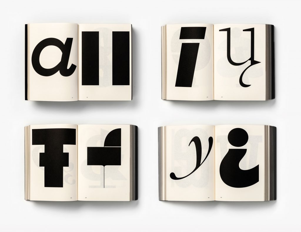
Kris Sowersby: The Art of Letters is an 800 page publication expressing the intersection of art, function and form in type design. It examines type designer Sowersby’s letter drawing practice while considering the characters as independent works of art. It champions the absurd beauty involved in creating multiple expressions of predetermined alphabets through nuance and theory.
 We are surrounded by letters. Yet how do we perceive them? Are we even conscious of it?
While a typeface is a well considered set of many elements, if one removes the context of language systems and alphabets, each character may be viewed as a singular abstract drawing, as art in its own right. As presented in this book, it allows us to re-see, or to see for the first time, their individual form and function.
Formist founder Mark Gowing describes of the concept as “asking more questions than it answers. What type designers do is often discussed as a kind of science. But the process of type design is also highly creative and involves an intuitive artistry led by thousands of minute decisions. I wanted to look beyond the function of type and realise the beautiful art form within the system. Type is an expressive art that can embody complex concepts and social meanings.”

For a type designer, their relationship to letterforms is intimate and complex. Something Kris Sowersby of Klim Type Foundry can attest. Along with his popular library of commercial fonts, Sowersby has designed custom typefaces for commissioners including The Financial Times, PayPal and National Geographic.
He has received numerous awards and accolades, including a Certificate of Excellence from the New York Type Directors Club and the John Britten Black Pin, the highest award given by the Designers Institute of New Zealand. In 2019, Sowersby was named an Art Laureate by The Arts Foundation for his continuing contribution to New Zealand Art and Design.
 As Sowersby explains, “Each letterform in a typeface is painstakingly drawn. It simultaneously has to function on its own and with others. Typography is language made concrete, and typefaces are the material from which it’s made.”
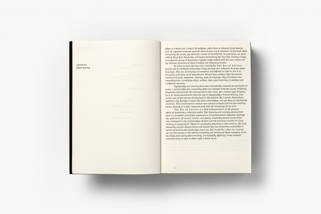
Kris Sowersby: The Art of Letters is finished with black-edged pages and a dust jacket featuring gold foil-stamped custom typography. Inside Sowersby’s letters come to life, printed one per page in black on cream paper. The book features a fascinating essay titled ‘What we read when we see’ by graphic designer, writer and educator Paul McNeil and a foreword by Formist publisher and designer Mark Gowing.


 Sowersby and Gowing collaborated on a custom typeface, Brotunda, used to typeset the book. Inspired by the rich history of rotunda typefaces, its use is exclusive to the publication.
Paperback
Black page edges
150 × 210 mm
800 pages
Editors:
Mark Gowing and
Dave Foster
Design: Formist
Essay: Paul McNeil
US $90.00
Kris Sowersby: The Art of Letters is available from the Formist Editions store:
www.formisteditions.co/products/kris-sowersby-the-art-of-letters


