Fresh From The Field: Auckland Home Show – By Spruik
A little renovation of its own. Spruik gives the Auckland Home Show a refined new identity designed to evolve, expand and reconfigure.
Fresh from the Field is a weekly article series sharing fresh and inspiring work from the Design Assembly community. Want to submit your work to Fresh From The Field? Fill out the form here.
The brief
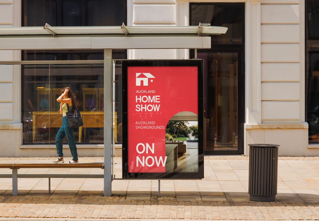
Auckland Home Show is Australasia’s largest home, renovation and building event, with more than 40 years of heritage. While the brand had strong awareness, its visual identity had become fragmented and was no longer reflecting the scale, energy or breadth of the experience. The brief was to revitalise the brand for a digitally led audience, while retaining the recognition and equity built over four decades. The new identity needed to work across consumer and exhibitor communications, unify multiple event experiences and categories, and create greater distinction in an increasingly crowded market. Most importantly, it needed to make Auckland Home Show feel relevant, exciting and worth discovering again.
The design response
We repositioned Auckland Home Show around a simple idea: Evolving Spaces.
Rather than treating the Home Show as a static collection of stands and exhibitors, we looked at what happens when people enter the event: they discover ideas, explore possibilities, make decisions and imagine what their own spaces could become. This became the foundation for a visual identity designed to feel as dynamic and varied as the experience itself.
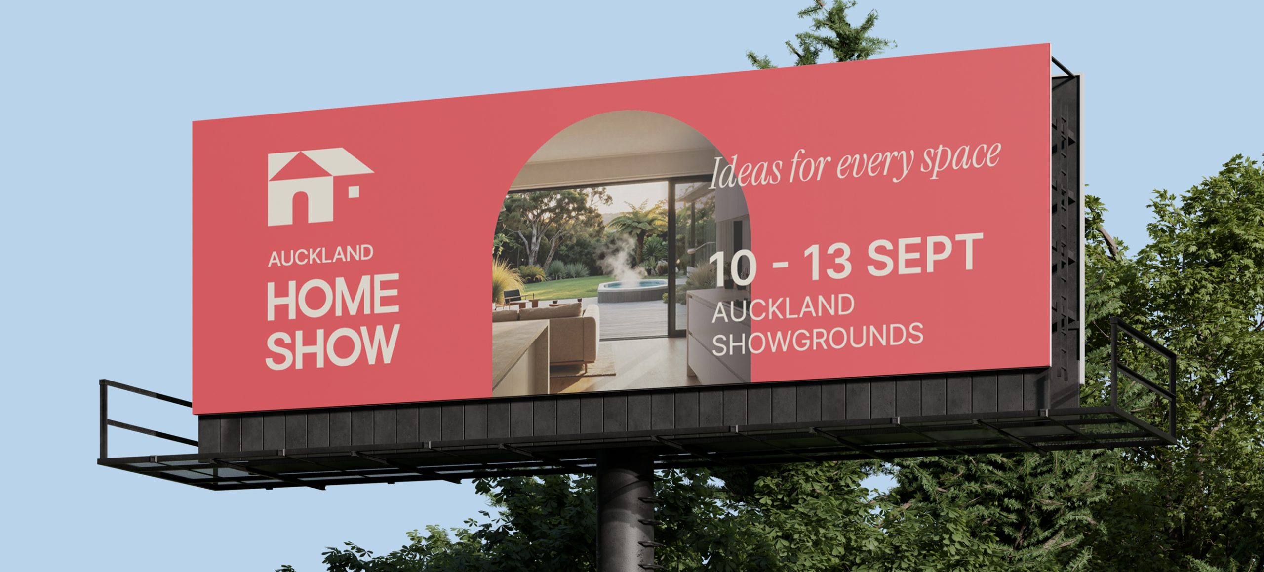
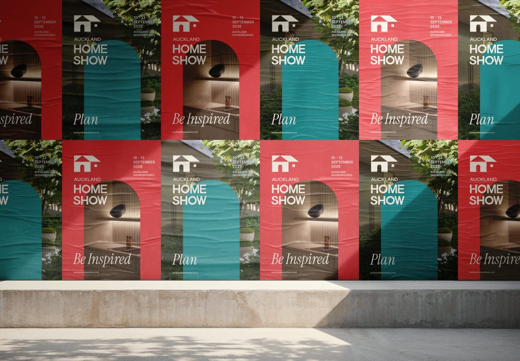
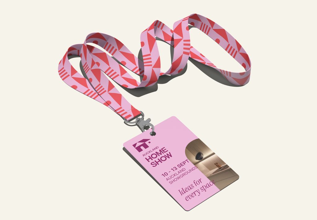
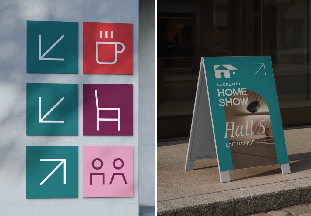
The breakthrough was developing a flexible graphic system built from simple architectural forms. These shapes can expand, contract, connect and reconfigure to create constantly changing compositions – representing the way spaces, ideas and aspirations evolve. The system gives the brand a distinctive visual language while providing enough flexibility to communicate everything from kitchens and bathrooms to landscaping, building and outdoor living.
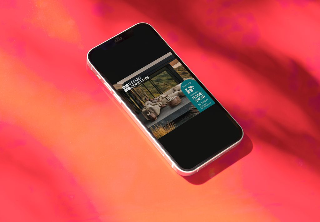
This modular approach also solved one of the project’s key challenges: creating consistency without making the brand feel repetitive. The identity could flex across digital, social, OOH, print, environmental graphics and event signage, while maintaining a recognisable Auckland Home Show presence.
The result is a more contemporary, confident and cohesive brand that reflects the scale of the event and speaks to both sides of its audience – consumers looking for inspiration and exhibitors looking to connect with them.
Rather than simply refreshing the look of an established event, the identity gives Auckland Home Show a visual system capable of evolving with it – creating a stronger platform for future growth and new experiences.
The design team
Stacey Morrissey, Creative Director
Nick Walker, Senior Designer
Website
Facebook
Instagram
LinkedIn
Youtube
The client team
EENZ
Facebook
Instagram
Youtube
TikTok
Pinterest
Website