
Fresh From the Field — Mac’s Seltzer, Dow Goodfolk
Dynamic and delightful, this Fresh From the Field features Dow Goodfolk‘s work for Mac’s Seltzer, which will have you smile while you sip!

The Brief / project Kaupapa:
Following seltzer’s runaway success in the USA and building on their reputation for being an imaginative bunch, Mac’s – New Zealand’s number 1 craft beer brand – decided to launch a seltzer range; a great opportunity to attract new people to Mac’s, people who weren’t necessarily into craft beer, or in fact any beer!
The challenge was how to capture the promise and attributes of a seltzer (a ‘cleaner’, healthier drink – alcoholic sparkling water with lower calories and less sugar, and fruit flavours) – in a Mac’s way, and also make sure people understood this was not a Mac’s beer. Or a Mac’s soda or cider.

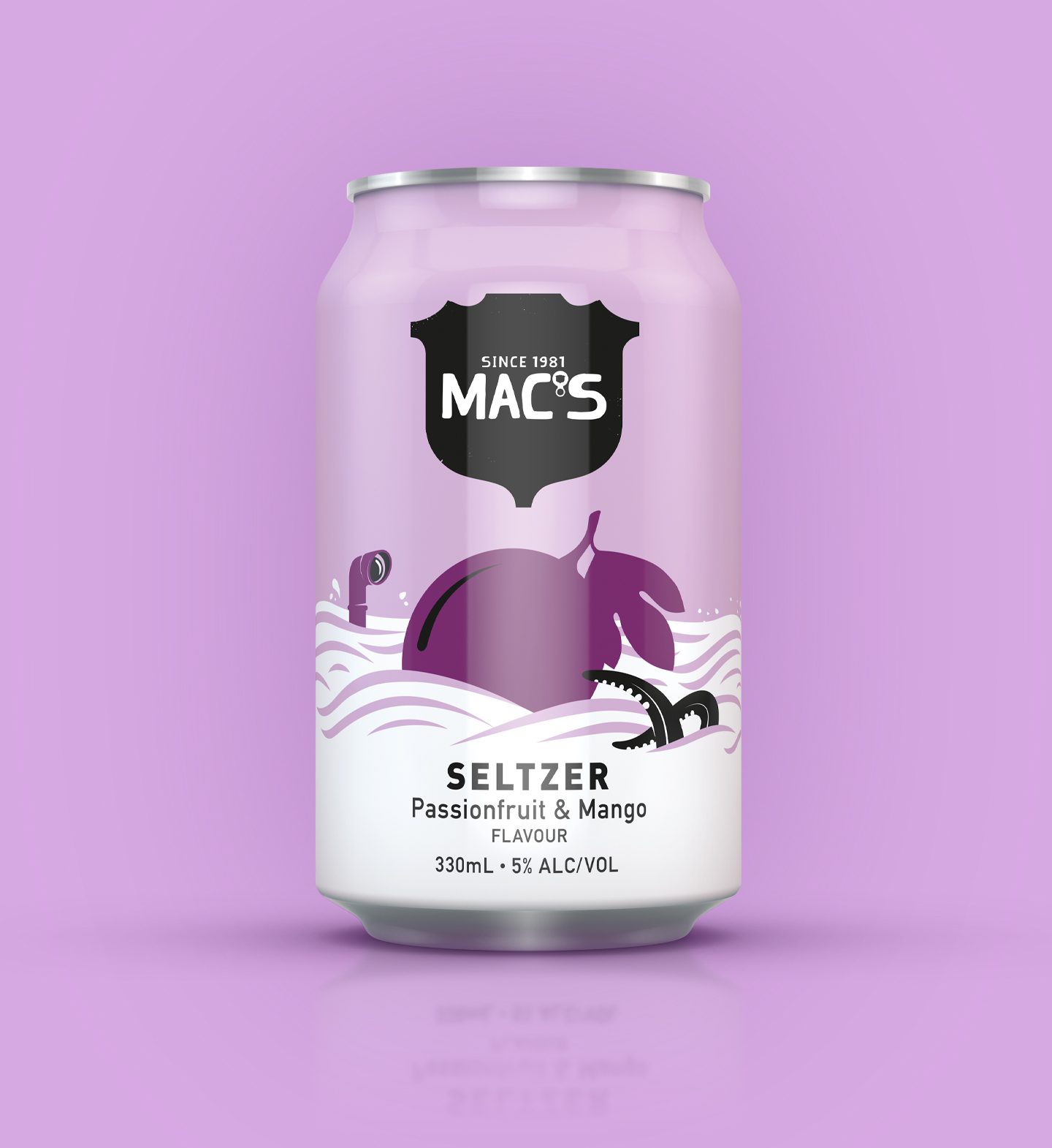
The Design Response:
We started out, as we often do with this client, with a collaborative tissue session of ideas. Our initial ideas started very minimally which was where the cleaner alcoholic drinks were going. Then throughout our design journey we played around with how much Mac’s energy – with their signature quirky styling – felt right to look like Mac’s, but not beer! – and we tried quite a few different balances. There was also discussion all the way through about whether to rock a white or a pastel coloured can, and it was only some research that helped make the final call – pastels are in!

One thing that is typical of our Mac’s client is their appetite to drill down into the nitty gritty of a design’s details, and look for left field or associative ideas to add into the mix. So once a general design direction is agreed there is always a lot more work to be done on the details. You won’t believe the discussions that go on behind what is floating in our seltzer ‘sea’! And exactly what a tentacle might be doing. Of course all of this is complicated by alcohol regulations and all of the ideas which are not allowed because, for example, you can’t be seen to be encouraging someone to swim while drinking.
And then the process repeats itself for the box designs, both for each seltzer and a mixed box.
In the end, the design is very simple – although not minimal! And we have inserted some discoverable Mac’s icons into our seltzer seas that may get you thinking, or at least smiling happily as you sip your healthy seltzer.
The Collaborators (creative team):
- Creative Director: Donna McCort
- Designers & illustrators: Leonie Whyte, Amanda Bearsley
- Account Director: Rebecca Hamer


