Fresh From the Field — Avalanche by Curious
The shape grammar of letterforms provides fertile territory for visual metaphor. The Apex of an A creates a pinnacle, an opportunity embraced by Curious in their revitalisation of the Avalanche brand. This Fresh from the Field showcases a playful approach to typography, fine grain texture, and playful illustrations, immediately reinvigorating this recognised identity.

The Brief:
When Curious first met clients Stefan and Paul, their vision was to reinvent Avalanche and build more personality into an already successful, but slightly tired brand.
From the outset Curious’ mantra for the project was ‘Avalanche starts with an A, and so does Attitude’. This not only created the driving idea, but it also eventually steered us down a path where the ‘A’ was to become a hugely important graphic component for not only the brand identity, but also packaging and communications.

The Design Response:
After several rounds of design exploration, it became evident that a bold, sans serif font featured on a pure white background would not only make the iconic ‘A’ extremely contemporary looking-but it could also be utilised as a colour coding system to clearly identify different category products. This strategic thinking laid a solid foundation for the brand architecture, but additional personality was absolutely essential to provide Avalanche with a totally unique point of view. This was duly achieved by introducing whimsical black and white illustrations that interconnected with the dominant ‘A’ icon.
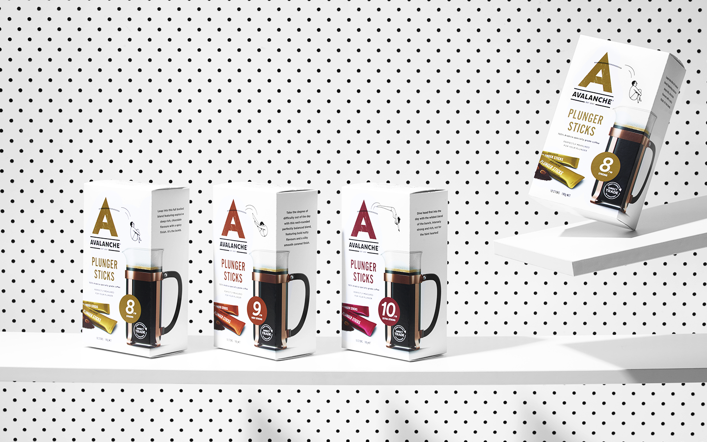
Joseph Carrington from Moses Illustration was selected to create all of the imagery. Not only because his style perfectly encapsulated the modern, casual feel that we envisioned for the brand-but also because he was totally open to collaborating closely with Curious on image content. This allowed both agency and illustrator to foster a creative environment where relevant situational humour could be introduced to reflect each product.
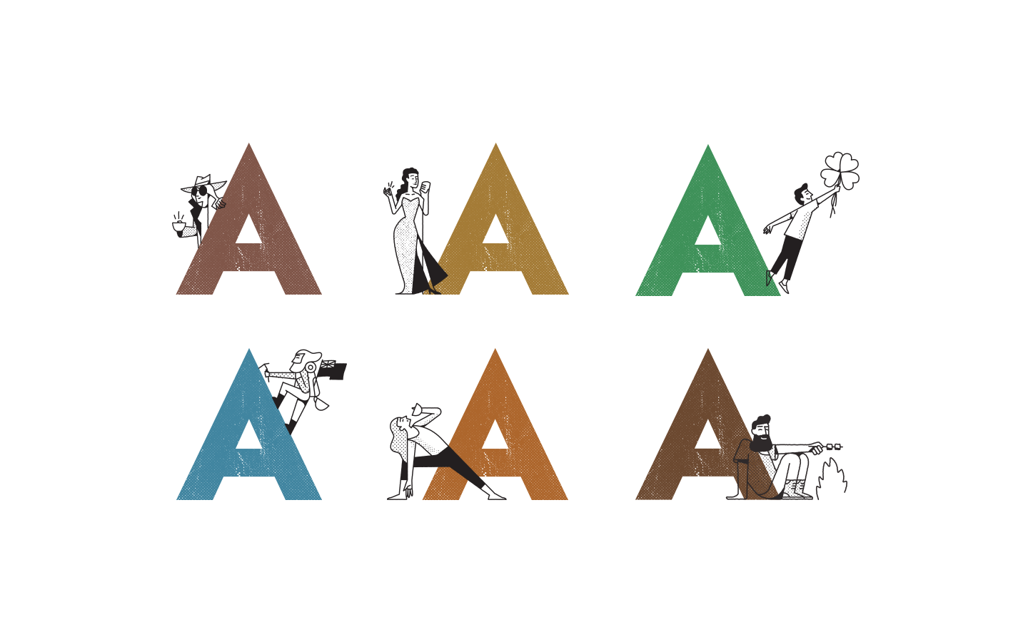
From figures leaping off diving boards for the Plunger range through to a voluptuous chanteuse personifying the silky smooth Café Style Caramel Latte, every image was thoughtfully explored and realised. The final graphic ingredients for the packaging were then formulated and incorporated. Beautifully styled photography of the products set in a contemporary, white, café style environment created appetite appeal and cleverly crafted copy was introduced to match the brand tone of voice to the visual storytelling.
All in all, a landslide success!