Fresh From The Field NZC: Representing New Zealand by Culture & Theory
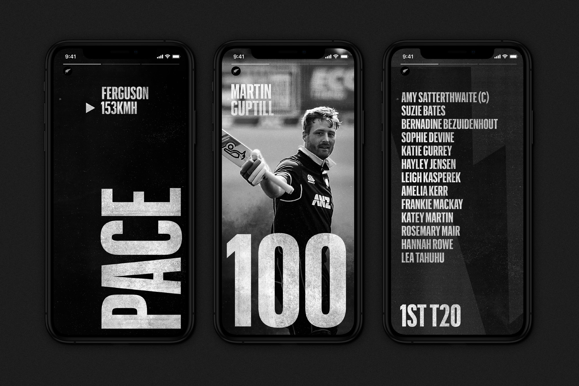
This Fresh from the field is further evidence of Culture & Theory‘s masterful typographic craftsmanship, and bold art direction. Featuring a striking campaign to celebrate the collective strength and spirit of competition within our international crickets teams.
If you have new or recent work that you would like to share in Fresh from the Field email nicole@designassembly.org.nz for details.

The Brief:
The BLACKCAPS and the WHITE FERNS are so much more than international crickets teams. They are the pinnacle of our sport and they are the demonstration of the New Zealand spirit of cricket. The brief was to create a clear and compelling proposition for our international teams’, authentically capturing the New Zealand spirit of competitive play.

The Response:
We separated the BLACKCAPS and the WHITE FERNS from NZC so that they had a strength and single-minded role around representing New Zealand on the world stage. We achieved this by elevating the fern and organising our representing suite of brands in a clear, simple and future-proofed structure.
With a clear role to represent NZ on the world stage, we created a bold, powerful expression that would support our core idea of ‘collective strength’. This culminated in a brand expression that’s fit-for-purpose for the digital and social media age, whilst retaining a classic sense of national pride.
With the majority of touchpoints turning up digitally, we needed to create a brand that could be implemented easily and quickly in variety of situations ranging from new squad announcements to real-time milestones during live matches.
The team:
Culture & Theory https://cultureandtheory.co.nz/
https://www.instagram.com/culture.and.theory/
https://www.linkedin.com/company/culture-and-theory


