Fresh From The Field — Finery by Onfire Design
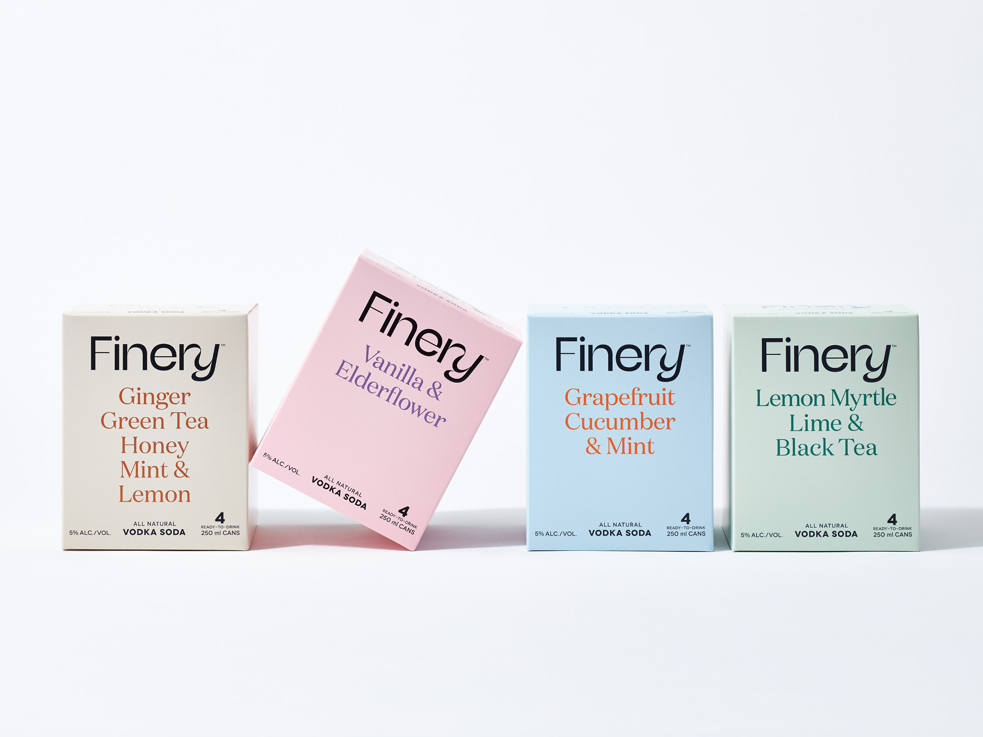
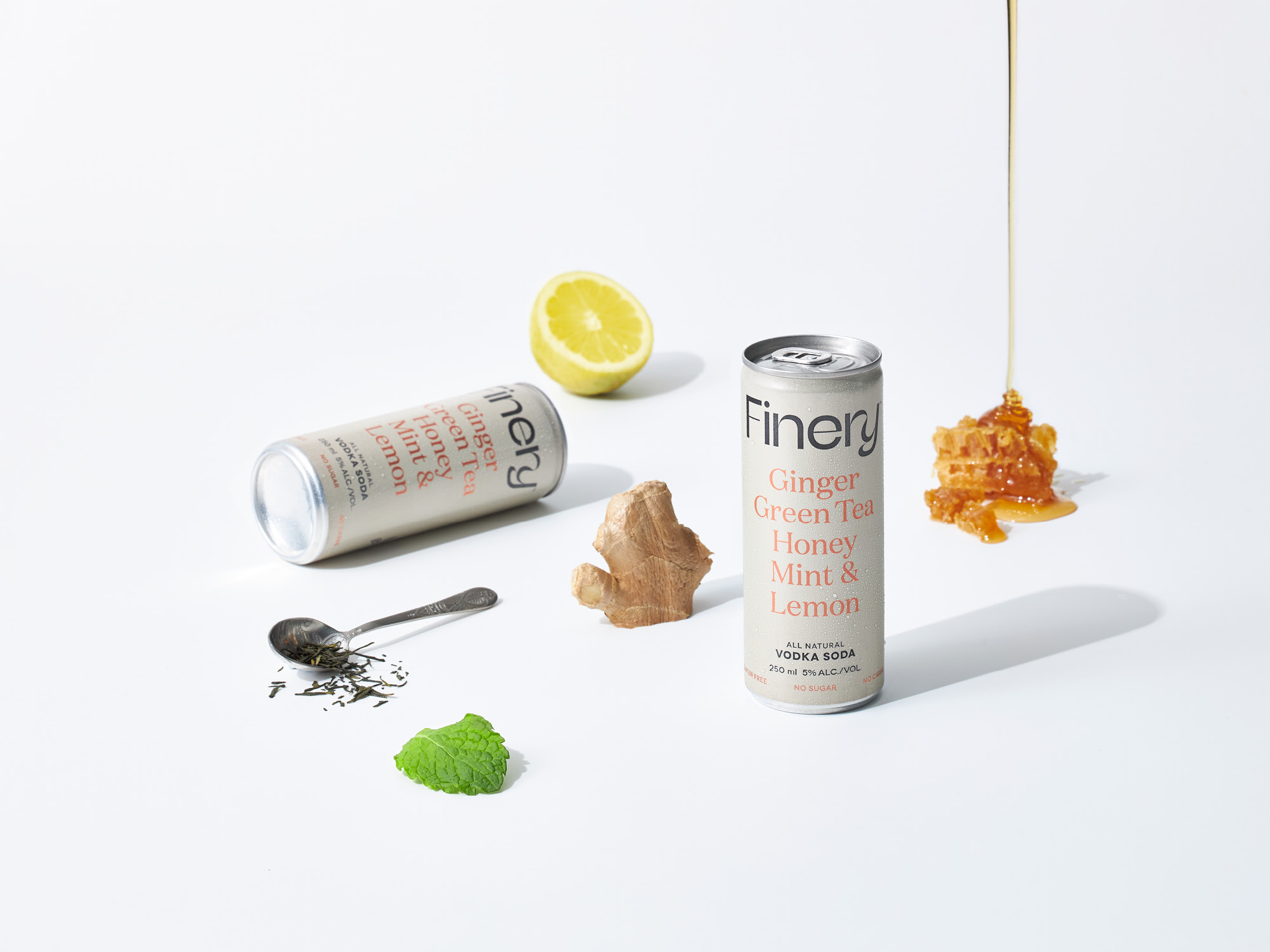
This Fresh From The Field for Finery Drinks (a favourite of the DA team) is by Onfire Design and features a striking identity, elegant packaging, and beautifully considered typography (just look at that phenomenal stroke variation and ligature!)
If you have new or recent work that you would like to share in Fresh from the Field email nicole@designassembly.org.nz for details.
The Brief:
Ageing gracefully, living a fulfilled conscious, balanced life, mixing family, social and healthy lifestyles is key in this fast-paced world. As advocates of raw whole foods, balanced of course with societies small pleasures, The Fine People team wanted to carry this belief across to an efficient, desirable and refined ‘drink of choice’…and stop leaving bottles of vodka at every social gathering! Research and sales figures show that white spirits are on the rise, while dark spirits and wines are losing market share.
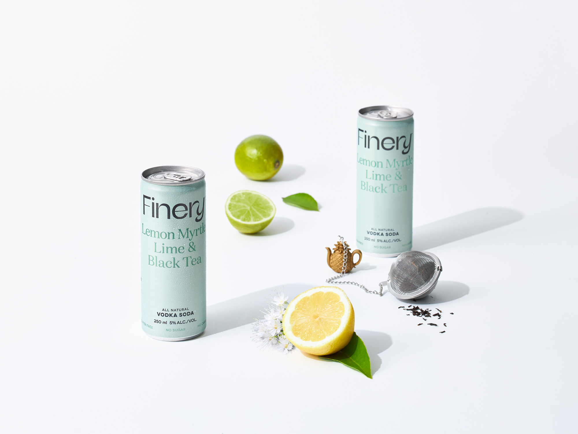
Consumers are actively seeking out new cleaner and flavoursome drinks experience. Over the last couple of years, a selection of clear premix spirits had launched into the New Zealand market and quickly gained loyal consumer followings. These however relied upon a flavour delivery which was boosted by sugars, Xylitol, Erythritol, Stevia or Citric Acids. For The Fine People the challenge was to create a new premium entrant which had no tolerance for artificial substitutes nor inferior quality ingredients—through recipe creations, sewing together honest, all-natural, local ingredients. Comprising aromatic botanicals, delicate fruit juices, teas and vodka to create the desired sweetness, while mixologist standard flavour profiles subtly unravelled during each sip – much like a fine tea or reserve standard wine.

The Design:
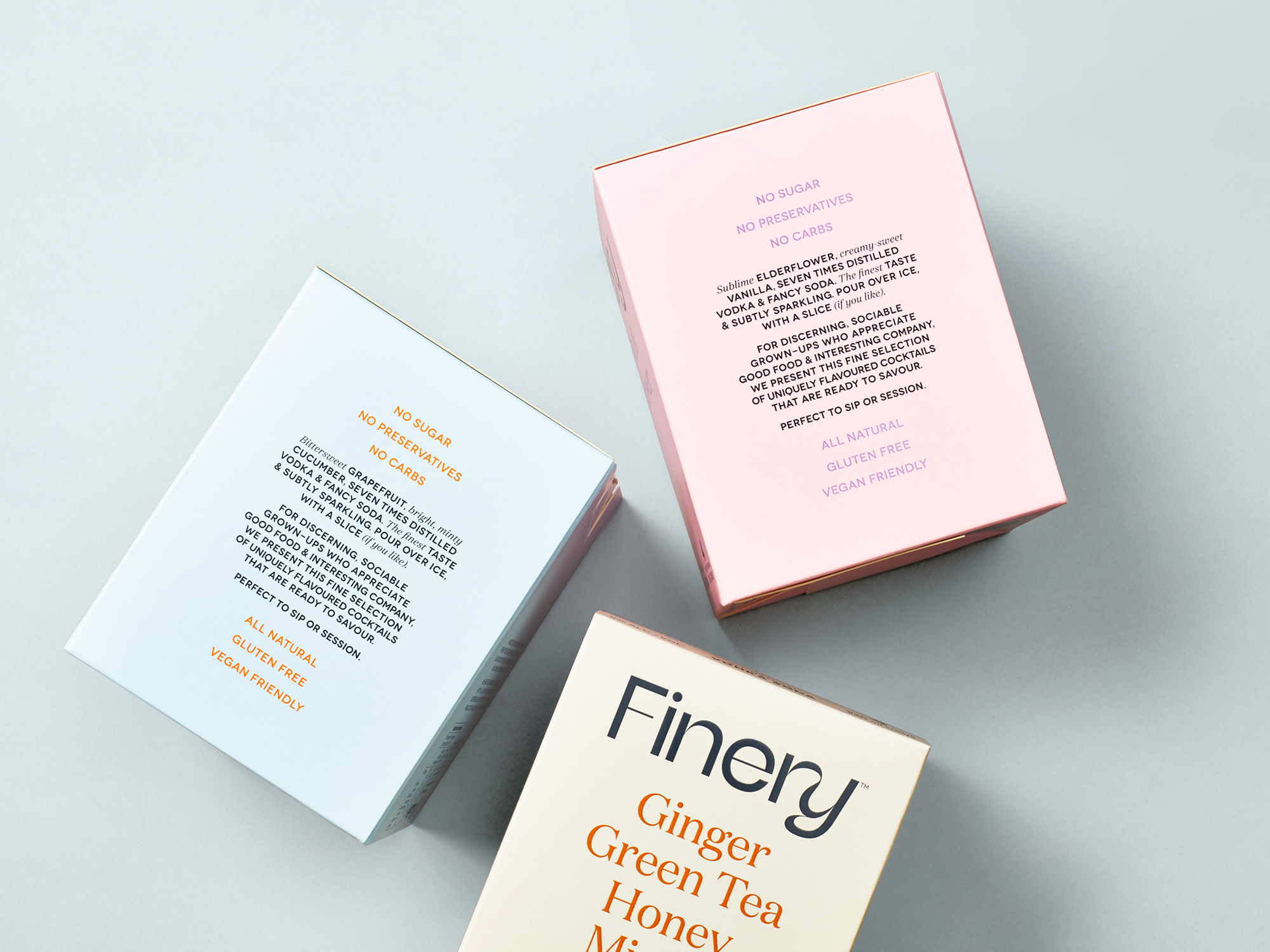
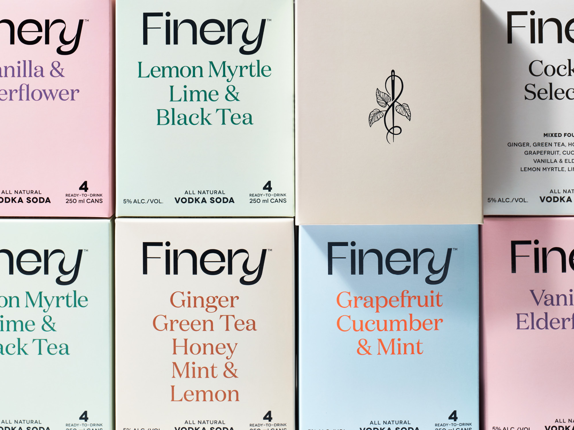
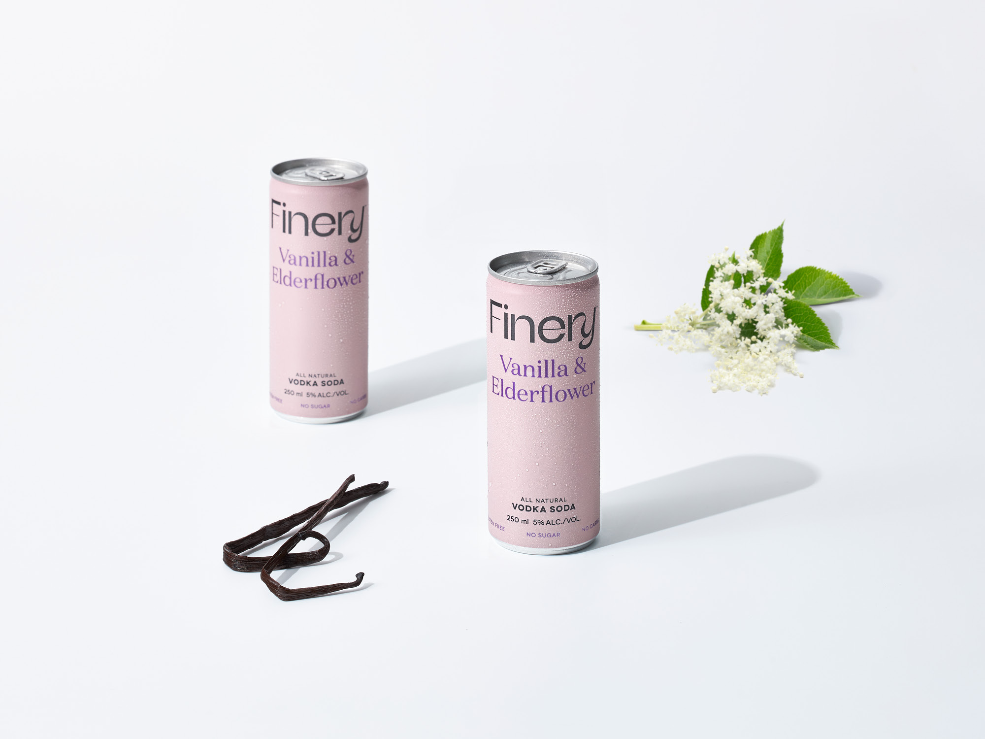
As a brand name, Finery optimises the exacting standards that each recipe has been created with, genuinely living up to its decorative and opulent fashion fraternal origin. Much like the savvy fashion-forward brands of today, Finery’s design aesthetic is stripped down and minimal. The brand name gave the Onfire team the chance to create an elegant ligature – a nod to the smooth, subtle flavours while creating a memorable stand-alone logo. All the hard work in the recipe creation was about championing the ingredient combinations; this led to the idea of each flavour combination displayed large on each front face. They are achieving yum factor through words, not imagery. A soft pastel colour palette and highbrow copywriting speak to the new spirit among consumers who are looking for a clean alternative, honest, to-the-point which fits their clean eating and drinking lifestyle.
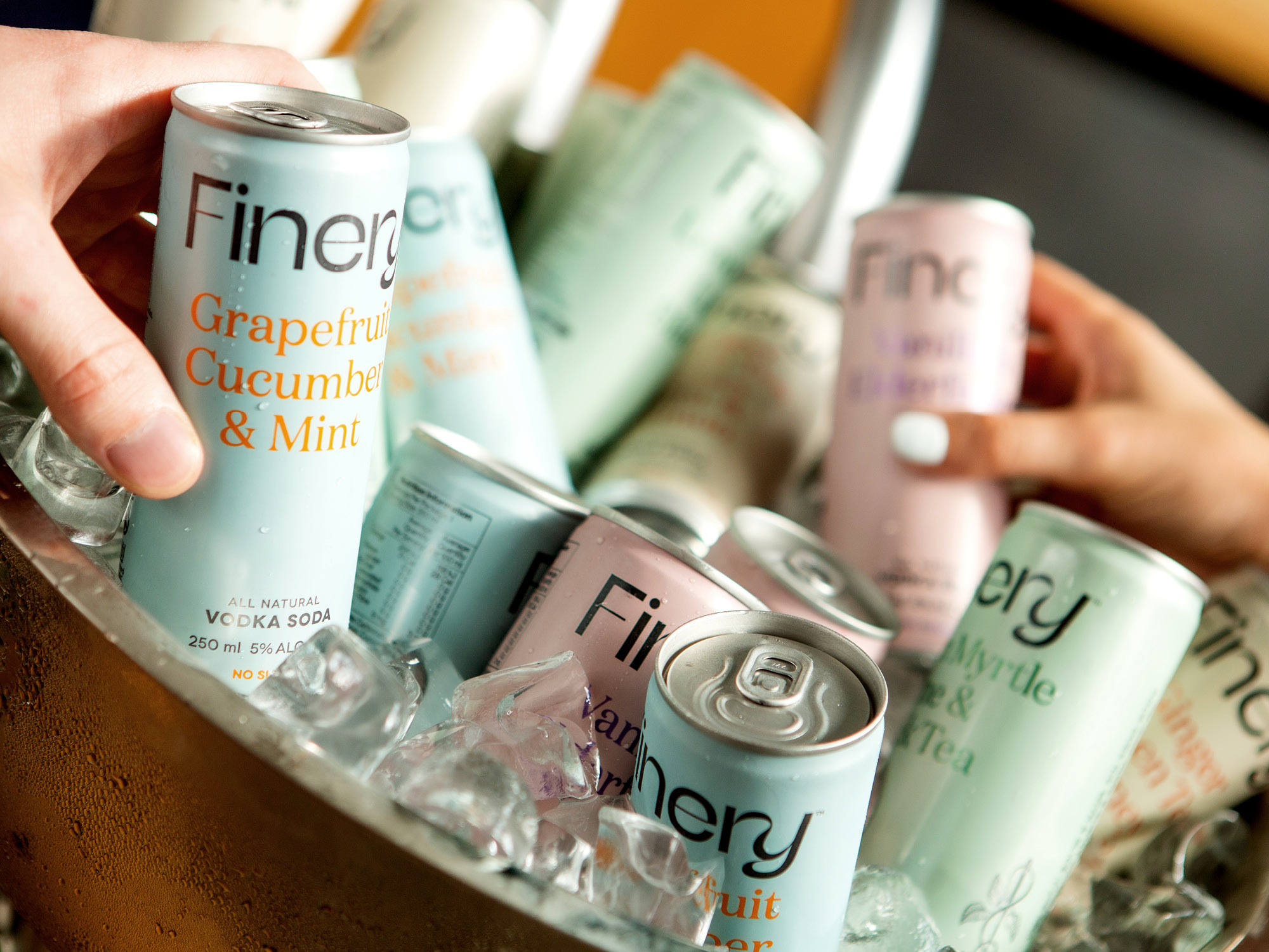
No sugar. No carbs. Gluten-Free. Vegan friendly (thanks to sugar cane vodka) and unpasteurised. These vodka soda RTDs are pure but hardly simple.