Aotearoa Design Dieline Success.
Design Assembly extends our heartfelt congratulations to all the New Zealand winners and finalists for the 2019 Dieline Awards.
The benchmark for impeccably designed packaging of consumer products, The Dieline Awards recognise the absolute best from designers and design agencies worldwide. The Awards began as a way to formally recognize the absolute best in consumer product packaging design worldwide, bringing awareness to the immense value that lies in well-designed brand packaging. Now in its 9th year, it has become the standard which brand owners, consumers, and designers turn to for the best packaging design in the world.
Since its inception, Dieline Awards has handed out 397 coveted trophies. While this may sound like a lot, the competition is truly the most competitive in the industry. This year alone, Dieline Awards received nearly 1500 entries from over 20 countries around the world, and only 94 received an award. This year, against some of the hottest competition in The Dieline’s history, New Zealand’s local design studios celebrated success across many categories.


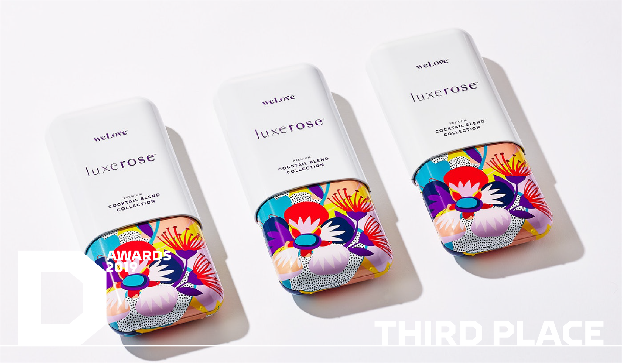
Auckland’s Onfire Design has placed in two categories (a first and third) for its exceptional Luxerose Cocktail packaging.
The Dieline Awards esteemed jury agreed and the Luxerose packaging was acknowledged for its excellence in all five key elements of the judging criteria: Creativity, Marketability, Innovation, Execution, and On-Pack Branding. Matt Grantham, Creative Director at Onfire Design, drove the project. “A key design consideration while developing the visual was to blur the lines between high-end, premium alcohol and aspirational brands in cosmetic and lifestyle markets,” says Matt. “We always kept the focus on being memorable, fun and something that is irresistible and enticing to be picked up. The glass vials provided us a tall and slender liquid container that are ideal for single serve pours. But the vials couldn’t be packaged in just any box, so a bespoke case was created that could serve as a keepsake after use.”


David Trubridge Ltd & Mat Bogust, Think Packaging won three First Place awards for Steens Honey Hive in the Fresh Food, Luxury and Limited Edition categories.
Their goal was to create customised packaging that would attract the attention of high-end shoppers amongst all the black/gold products in an emerging and ultra-competitive Manuka Honey category – just as honey bees are irresistibly drawn to the bright colours of flowers.

Butcher & Butcher won first place in the Multi-SKU category for Cook & Nelson’s Gift Hamper
“Cook & Nelson are purveyors of the most exciting and exceptional fare crafted by the best artisan producers in the world. They search the globe to discover individuals who share a passion for crafting extraordinary food, exciting new processes and recipes resulting in remarkable unexpected fare. Their brief was to create a gift hamper free of cellophane, gold ribbons, and no sign of a cane wicker basket in sight.”

Fuman won second place in the Fresh Food category for their East Rock Packaging.
“To speak to a culturally diverse market, we drew inspiration from Asian art forms such as Gyotaku – where a real fish is layered with ink and a print is taken directly from the skin. The logo uses Hanko signature stamps, which are hallmark stamps that signal quality across cultures.”

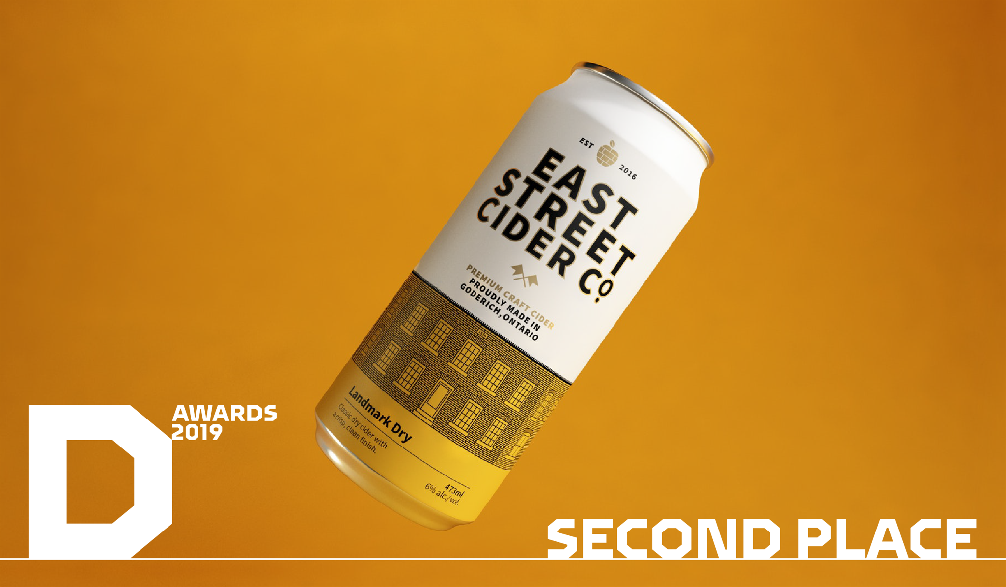
Queenstown based Makebardo won Second Place: East Street Cider Co.
“We extended the illustration of the building a full 360° across the bottom of the can. This helped to highlight the horizontal architecture of the building and allowed consumers to discover the entire building when rotating the packaging. Additionally, it created strong visual impact at shelf – when several flavours of cans are combined, it creates the illusion of the construction of the building.”

Milk Brand Agency won a Second Place for Hanleys
“Hanley’s is a brand built on values, a completely genuine story about an owner and her love for animals and their well-being. Our identity needed to reflect this natural simplicity. Thus we chose natural raw photography showcasing animals in their everyday surroundings, doing things that dogs like to do. Colours, photography style and raw paper stocks represented where Hanleys is from – the South Island of New Zealand.”


