A Few Choice Voices: Different Ways of Talking About Design
Written by K. Emma Ng
Supported by Creative New Zealand
![]()
Emma Ng is a contributor to Aotearoa Design Thinking 2018, a series of commissioned critical design essays published by Design Assembly and funded by Creative New Zealand.
This article is the last in a four part series on design and its support structures that enable us to nurture, celebrate and critique designers and their work. Over the course of the year Ng will “map Aotearoa’s past and current support structures, look at models elsewhere, and mull possibilities for the future”. Read part one here, part two here and part three here.
I flip-flopped over what to write about for this final instalment of my series for Aotearoa Design Thinking 2018. If you’ve been following along over the course of the year, you’ll know I’ve been looking at support structures for design in Aotearoa. Along the way I’ve touched on design exhibitions, government initiatives, design societies, professional associations, and conferences.
There are, of course, still lots of other areas that could be explored. A piece on design schools is an obvious and important omission. But I thought the intricacies of design education—past, present, and future—are best left to someone who works more intimately with tertiary institutions. I also thought about surveying design publications, running the gamut from Design Review to The National Grid.
In the end though, I wanted to end the series on an optimistic note by celebrating the endless ways that we can turn a critical eye to design. So today I’m offering up a few choice examples of people writing, talking, and designing about design. I wanted to present an encouraging selection that demonstrates the different ways we can share in conversations about design, including informal approaches like blog posts and design proposals. Thinking about influences and references is a familiar part of the design process, but is maybe something we don’t take the time to practice consciously as part of the writing process.
You’ll see that many of my favourite reflections on design come from designers themselves. This intersects nicely with another theme I was thinking of dedicating an article to: designer-run initiatives. A lot of the examples here are the result of designers forging ahead and making space for themselves to say the things they want. As someone who largely works with contemporary artists, I was thinking of ‘designer-run initiatives’ as a parallel to ‘artist-run initiatives’—spaces driven by the concerns and interests of an individual or small group of practitioners. Publications like Strips Club, The National Grid, and The Silver Bulletin are all examples of this, as are grassroots studio practices that thrive on collaboration, like Index and (the now dormant) Pivot Print.
I wouldn’t call this a round up, a ‘best of’, or even a well-rounded selection! Sharing some of my favourite things actually feels a bit revealing. But I hope that this medley introduces you to at least one thing you haven’t crossed paths with yet.
Johnson Witehira on: DECOLONISING DESIGN, December 2017
Johnson Witehira delivered this talk at Emily Carr University in Canada last year. It’s a great overview of his journey through many different ideas and influences, and how they all came together to feed his progression as a designer. This is less a treatise on decolonising design, and more of a demonstration of how designers can filter ideas through their own experiences to shape a smart, self-aware personal practice.
‘It wasn’t until my doctorate that I began to engage with ideas around decolonisation […] thinking about things with a whole new level of criticality. […] what I try and do as a designer is make sure I tell our stories in modern places, and try and reuse forms that have only existed in customary spaces.’
Witehira demonstrates that being a Māori designer can be an advantage; for him working with two overlapping sets of influences only expands the pool of ideas he is able to draw on. In my favourite section of this talk, he talks about how using the word ‘customary’ (instead of ‘traditional’) captures the idea that practices like carving and weaving are still alive and central within Māori culture. But he goes a step further, putting forward the idea that ‘customary’ is a flexible enough term to also encompass new forms of Māori making, including graphic design.
Matthew Galloway on: THE CHRISTCHURCH CITY COUNCIL LOGO, July 2012

Matt Galloway is a designer who has worked with many forms to unravel design’s political freight, ranging from publications to art installations. As an MFA student in post-quake Christchurch, he began editing, designing, and publishing The Silver Bulletin—conceiving of it as a risographed space for cultural exchange in a city stripped of physical spaces for coming together.
A short piece he wrote for The Silver Bulletin #7 remains among my favourite writing on design. In a few brief sections that fit easily on a single page, Galloway looks at the historical baggage of the Christchurch City Council logo, and speculates on what its Cathedral iconography might come to mean going forward.
‘However, from 12.51pm on February 22nd 2011, the Christchurch City Council logo could no longer be classified as descriptive. So what has it become? How can it now be categorised? As metaphoric perhaps? But a metaphor for what?’
As a piece of design criticism, this piece’s formula is simple and effective: it pays careful attention to its local context and zooms in to really see something in a piece of design often overlooked. It concludes with a design response: four alternative logo suggestions that reflect on the philosophy of the city’s new era. Six years on, it’s interesting to note that the Christchurch City Council is still using the same logo, its politics still hidden in plain sight.
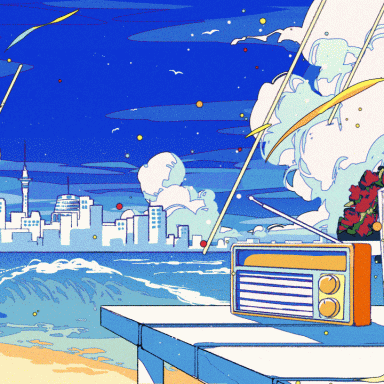
Helen Rosner on: ‘CONDUCTOR’ BY FRERE-JONES TYPE, January 2018
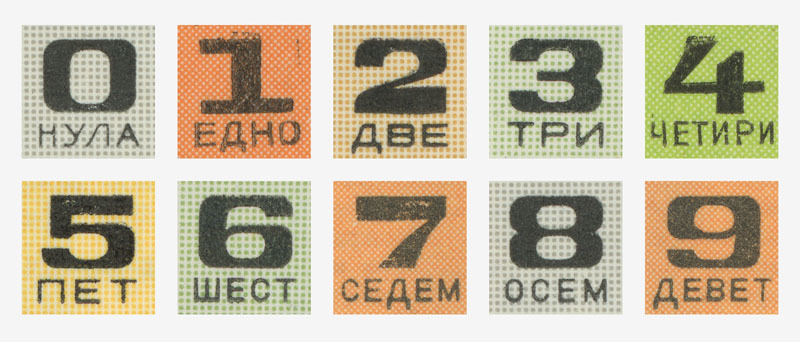
Bulgarian lottery tickets, whose numerals inspired the development of Frere-Jones Type’s ‘Conductor’ family.
It’s a treat when a writer you like turns their eye to design (especially when it’s a writer you like for searing the painter Gauguin in a long and complicated review of the American chain restaurant Olive Garden). It’s not often that type foundries to commission writing to celebrate a new release, but that’s what Frere-Jones Type did in January—asking Helen Rosner to write about the development of Conductor, their first display type.
Because Rosner is a features writer used to sniffing out a human-interest angle, her enthusiasm for type is embellished with details that give the piece a secondary function as a kind of profile of the designers themselves. The result is a satisfying medley of history, process, and technical details explained clearly enough that even those of us who aren’t intimate with the nuances of letterforms can understand them.
‘Nina Stössinger, who created Conductor Italic, was trained at the Royal Academy of Art in The Hague, where she was steeped in that classical idea of the italic as referencing handwriting, intensely rhythmic, with fewer interrupted strokes. In its first drafts, Conductor Italic hewed to those rules, but it didn’t feel quite right. The moment the italic was unhooked from what Frere-Jones called ‘that really doctrinaire way of building an italic’ was the moment it started to find its own voice.’
Stone Soup on: THE DESIGN OF FOOD MAGAZINES

Stone Soup – a food magazine that ditches the food porn.
Stone Soup might seem an odd inclusion—it’s a publication about food, not design. But in its style and form, this publication has a lot to say about design. Having been away from Aotearoa for a year or so, I’ve been out of the loop and missed the first few issues of Stone Soup. But based on Vol. 6 (which was produced under the creative direction of designer Tyrone Ohia), Stone Soup breaks from the ubiquitous full-bleed food porn to signal that it’s different: ad-free, thoughtful, and people-focused.
It makes a bold claim to a radical spirit: ‘Stone Soup Syndicate are an evolving congregation of creatives who have founded a fresh take on food publishing: a free, independent street press and digital platform with a counter-cultural spirit’. As a free publication funded by Press Patron supporters, the Syndicate are trying to forge a new publishing path. And its design supports this. Everything about it from printing decisions to its typeface choices mark it out as worlds apart from the glossy food mags at the supermarket checkout.
These are deliberate decisions. Stone Soup’s ‘instigator,’ Aaron McLean has contributed to many of those glossies over the course of his career as one of the country’s leading food photographers. In a culture where ‘conscious eating’ has become just another way of saying ‘diet’ it seems flippant to say that Stone Soup is about conscious eating—but it is.
Ella Sutherland on: DESIGN AS HISTORY, December 2016

Ella Sutherland’s posters for the Dowse Art Museum, which reworked graphic design elements from the museum’s 1970s-1990s posters.
The thing I love about Ella Sutherland’s work is that she always returns to the degree zero elements of design—engaging with colour, repetition, contrast, and scale as the fundamentals of meaningful mark making. Like Stone Soup and Matt Galloway (who she’s collaborated on several projects with in the past), she’s a designer who uses design to think about design.
This 2016 project for the Dowse Art Museum is one of several where she has reworked graphic elements from archives. Here, it was Dowse Museum posters made between the 1970s and 1990s. Stripping out the exhibition content (the text and the images), Sutherland is interested in the essential ingredients of design itself—‘aspects such as line, rhythm, movement, balance, pattern and framing’—as elements that convey the voice of the institution. As reflections on design and design history, I think these projects work because they don’t tell you what to think. Instead they ask viewers to feel out for themselves the meanings that design can carry across space and time.
Kris Sowersby on: BEING ORIGINAL, August 2018

Kris Sowersby speaking at TypeCon 2018 XX, with a background animation made by Andrew Johnson.
Type designers seem to have a knack for marrying philosophical ideas with an unparalleled attention to technical detail. It’s always a pleasure to bear witness to the curiosity that drives them and how it shapes their output. Just a few weeks ago Kris Sowersby of Klim Type Foundry presented at TypeCon in Portland, Oregon, and has since published the lecture on his blog.
It’s a thoughtful presentation, full of questions—no aphorism-filled chaff here. He ranges from type history to Chinese knock-offs to Nine Inch Nails to make the point that ‘copies’ can be the site of great originality in type design. In some ways, his presentation reminds me of Johnson Witehira’s work, in that Sowersby is deeply concerned with making sure we ask the right questions for today, rather than automatically swallowing the prescriptions of the past.
‘Shanzai is a Chinese neologism that means ‘Fake’, coined to describe the knock-off cell phone market. […] Han explains that these products do not set out deceive, their attraction lies in how they draw attention to the fact they are not original, but that they play with the original. They transform the original by embedding it in a new context. Their creativity is based on active transformation and variation. […] I like to imagine typeface design in this way, a continuing process of rediscovery and re-creation.’