Fresh from the Field — Activist Manuka Identity and Packaging by Fred l’Ami
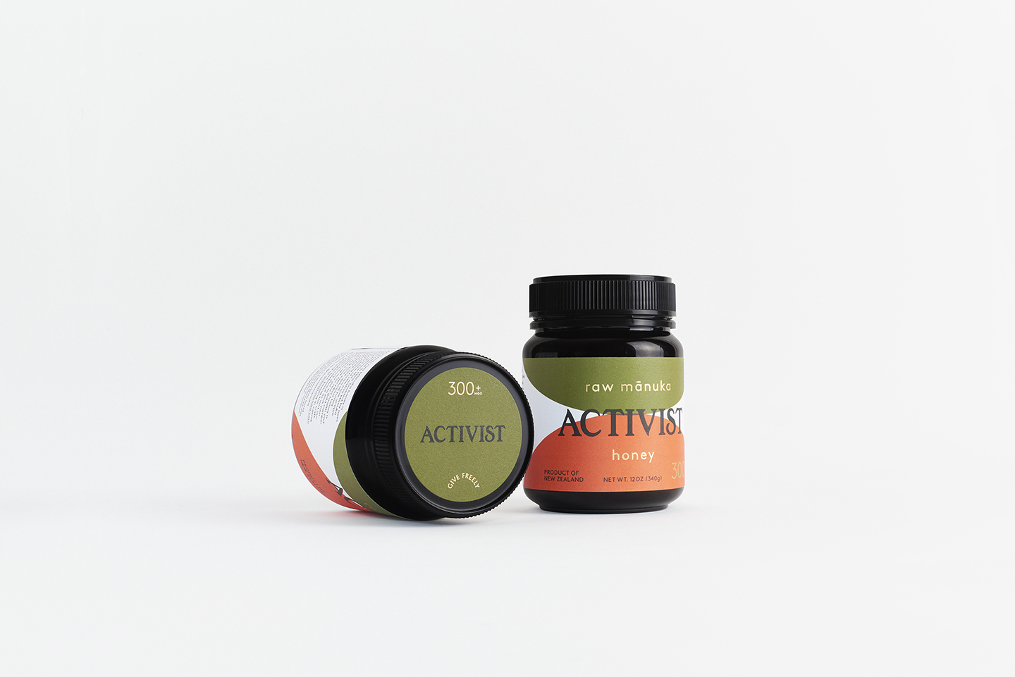
This week’s Fresh from the Field features the identity and packaging design for Activist Manuka by Fred l’Ami.
If you have new or recent work that you would like to share in Fresh from the Field email Lana for details.


Friends (and fellow kiwis living in L.A.) Luke Harwood & Gabrielle Mirkin wanted their Manuka honey brand to celebrate a powerful period in New Zealand’s history. A time when locals stood up and exercised their rights and left-over house paint was re-purposed for protest signs. The design direction echoes this sentiment through a vibrant colour palette, emphatic typography & tactile stock. The customised Activist logotype taps into history but through the pairing of a modern geometric sans, make it feel contemporary. The gold foil accents honour this beautiful product and make it feel special. Protecting what you love & standing up for what you believe in underpins the Activist brand and is particularly relevant today.
Luke & Gabby are proudly championing the real-life relationships that make Activist so unique. Working with a dedicated team of honey fanatics to bring the finest raw Manuka honey to the US, they’re also working with close friend photographer Derek Henderson to tell their New Zealand origin story. We’re excited to be part of the family bringing this wonderful product to the USA.
www.theycallmefred.com
@theycallmefred
www.activistmanuka.com


