Wine Literacy with Nicole Arnett Phillips – Co-presenter of DA Workshop Wine & Type, 17th May, Auckland

 Wine Literacy
Yes, the primary function of any piece of text is to convey direct meaning. But the best typographic (& lettering) treatments also have a psychological influence on readers in a profound indirect way via learned association and visual literacy.
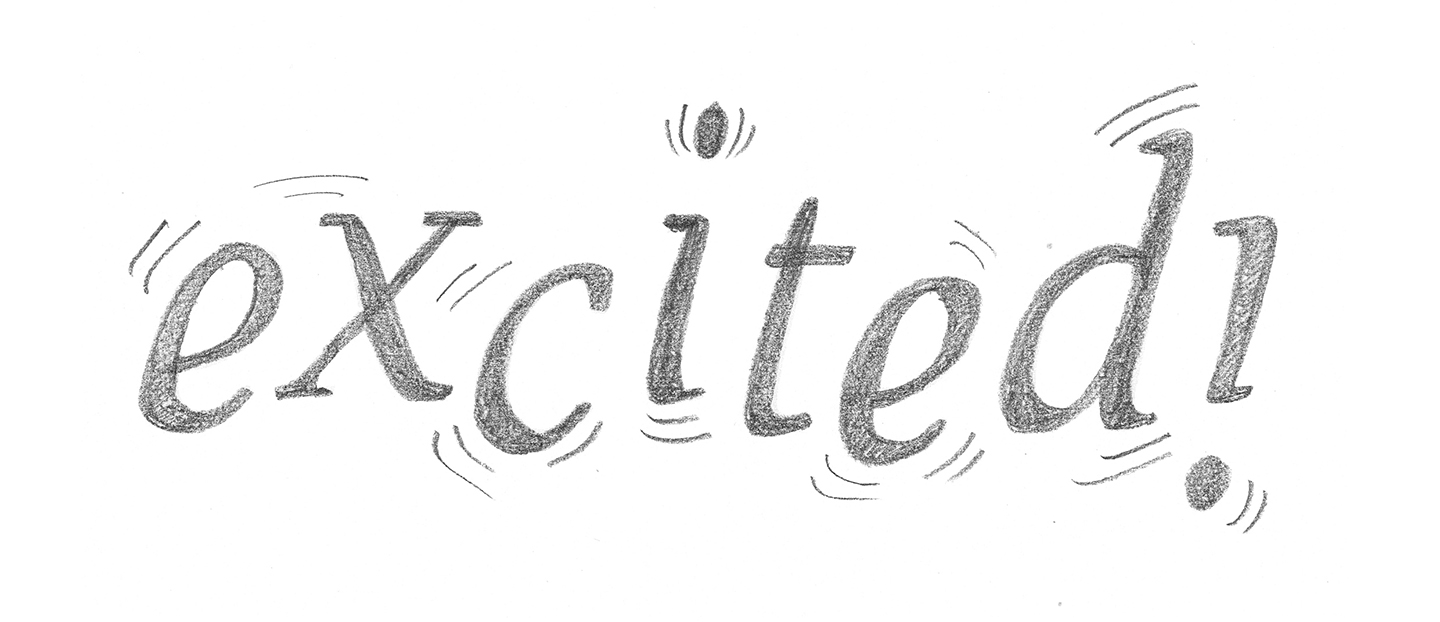
Audibly you recognise the difference between a voice to reprimand or a voice to comfort, one that is authoritative or one that aims to excite. Just as when we speak, each typeface or piece of lettering has a voice and visual communication requires the same consideration of tone, expression and personality the aesthetics bring to the meaning of the words…
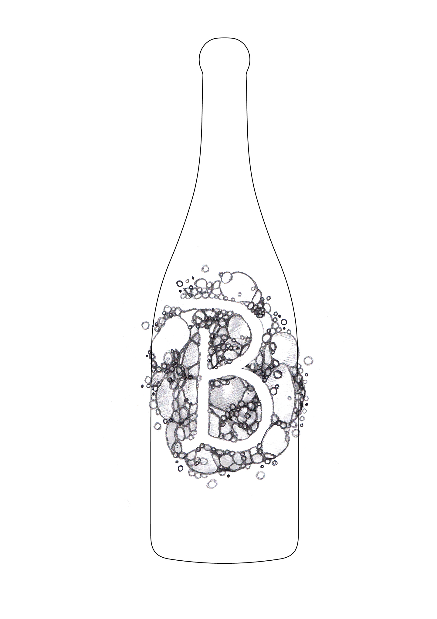
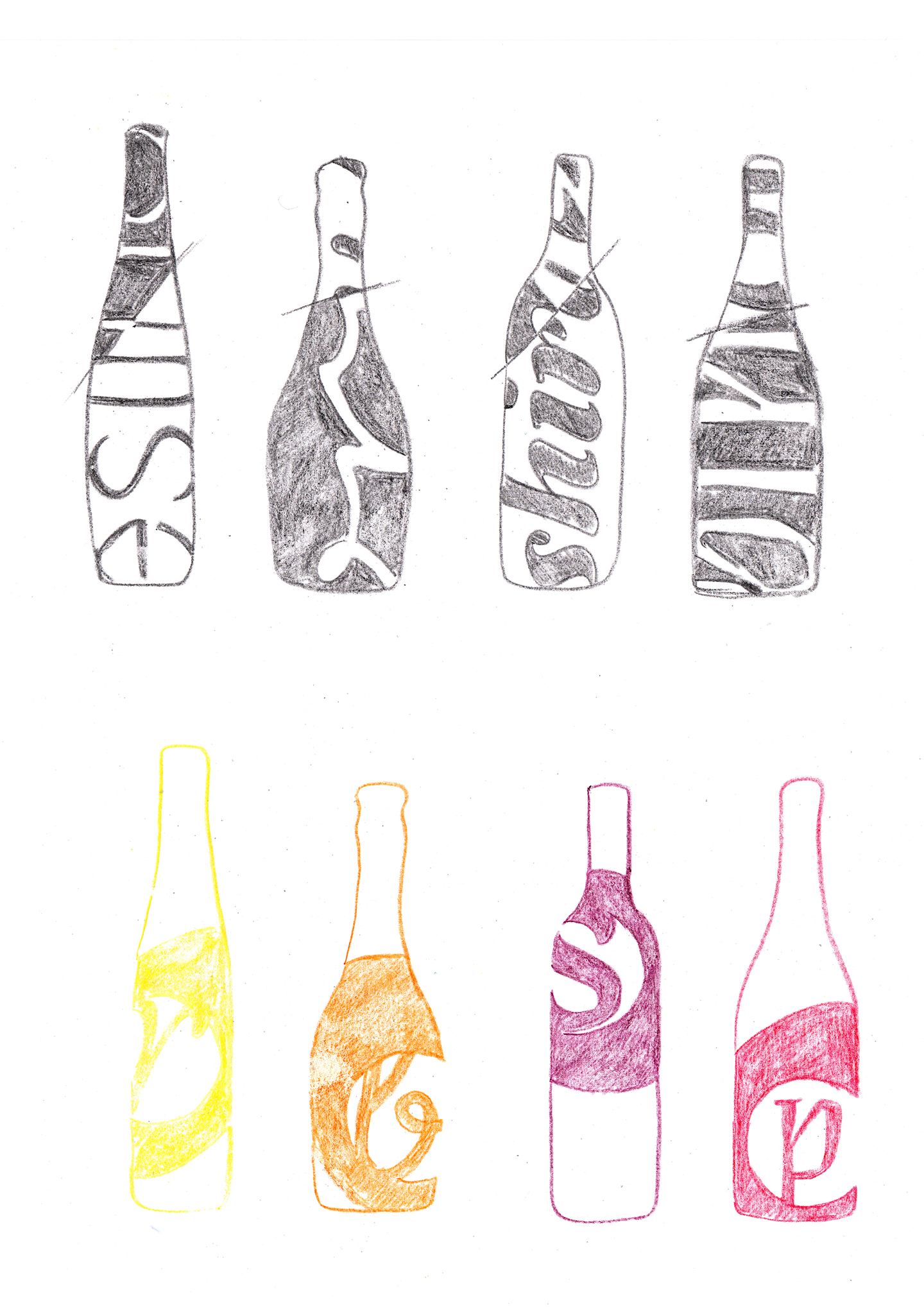
The symbiosis of form and function in typography is an idea I have been playing with in my personal and professional work since I began my career as a book designer. After supporting my friend Sarah Hyndman with some TypeTasting research in 2015 I combined my passions for expressive typography and wine, hosting events where designers would draw the characteristics they tasted as a series of wine labels and bottle treatments.
Think about the robust boldness of Shiraz, the crisp refreshment of a Sauvignon blanc, the light spice of a Pinot Noir, the smoothness of a Merlot, or the delicacy of sparkling Pinot, all of these sensory characteristics have their own aesthetic/
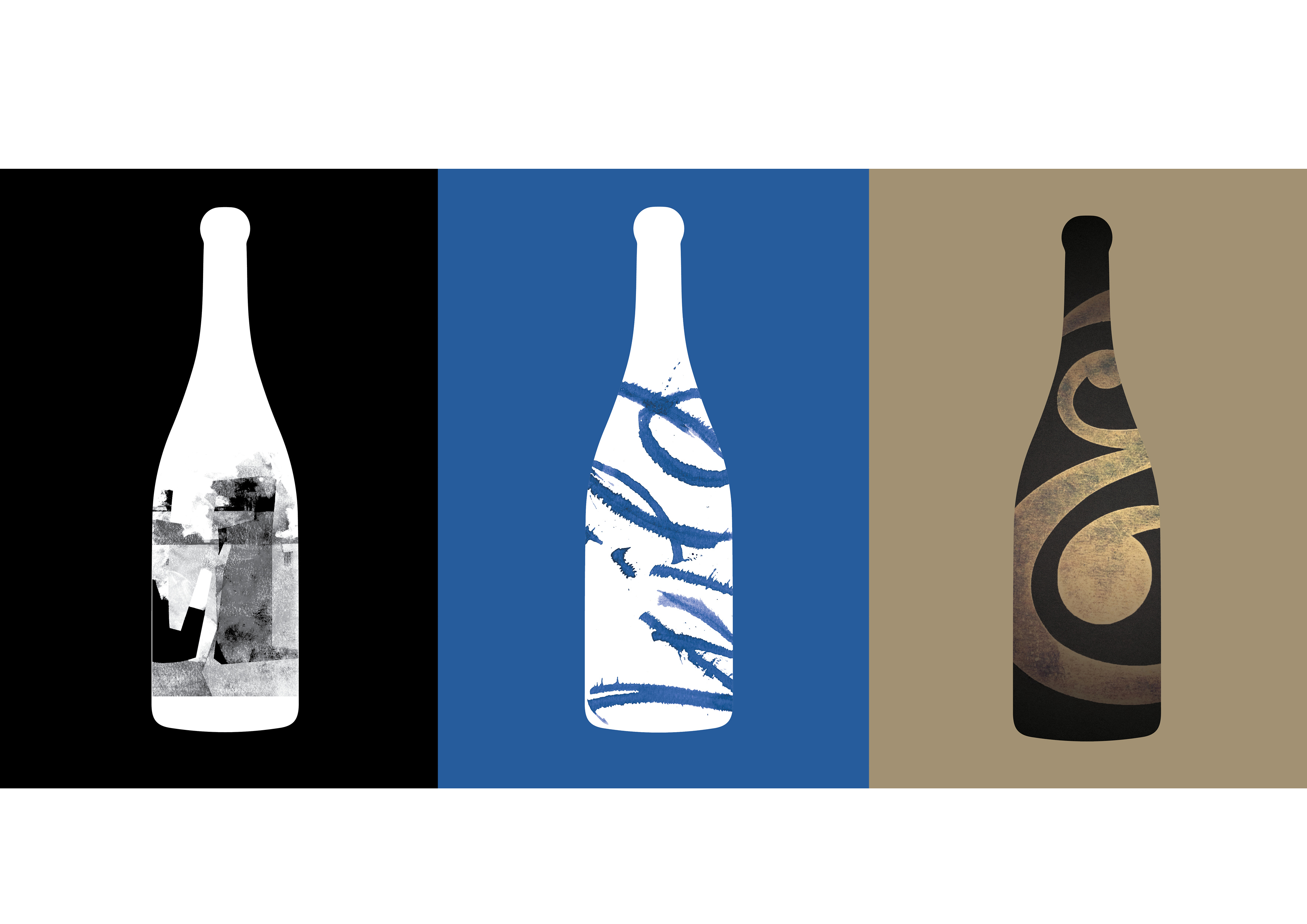
I am incredibly excited to be collaborating with Craig Black, who is behind some of the most exciting and remarkable drinks packaging the design industry has seen in recent years. Our Auckland workshop next month aims to illustrate ways designers can use typographic devices to narrative effect conveying attributes of New Zealand’s delicious Crafters Union’s wines, encouraging participants to experiment with typographic interplay as a storytelling device.


If you’d like to find out more about Nicole, ahead of the Wine & Type Workshop on 17th May in Auckland, have a listen to the DA Conversation we recorded with Nicole last year.
DA Conversations Podcast with Nicole Arnett Phillips, June 2017
Welcome to Design Assembly Conversations. In this series we talk to New Zealand graphic designers, hear their stories, and celebrate their work.
In this episode I spoke to Nicole Arnett Phillips. Nicole is a designer, typographer, publisher and print-maker. Orginally from NZ, she currently lives in Brisbine. She divides her working week between client work and her own practice of publishing, typographic and printmaking pursuits AKA Typograp.HER
Interview resources
www.typographher.com
www.nicoleap.com.au


