Fresh from the Field — The Chaat Company by Hardhat Design

7 years ago by

This week’s Fresh from the Field features an identity for The Chaat Company, an Indian company specialising in Indian snacks set design by Hardhat Design.


If you have new or recent work that you would like to share in Fresh from the Field email Lana for details.

The identity for Chaat brings the visual language of the bustling streets of modern India and the bold flavours and textures of Chaat (Indian street food) to a Western audience. We chose to use strong contrasting colour, striking typography, elements of hand-drawn type & illustration, and a maximal approach, with each flavour receiving its own unique type treatment, colourway and series of illustrations. The brand has been expanded outwards into print and online collateral, stationery and advertising materials.
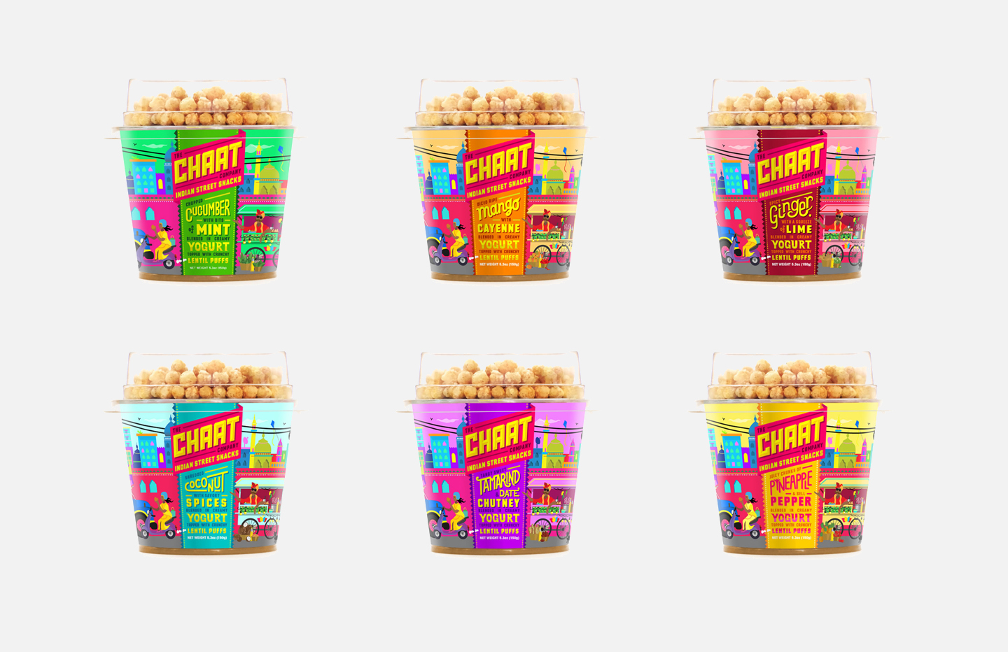
SaveSave
SaveSave

Tags : Fresh from the fieldHardhat designidentity brandingthe chaat company

Fresh From The Field: Hamilton Gardens — By Daymark

Explore a world made more wonderful by Daymark Design.

1 week ago by Natalie Iogha

Fresh From The Field: Heal Within — By White Rabbit

Auckland based graphic design studio White Rabbit creates a science-backed brand identity, website, packaging and collateral infused with the essence of the natural-wellness. The brief Heal Within’s products use non-hallucinogenic […]

2 weeks ago by Natalie Iogha

Fresh From The Field: Grandpa's Bacon — By Onfire Design

Grandpa is an everyday affable Kiwi bloke – simple, honest and lighthearted. This week Onfire Design walk us through how they refreshed a previously no-name brand into one that now […]

3 weeks ago by Natalie Iogha

Fresh From The Field: Colab — By Studio South

Colab’s intriguing new brand identity has got our synapses firing! The brief Colab is a new online cohort platform for product professionals to learn, share, and grow. Unlike large boot […]

1 month ago by Natalie Iogha

Leave a Reply