Design and Documentary: An Interview with Ella Sutherland
Written by Layla Tweedie-Cullen
Supported by Creative New Zealand
![]()
Layla Tweedie-Cullen is a contributor to Aotearoa Design Thinking 2017, a series of commissioned critical design essays published by Design Assembly and funded by Creative New Zealand.
This article is the third in a four part series of long-form interviews with interesting, exciting and innovative members of Aotearoa’s design community.
Part One: An Interview with Nell May
Part Two: Printed Matter and the Document: A Conversation with p. mule
Describing her practice as being “concerned with how language is made visible, in particular, the ways in which typographic systems may be collected and represented as a documentary of sorts”, Ella Sutherland is a graphic designer currently based in Sydney. Visually playful and energetic, her work is predominantly print-based and includes publication design for artists and arts institutions and identity design. Alongside her commercial work, Ella initiates autonomous research-based projects and regularly produces installations and exhibitions. Recently, she has worked with found bodies of knowledge, collected from libraries and archives that have provided inspiration for generating new work. She is also a lecturer at the Visual Communication Programme at University of Technology Sydney (UTS). Ella studied graphic design at Ilam School of Fine Arts in Christchurch and while completing a Masters degree, co-founded Dog Park Art Project Space (Christchurch), which operated for two years between 2012–2014.
 Inside, 2017: website development. Future Souths, 2017: website.
Layla Tweedie-Cullen: What design projects are you currently working on at the moment?
Ella Sutherland: I’m currently working on the identity and website design for an exhibition opening in Sydney in November. Titled Inside, the show examines the parameters of the social, cultural and physical body through the work of 14 artists from Australia, New Zealand, United States and the UK. Referencing sources such as Chris Kraus’ film Gravity & Grace and the writings of Judith Butler and Hannah Black, the show explores the value of transgression in relation to the ‘abject’ body.
Initially, we were going to focus on producing a publication, but as the show developed the elasticity of a website felt more appropriate. I worked on the design of another website earlier in the year for a project called Future Souths, an ongoing collaborative platform engaging artists, curators and, theorists invested in the aesthetics and dialogues of the global Souths. The website facilitates a series of online chatroom dialogues as a means of forming a vocabulary for the Future Souths project and making a contribution to the counter-archive of post-colonial art historiography. Each dialogue begins with a text, authored by one of the collaborators, which forms the basis of discussion with interlocutors. The dialogues collected through this process will be developed into a book, scheduled for publication in 2019.
I also have an ongoing relationship with Brussels-based writer and curator, Eleanor Weber to develop the collateral and website for EFFE, an international feminist platform for art and writing online. We produce and support exhibitions, publications and residencies, with EFFE occasionally manifesting offline such as coup de coeur, a five-part exhibition series held at the Cité internationale des arts in Paris in 2015. The next project in-development is Lit, an exhibition including works by four contemporary lesbian artists. Lit is about language, social conventions and the effects of these institutions on non-heterosexual lives. The online exhibition will comprise individual artist pages (digital videos, scanned pencil drawings and text), contextualised with an essay by Eleanor.
 (Top) coup de coeur, 2015: selected exhibition posters, (Bottom) EFFE, 2016–2017: selected screenshots of project pages.
LTC: Looking through the work on your website, I’m interested to know more about your design approach for the publication with a body always but but still drying?
ES: with a body always but but still drying is a publication that brings together some short texts produced in and around The Bureau of Writing, a project facilitated by the Biennale of Sydney and Artspace, Sydney in which seven writers worked alongside artists and events associated with the 20th Biennale of Sydney (2016). Working at the intersection of performance and text, there had been no initial proposition for the The Bureau of Writing to publish a tangible outcome for the project. Because of this, there was a lot of conversation around what it would mean to present texts that were not initially intended for publication. The project navigated both an institutional need for outcome as well as an awareness of the artists’ process of experimentation.
I worked with the artists (Andrew Brooks, Beth Caird, Kelly Fliedner, Benjamin Forster, Astrid Lorange, Aodhan Madden, Sarah Rodigari) to develop a design which was less about the contribution of each individual, but more about creating a rolling experience to reflect on their participation as a group over the course of the project. Aside from a table of contents on the cover, the book includes little reference to each author; a reader could potentially move from start to finish without being immediately aware of who had authored each part.
In regards to the design treatment, I worked with each writer to develop a distinct grid and typeset to suit each of their contributions. For example, running throughout the gutter of the publication is a text by Benjamin Forster in which all email correspondence exchanged by participants regarding the publications is scrambled and output by an algorithm. Benjamin’s text bleeding into the gutter is both the conversation and material reality holding the publication together.
 with a body always but but still drying, 2016: selected page spreads.
LTC: Are you continuing to work on New Zealand-based projects while in Sydney?
ES: The dialogue I have with artists, designers and organisations in New Zealand is a really valuable part of my practice, so despite living in Sydney, I often work on projects based in New Zealand. Last year I designed and edited a publication called Pale Like a Fish which followed on from an exhibition I had at North Projects in Christchurch. The book collects together a series of contributions from artists and writers to reflect on the influence of gesture and narrative in understanding ‘typical’ reading spaces, such as the newspaper. More recently, I begun work on a project with Evangeline Riddiford Graham which follows on from her exhibition Look Out Fred! at Enjoy Public Art Gallery. The publication will centre around five audio works that were developed for the show using the structure of a perpetual canon; a musical composition in which the song and its echo repeat indefinitely. Called Perpetual Cowboy, the script follows Fred, a storytelling cowboy and his alter-ego performed by an ʻechoʼ as they engage in a roundabout ride to unbutton the identity of the protagonist. This five-part negotiation prompted us to develop part of the publication as a set of scores. I’m currently in the process of designing a visual language to act as the voices of the script and a layout system which responds to the structure of the perpetual canon.
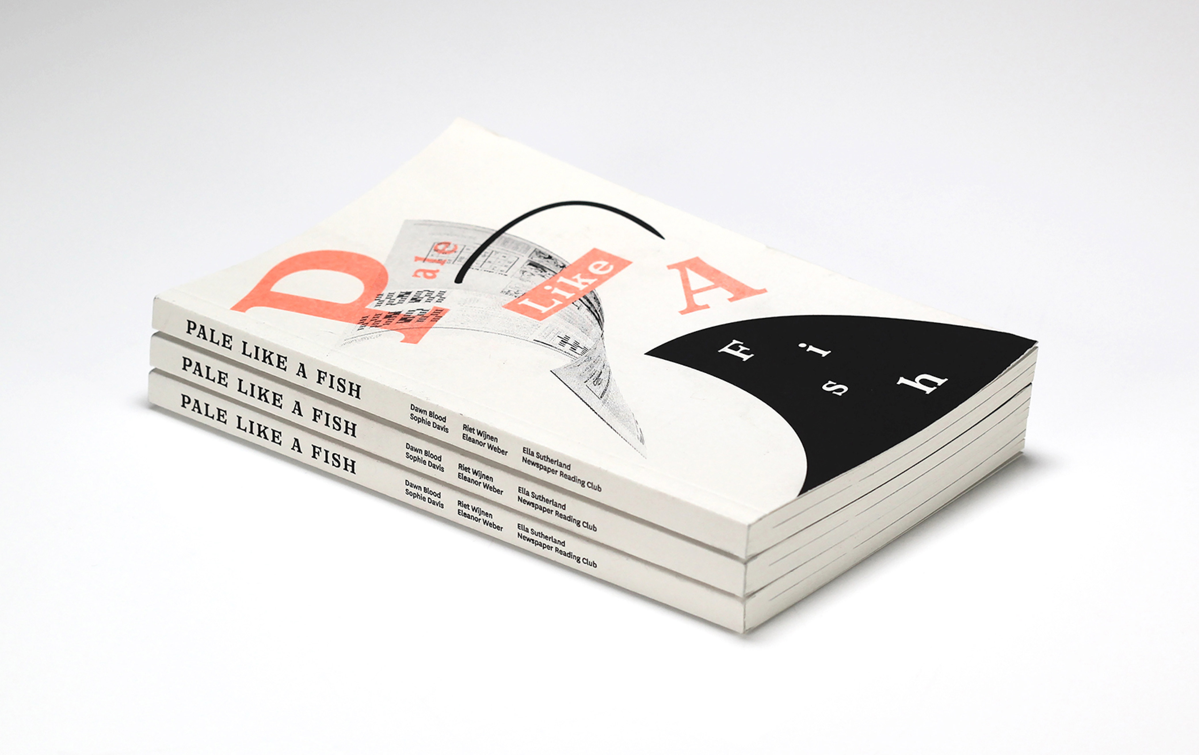 Pale Like a Fish, 2016.
LTC: While living in Christchurch, you co-founded and co-directed Dog Park Art Project Space which ran from 2012 until 2014. Can you talk about the identity you developed for Dog Park, including the many posters, invitations and printed collateral you designed and produced for exhibitions presented over this two-year period?
ES: Dog Park Art Project Space was initiated at a time when very few arts institutions were in regular operation and the majority of Christchurch initiatives were focussed on developing a transitional mode of working. As the city experienced a significant decline in visitors post-quake, the formulation and progression of new projects relied heavily on establishing a voice and visual identity that could be broadcast locally, nationally and internationally.
Located in a tilt slab warehouse on the fringe of Christchurch’s CBD, Dog Park’s identity was initially developed in response to the physical surrounds of the gallery. The letterforms were designed to create a figure ground flux in the spirit of the minimal, industrial logotype common to businesses in the area. As the program progressed, we produced flyers, small catalogues and publications, with the most visible aspect of the identity being the poster series produced monthly alongside each exhibition. While beginning at the same point as the logotype, the look of these posters evolved to be quite distinct from the initial lo-fi industrial approach; a style once described to me as ‘fruity modernism’. The posters would be printed on a risograph at Ilam Press, with half of the run bound into a pad for distribution at the gallery and the other half posted to a host of artists, designers and galleries all over New Zealand. What eventuated was an identity that had its own momentum, generating numerous conversations about poster design, printed ephemera and the role of a distinct visual language alongside an artist-run space.
![]()
 (Top) Dog Park Art Project Space, 2012, logotype, (Bottom) Dog Park Art Project Space, 2012–2014, selected exhibition posters.
LTC: You also engage in critical design research outside of a commercial design practice. What are some of your main concerns behind this work?
ES: My research practice is predominantly concerned with how language is made visible, and in particular, the ways in which visual systems may be collected and presented as a documentary of sorts. This is a territory which encompasses multiple overlapping fields of interest: the potential of language; the success and failure of material in producing the word; the evolution of production techniques in disseminating thought, and the documentary canon.
While the study of visual language is often focused on clarity, legibility and the development of typical form, I am more interested in a poetics: the space between language, the alphabet and the thread which connects writing to the world. These are words cut loose from service; language that exists as a reality in and of itself. I’m also attracted to finding literacy in visual signs not currently seen as an alphabet, in a sense tapping into the ability we have to find a rhythm, order or text in abstraction.
The slipperiness of the exchange between visual signs giving form to the otherwise shapeless mass of an idea informs a lot of the work I make: what is the resemblance between these? How do signs link these layers and output a repeatable unit? This is interesting from a documentary perspective in the sense that, for a smooth translation to be possible, a social agreement of understanding must be reached. In large, this is identity determined in relation to other parts of the system, or, the process of linguistic value. As my approach to producing work is to respond in a site-specific way to the context in which the project is taking place, the nature of typography and language being so fully integrated into everyday life makes it a rich site to engage when reflecting on the cultural, technological and socio-political context of its creation.
LTC: Can you talk about some of the work that has resulted from this research?
ES: I have recently exhibited two projects in Sydney which engage with this methodology. For the Redlands Konica Minolta Art Prize, I presented Time if you are Paper (2017), a lithograph edition produced with Big Fag Press which follows the trajectory of the annual exhibition ephemera produced by The Group, an informal art association based in Christchurch between 1927 and 1977. By isolating the typographic language of the archive, the work questions how graphic design might offer up alternative perspectives for understanding history through typographic language.
 Time if you are Paper, 2017, Framed offset lithograph, 600 x 1000 mm. Redlands Konica Minolta Art Prize 2017, NAS Gallery, Sydney. Photographer: Peter Morgan.
Following on from this, I developed a work for the John Fries Award called Queue (2017) to reflect on the ways that learning institutions collect, archive and represent knowledge. To do this, I extracted the typography from the spines of books in the “Queer” section of five Sydney university libraries to document the use of this label and explore the landscapes surrounding the practice of this categorisation. My hope was to be economic in my intervention with the collection so that the work may observe what is determined “queer” and provide an illustration of the various ways in which it is deployed and interpreted in an academic space: both in terms of representation and omission. The project cites Ariel Goldberg’s questioning of the value of queer as label in their book The Estrangement Principal [1] and reiterates their thinking that identity resists being reduced to easy, well-bounded categories.
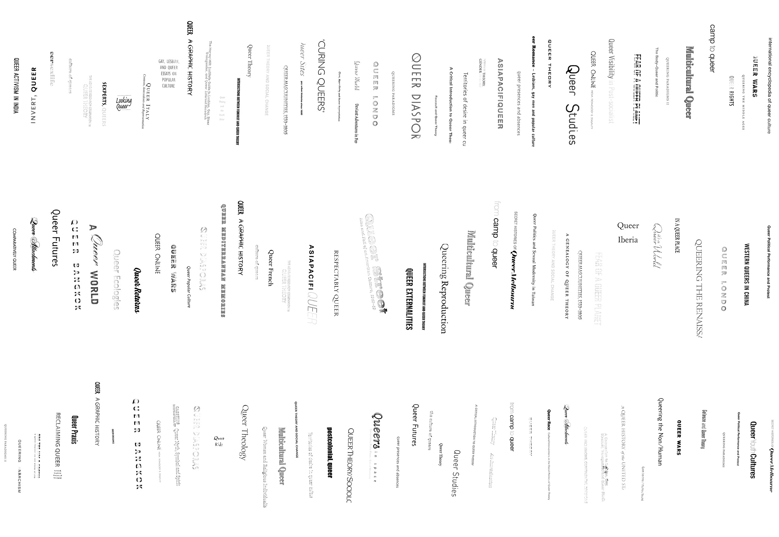 Research material collected from Macquarie University, University of Sydney and University of Western Sydney for Queue.
LTC: What projects do you have coming up?
ES: I am currently working in collaboration with artist Sarah Rodigari to develop a series of artist pages for the next un Magazine titled Laugh now, cry later. Exploring the intersection of humour and art, Sarah and I examine the space of missing the point, failure and the gag for the issue. By extracting the track changes made on Sarah’s thesis by her PhD supervisors, Actual Hell: Pedagogical Gags and Shaggy Dogs 2014–2017 creates a space of transparency around the labour systems involved in producing a thesis. By reformatting the comments as jokes, the work brings to light the sometimes humorous nature of academia, alluding to failed punchlines and the cyclic slippage of slapstick humour.
Over the coming months I will also be focusing on the development of a new series of typographic documentaries. This will involve producing projects in response to sites in both Australia and New Zealand and creating a framework for archiving and distributing the research. I am interested in determining if alternative narratives can be located within the archives, collections and systems referenced in the project. By focusing on artefacts produced by independent organisations, counter-movements, self-publishers and artists, I hope to discover modes of representation that connect to histories that have evolved outside of traditional historiographic practices. This is a proposition founded on the notion that the creation of printed artefacts is hugely determined by the culture, technology and socio-political issues surrounding their creation. They are simultaneously objects created by artists and designers and a primary article in the documentation of history. As these works often have a connection with developments in print technology, my hope is to produce a printed series for distribution using printers and processes local to each site of research.
 Actual Hell: Pedagogical Gags and Shaggy Dogs 2014–2017, 2017: selected page spread.
[1] Goldberg, Ariel. 2016., The Estrangement Principle. New York : Nightboat Books


