Fresh from the field — Ministry of Awesome, Christchurch
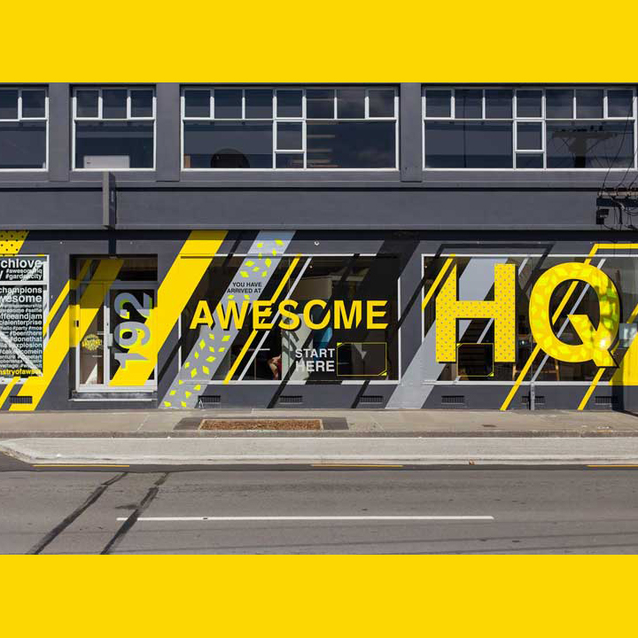
This week’s Fresh from the Field showcases the new look for the Ministry of Awesome‘s Christchurch space by Tanker Creative, thanks to Nicola Devine.
If you’ve got new or recent work that you’d like to share in our weekly Fresh from the Field series email Zoë for details.
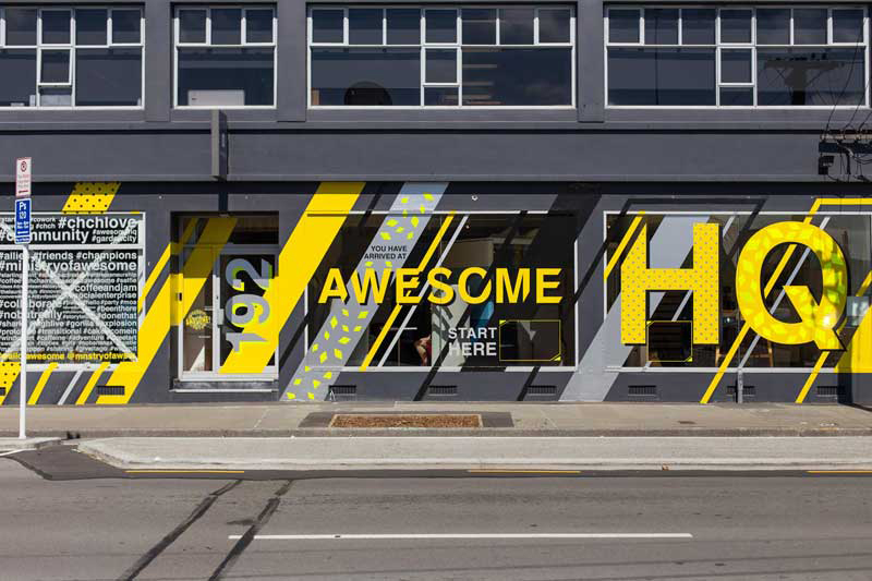
“Crazy, cool, wow and eye-catching” was the brief Team Tanks got from the Awesomologists at Ministry of Awesome when their Christchurch CBD building needed a facelift.
A radical team of start-up activators, event organisers and co-working space sharers, the folks at Ministry of Awesome provide a place to grow ideas and bond with like-minded souls.
Their work is all about promoting a culture of inclusion, positivity, and progress to help people follow their passions and create a thriving, connected, and activated city.
To realise their potential business or project, they invite entrepreneurs to speak about their ideas, then provide them with the relevant info and connections. They encourage businesses and individuals to join their co-working space, whether for a day or long term, not just for convenience but also social dynamic. Their ideology around bringing people together comes from their love of Christchurch and their passion for re-energising local people and places. They wanted this ethos reflected on the outside of the St Asaph Street Awesome HQ office.
Tanker took the rebuild zone as their inspiration: roadworks, hi-vis, juxtaposition of old and new, organic and inorganic. This is the contemporary, visual vernacular of our city, so why not embrace it?
This informed their look, colour and material choices. Hi-vis, retroreflective and metallic vinyls signal are where it’s all happening. Graphics are dynamic and punchy. Whether you’re driving past at 50 km/h or taking an inner city stroll, there’s different levels of information to soak up. The more you look, the more you see.
Awesome HQ came up with their favourite hashtags which they encourage people to use when referring to them on social media. The design also invites passers-by to ‘Start Here’ and ‘Take a Peek’ to inspire them to take a closer look and visit the Awesome exhibition spaces inside which showcase current projects in unique ways.
While attracting attention from the street, clever placement of the graphics also creates privacy for those at work in the office or meeting rooms.
To achieve the vision, Tanker worked with the amazing team at Action Signs who executed the installation perfectly. Not A Day Wasted Pictures was there to capture it. Check out the time lapse which was filmed over four days and contains some epic drone footage!
