Fresh from the field — Batch from Transformer
This week’s Fresh from the Field profiles a new promotional project by Transformer for Batch.
If you’ve got new or recent work that you’d like to share in our weekly Fresh from the Field series email Zoë for details.
Batch is a self-initiated promotional project aiming to encapsulate who we are, as collaborators who excel in our client partnerships. Olive oil symbolised in so many ways the qualities of partnership; it is a versatile product that enhances whatever it is matched with. The provenance of the oil, as an enterprise created by the community of Tern Point to grow, tend, pick and press the olive oil, brought the concept to full circle.
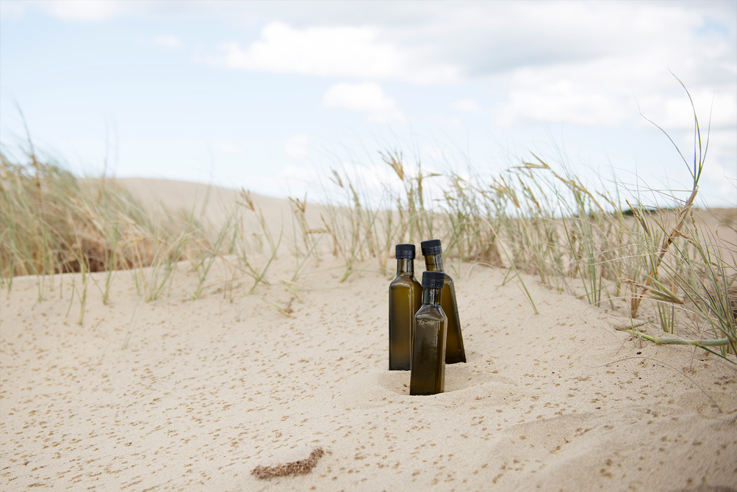
With any project we undertake, we consider it essential to the design process that we immerse ourselves in the brief at hand. The team made an excursion to Mangawhai to experience the groves and document the locale in which the olives are grown. And what better excuse to make a day trip out to the beach, in the name of research?
We wanted to reflect the natural and crafted aspects of the product – this is olive oil in its purest form, grown in an environment where the elements of sun, land and sea come together. As a whole team, we spent an inking session developing the logoform and abstract ink marks that represented these elements and would lend an organic, free-form feel to the design.
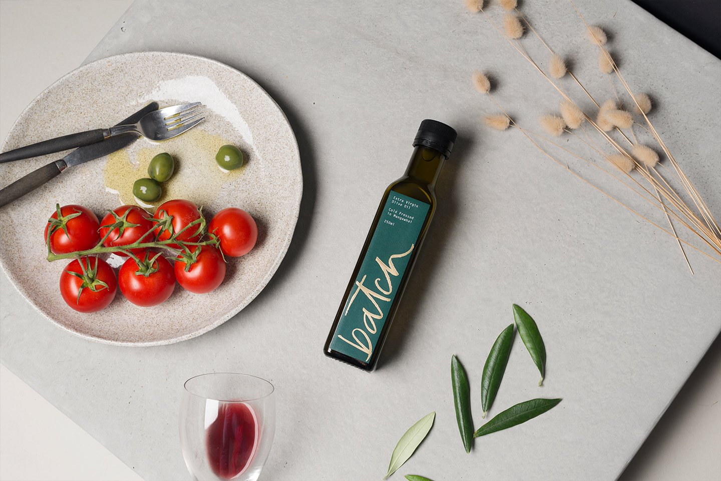
The olive oil was packaged in a cardboard box, nested in wood shavings to reference the hand-crafted nature of the product. The bottle label was foiled in a champagne gold to offset the forest green. Another essential component to Batch was an accompanying accordion-fold pamphlet that described the origins of the project and product.


See more from Transformer at: http://transformerdesign.co.nz/