Fresh from the Field — Proudly Asian Theatre, Category
This week’s Fresh from the Field celebrates the new branding for PAT by Category.
If you’ve got new or recent work that you’d like to share in our weekly Fresh from the Field series email Zoë for details.
About:
Proudly Asian Theatre is an exciting new theatre company dedicated to giving a voice to Asian theatre artists in New Zealand.
PAT’s aim is to explore, celebrate and honour the vital stories and unanswered questions at the heart of plays with Asian roots and, in turn, inspire the growth of diverse new contemporary works in the New Zealand theatrical landscape. In 2013, PAT presented the first New Zealand production of David Henry Hwang’s Obie Award winning play FOB at The Basement.
In 2014 PAT produced a sold-out season of Renee Liang’s Lantern at The Musgrove as part of the 2014 Auckland Lantern Festival. Later in the year, they took home four awards including Best Independent Theatre Company and Best Director at the 2014 Short+Sweet Festival for their piece Call of the Sparrows. In 2016, they are set to debut a full length version of their award winning short.
Response:
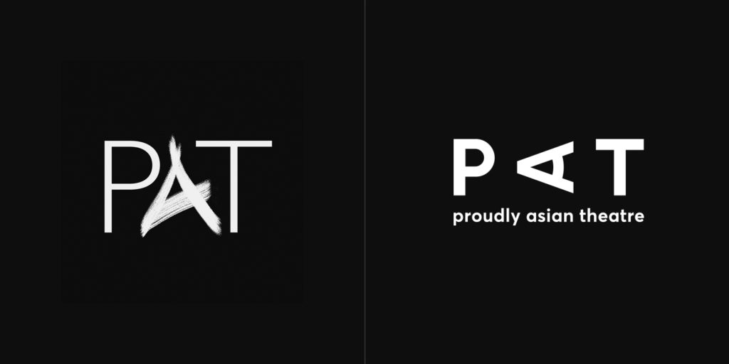
Rebranding from Pretty Asian Theatre to Proudly Asian Theatre, this theatre company needed a logo to match their new angle. Something bold, robust, and non apologetic was needed.

Focusing on pushing ideas of: voice, character, culture, and community, a new mark was drawn. Letters were based on contemporary geometric fonts. The rotated ‘A’ being the letter to balance. The typeface Averta was used, as it is here. With the definition of the word Averta summing up the company well — to act or speak openly, bluntly or without moderation, without hiding.
Contributors:
Lindsay Yee
James Roque
Chye-Ling Huang


PAT currently has a boosted campaign running, (please check it out).
