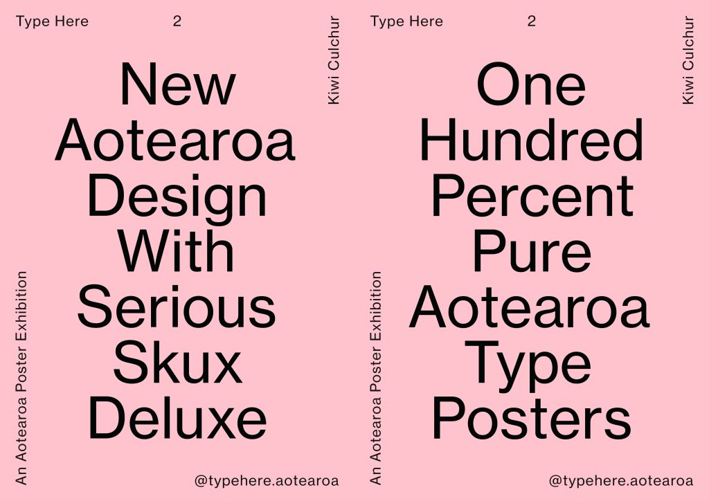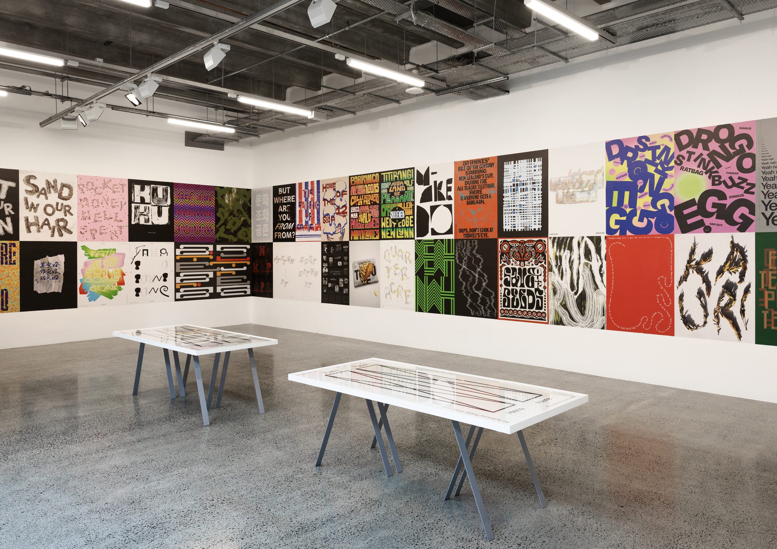
A Look Back – Type Here 2025 – Aotearoa Typography Poster Competition
Type Here 2 Finalists where exhibited at AUT’s Te Wai Ngutu Kākā Gallery.
Presented by creative agency Osborne Shiwan, Type Here is an Aotearoa poster competition and exhibition, focussed on contemporary typography. Aotearoa is a place rich in storytelling, from epic mythologies to emotional journeys, our stories carry the very DNA of our nation. Type Here celebrates these personal stories, expressed through language, culture and typography.
Lloyd Osborne, Type Here Convenor: “True diversity helps us grow as designers. The Type Here exhibition is a typographic snapshot of who we are as a nation and features a wide gamut of design — from expressions of aroha to social commentary, all ‘types’ are on show.”
The competition theme for 2025 was ‘Kiwi Culchur’. There were 43 finalists selected from 149 entries. The main winner was ‘The Fabric of Society’ by Sonia Mijatov. Judges for Type Here in 2025 were Hamish Childs, Emma Hickey, Kaan Hiini (Te Arawa, Ngāpuhi, Te Rarawa, Pākehā), Sarah Maxey, and International Judge Bráulio Amado.
Type Here 2 follows on from the TDC69 Aotearoa exhibition which featured ‘the world’s best typography’. Both exhibitions were sponsored by Phantom Billstickers and made extensive use of street posters in their respective campaigns.
Lloyd Osborne: The Type Here 2 campaign works with ‘Kiwi’ vernacular to engage with our audience at every stage — from competition to exhibition. We decided early on to strip the design down and focus on key messaging. The campaign compliments the exhibition without distracting from the stunning range of work exhibited. Campaign street posters work alongside social media and brand touchpoints within the gallery itself.
When: 19 September to 17 October 2025
Where: Te Wai Ngutu Kākā Gallery, AUT
Contact: convenor@typehere.co.nz
Instagram: @typehere.aotearoa
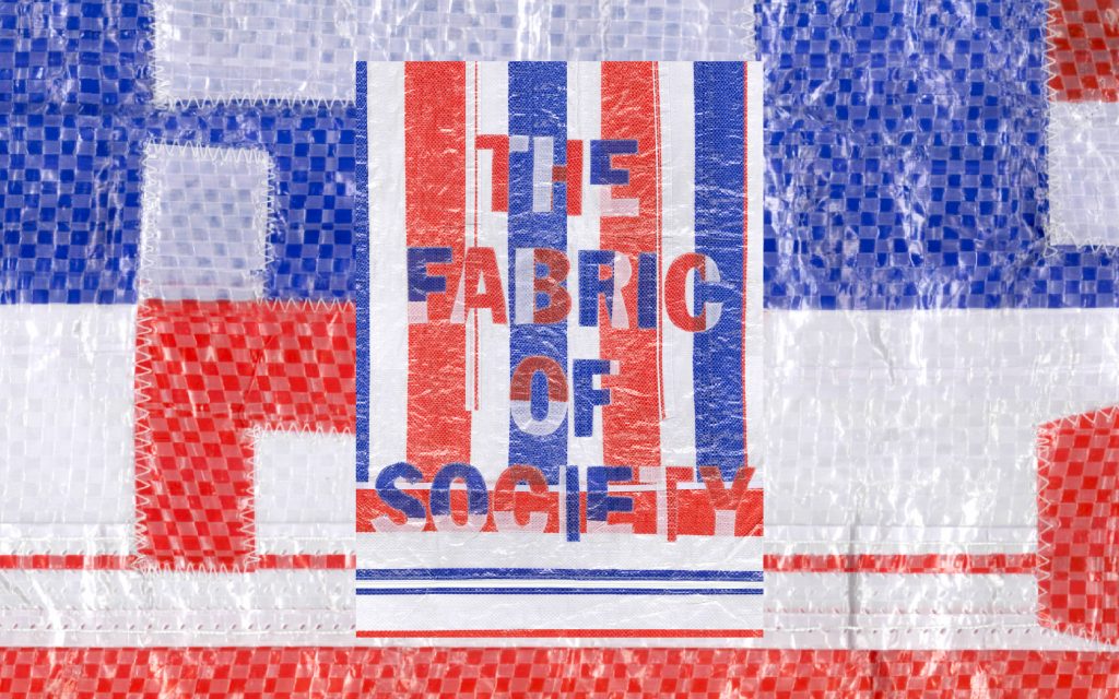
Winner
Sonia Mijatov
Fabric of Society
I’ve always had a fascination with the five-dollar plastic plaid bag. You know the one – in your garage, attic, moving van, or local Saturday vege market. This year’s Type Here happened to be in the middle of move between cities for me – so, putting two and two together, I realised this flimsy little bag is often the glue holding our lives together. Seeing the bag pop up everywhere, it became a symbol of our classic “she’ll be right” attitude. Buy the cheapest bag, put all your trust in the world’s worst zip, and hope you make it from A to B.
Dusting off my sewing machine, I wanted to make a poster of a bag, out of a bag. Wrestling cutout letters onto the bag fabric, then scanning it and hoping for the best; the entire process was a bunch of blind faith with a side serve of dumb luck. Fitting, really.
Links
Website
Linkedin
Instagram
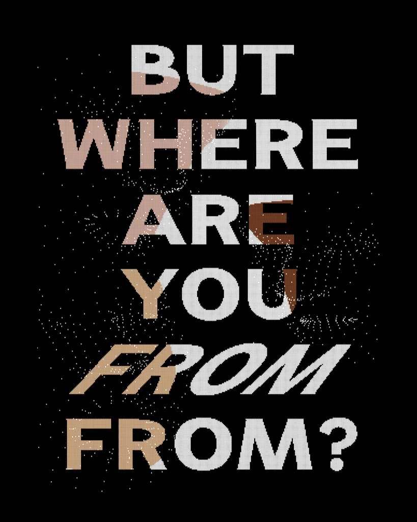
Finalist
Mark Wilson
FROM from
I think many Kiwis hear this question from Pākeha when they don’t look like them. Yes, it’s easy to say it comes from a place of curiosity, and that’s great. But to so many people struggling with their identity and sense of belonging to place, it’s deeply personal. Usually asked with flippant conjecture, it kinda starts to suggest the real question they want answers for: “You look out of place, so why are you here?” Never have I heard Pākehā asked where they’re ‘FROM from’? Is it just me..?
On a less deep note, I’ve been tutu-ing with programming so made this an interactive piece. I created the typeface last year. It changes skin tones when you blink. It goes italics when you open your mouth. Kinda cool.
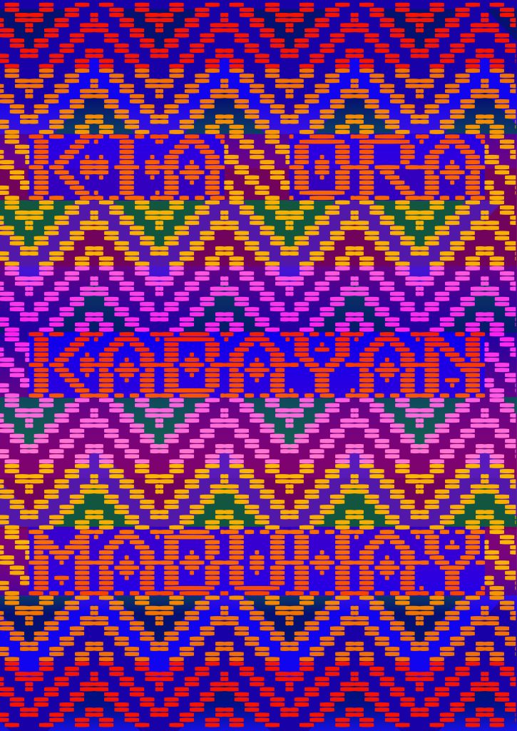
Finalist
Denise Narciso
Kabayan
In Filipino culture, kabayan means “fellow countryman.” It is a term of endearment that expresses kinship, especially among Filipinos living overseas. Hearing it often lights up faces; it evokes brotherhood, sisterhood, and a shared sense of identity. In Aotearoa New Zealand, where the Filipino community continues to grow, we greet each other with kabayan as a reminder that we are never alone.
In my design, this word is woven into a traditional Filipino pattern to symbolise connection, resilience, and togetherness. The greetings Kia ora and Mabuhay from Te Reo Māori and Tagalog both carry the spirit of “long life.” Placed side by side, they honour a shared love for both cultures, celebrating the intertwining of past and future as well as the journeys that bring us here.
I was inspired to showcase my Filipino identity within this year’s Kiwi Culchur theme because it reflects the vibrant cultural tapestry of Aotearoa New Zealand. This project is my way of contributing to that tapestry, acknowledging where I come from, embracing where I am now, and celebrating the communities that make this place home.
Finalist
Chanel Tukuitonga-Yandall
Tautai (Navigators)
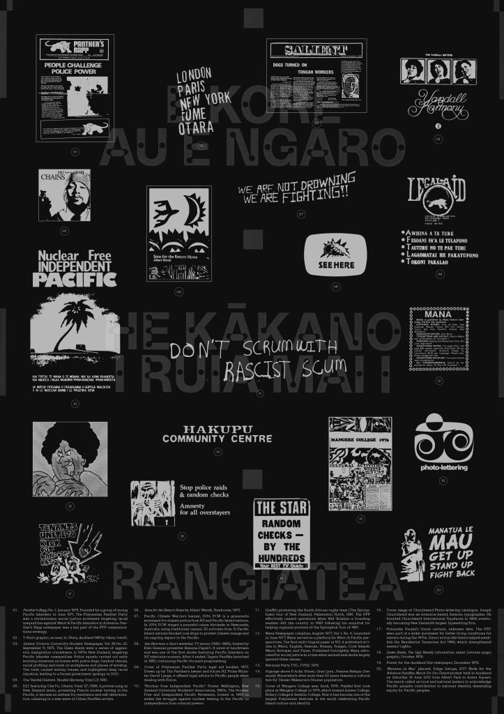
This year’s Type Here theme was ‘Kiwi Culchur’ and asked what NZ’s diverse culture means in 2025. The intent behind my entry ‘Tautai (Navigators)’ was born from my ongoing research into Māori/Pacific social justice movements from the 1970s. The mahi of these groups, like the Polynesian Panthers, directly led to the creation of the New Zealand Tenancy Tribunal and contributed significantly to policy change in the country. What began to stand out to me early on was the fact that many involved were first generation NZ-born Pacific teenagers, kids really, trying to navigate what Pacific identity in NZ was. There was no path set for them to follow. So a diverse culture to me is the individuals and communities that build it and is inherently political.
It was this self-determination and spirit that I wanted to communicate through the lens of the typography created by these groups. The poster is a type collage, pulling from t-shirt graphics, legal aid booklets, hand-drawn placards, graffiti, newspaper headlines, art, album covers, type catalogues and TV screens, set against a whakataukī that speaks to heritage as a foundation of self and to provoke the question: What is Aotearoa’s own Pacific identity?
“E kore au e ngaro, he kākano i ruia mai i Rangiātea”
(“I will never be lost, for I am a seed sown in Rangiātea”.)
This whakataukī is set in ABC Camera by Dinamo which is a reinterpretation of light traps, which were originally used in the 60s and 70s to make text more readable on CRT screens. Similar in logic to ink traps, light traps compensated for low resolution: When the font appeared, the screen’s blur filled in its holes so that each letter looked complete. I chose this in an effort to communicate the surveillance state Pacific people lived under during the 1970s and 80s.
I wanted the opportunity to platform the mana in type, to the role it has played within NZ Pacific history, and its power to speak for those who are not always heard. Tigilau Ness, founding member of the Polynesian Panthers said of Mana newspaper:
“I wanted to drive the Ngati Whatua issue to the forefront to educate Pacific people as to what was happening to tangata whenua. We were young, we were educated and we were angry about a lot of things that were happening to our people. Around that time, there was the issues of the Dawn Raids that nobody was really interested about – but we shone a light on that. As young people, 16-17 years old, we came through that. So Mana was our voice.”
Links:
Instagram
Finalist
Hannah Small
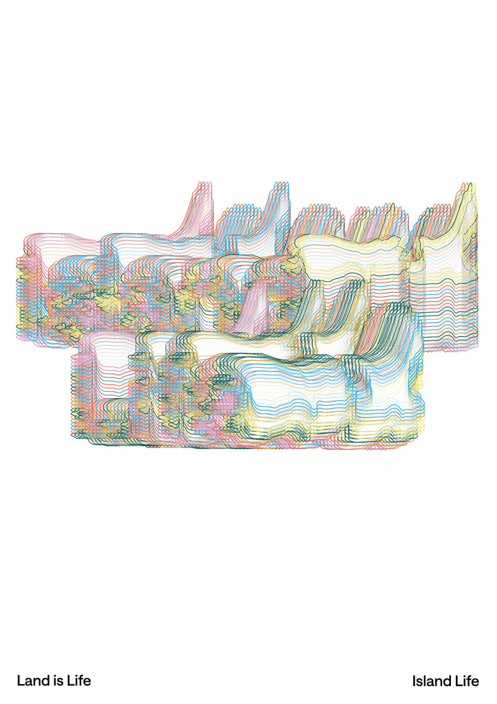
Land Is Life
Land Is Life rotates the landform of Aotearoa around an axis, layering it in multiple colours to create a fine, textured effect reminiscent of the linework used in passports and banknotes.
As the forms turn, Island Life and Land Is Land are revealed and concealed within the shifting geography, reinforcing the idea that meaning emerges from the land itself. The work reflects the importance of whenua and the special uniqueness of Aotearoa as an island nation at the bottom of the world.
Links
LinkedIn
Finalist
Tana Mitchell
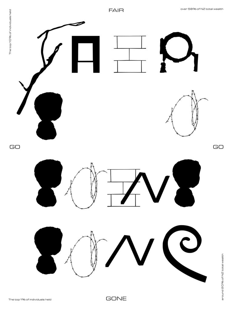
FAIR GO / GONE
My current practice-based research explores finding-ways, getting lost, landmarks, and milestones. Through observation, repetition, and dérive in the urban landscape, I’ve been developing ornamental alphabets from this experimentation.
This poster employs one of these experimental alphabets to examine “Fair Go” — a fundamental New Zealand cultural value rooted in equal opportunity that has fragmented under growing wealth inequality. The alphabet, constructed from unintentional letters found in everyday neighbourhood textures, visualises this erosion.
The deliberate search for scattered letters mirrors how opportunity itself has become fragmented and unevenly distributed. The neighbourhood’s physical environment — its mix of maintained and neglected surfaces — literally embodies unequal resource distribution. By assembling formal lettering from informal, overlooked materials, the work reveals how this core cultural value now requires active excavation rather than being an inherent social feature. The “Fair Go” must be painstakingly reconstructed from whatever accessible fragments remain.
Type Here 2025 reminded us just how powerful typography can be in the hands of Aotearoa’s designers. Want to throw your hat in the ring next time?
Follow Type Here for updates on future competitions, announcements and everything happening behind the scenes.
Find them at typehere.co.nz and @typehere.aotearoa.