Fresh From The Field: Resale Royalties Aotearoa (RRA) Toi Huarau – By Run Aotearoa
Run Aotearoa has developed a culturally rich and visually compelling branding for Resale Royalties Aotearoa (RRA) Toi Huarau to connect New Zealand artists, art market professionals, art buyers and art sellers – with a design that is both authentic and resonant.
Fresh from the Field is a weekly article series sharing fresh and inspiring work from the Design Assembly community. Want to submit your work to Fresh From The Field? Fill out the form here.
The brief
In 2024, Copyright Licensing New Zealand was appointed by the Minister for Culture and Heritage as the collection agency to administer the Artist Resale Royalty scheme. The scheme was established to ensure that creators of visual art are recognised and financially rewarded when their work is resold on the secondary art market.
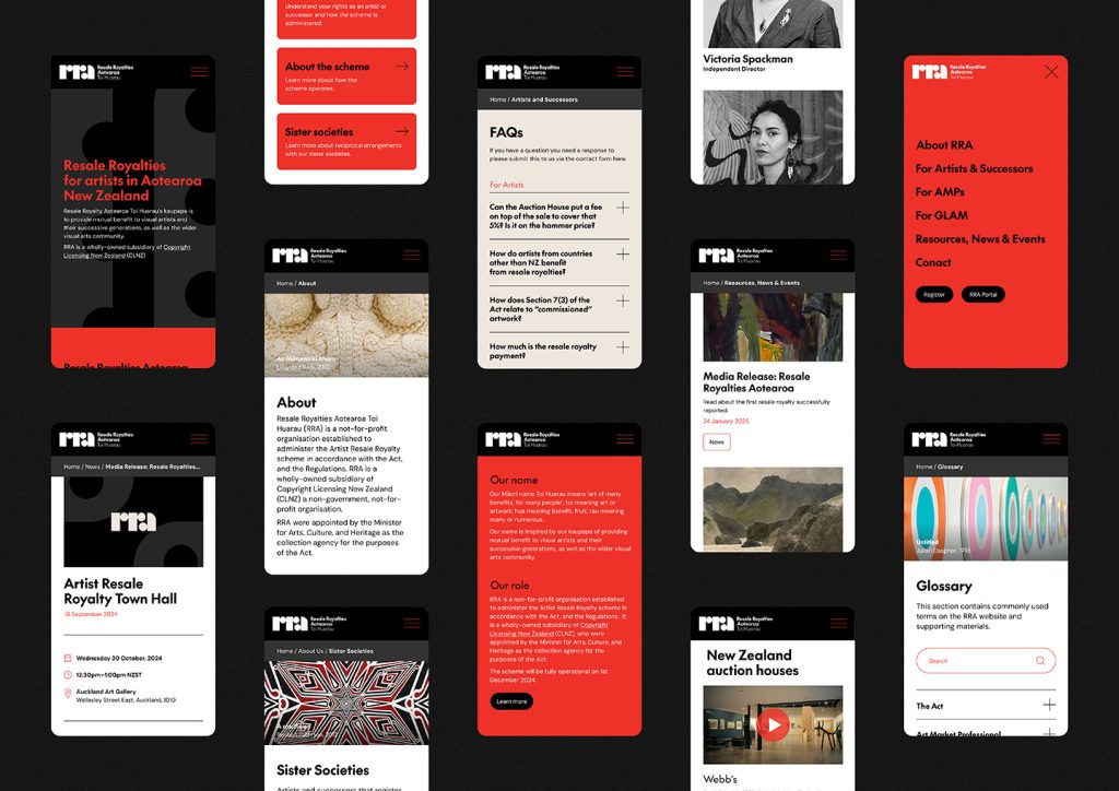
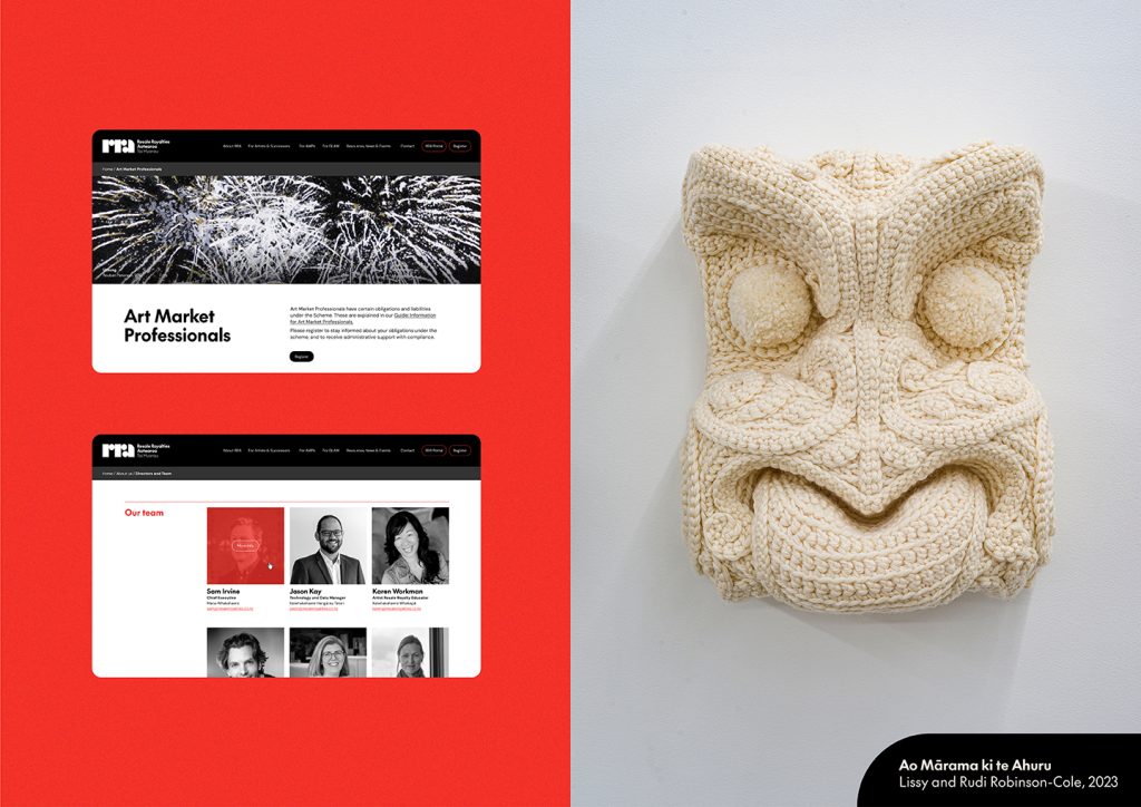
The brief was to create a bilingual name, design a distinctive visual brand identity, and develop a high-performing website supported by a suite of collateral.
The brand needed to connect with its diverse audiences – New Zealand visual artists, art market professionals, and art buyers and sellers – through a design that was both authentic and resonant.
Because the core audiences work within visual mediums, it was essential that the brand and website were not only functional but also visually compelling, with thoughtful use of imagery and design to reflect the creativity of the sector.

The design response
Before the design process began, a suitable and compelling name had to be developed. This involved Run holding a discovery wānanga to gather insights around a name and clarify a design direction early on.
From this process, the reo Māori name “Toi Huarau” was chosen. Linguistically meaning “art of many benefits for many people,” the name reflects the notion of a virtuous cycle that creates widespread benefits, particularly for artists and their descendants.
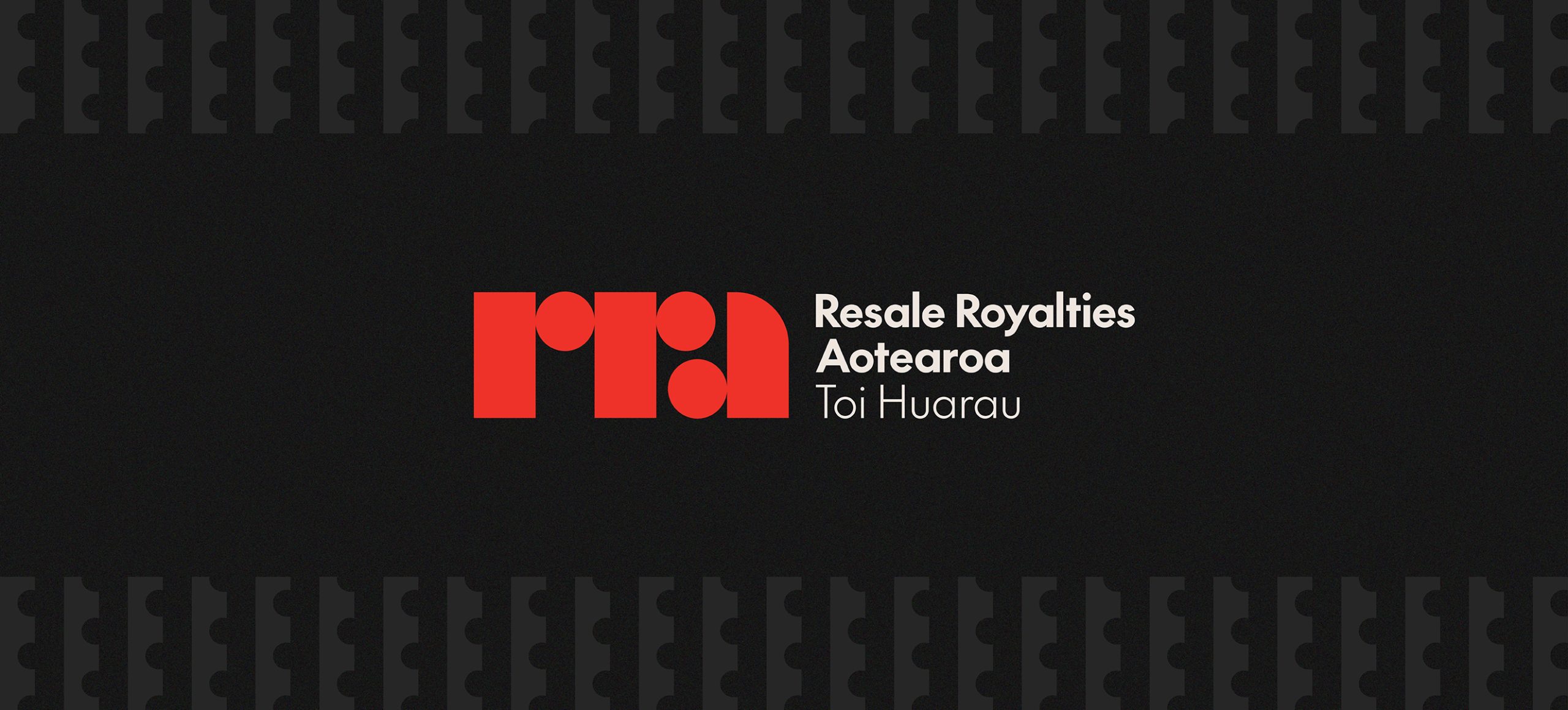
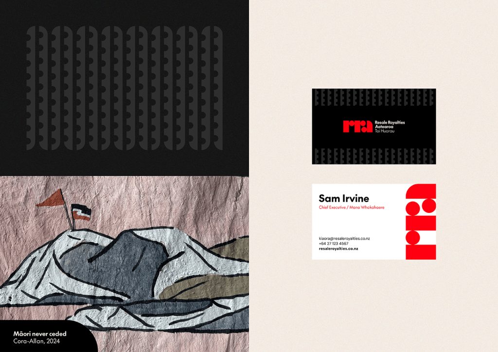
The tohu (icon) design cleverly forms the initials of the name using bold, geometric shapes – creating both a distinctive logomark and a visual acronym.
This dual function builds recognition of the new system while delivering a striking and memorable design. Its layered meaning and visual strength encourages interest and engagement, prompting viewers to look closer and connect with the brand. The design also aligns with aesthetic preferences identified during the discovery phase, which favoured a solid and simple look. The icon is paired with a clean sans serif typeface, with fine detailing that subtly mirrors the straight and curved forms of the tohu.
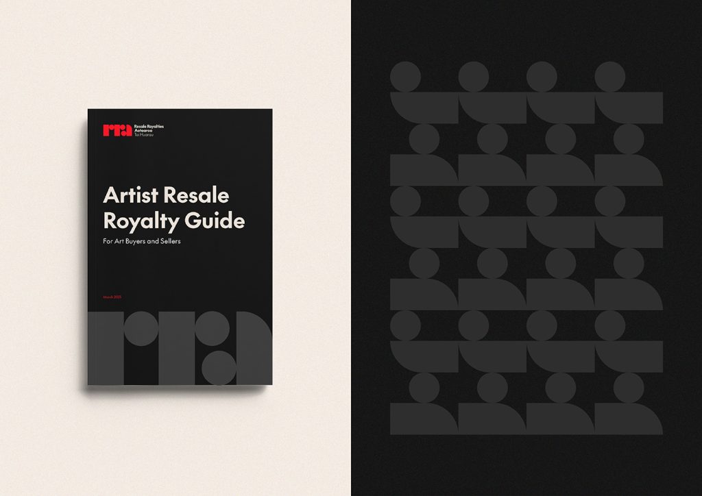
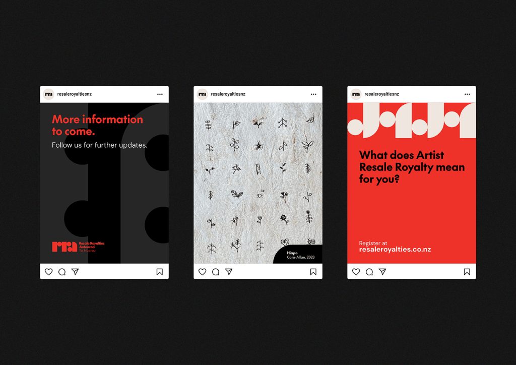
Run developed complementary brand elements to add to the visual identity, created using shapes from the tohu. The circle was reimagined into a contemporary pītau form – a common design seen in many Māori artforms. Representing an unfurled fern frond, it symbolises new beginnings and the potential for growth. This aligns with Toi Huarau as a new and progressive system with the potential to create many benefits for many people. The individual shapes from the tohu form additional brand elements to complete the set. These bold elements are intentionally designed for flexibility across all brand touchpoints –functioning as holding shapes, borders, patterns, or stand-alone graphic features.
Staying true to the brand’s simplicity, Run selected a limited colour palette of red, black, charcoal, and cream. The brand typeface, ‘The Future’ by Aotearoa New Zealand’s own Klim Type Foundry, connects to the kaupapa in a meaningful and practical way, reinforcing the brand’s commitment to supporting New Zealand artists and creatives.
In line with this approach, Run specified the use of imagery that complements the geometric brand elements, extending the visual language while celebrating the work of Aotearoa-based artists. A curated selection of artists generously granted permission for their work to be featured (with full credits). Run carefully selected artworks and imagery that aligned aesthetically with the brand while showcasing a variety of styles. The result is a visually engaging, culturally relevant, and cohesive identity, brand collateral and website design that represents and celebrates the wider art sector.
The design team
Laura Cibilich – Co-Founder and Design Director
Raymond Otene McKay – Co-Founder and Creative Director
Ariana Stone – Pou Ahurea Māori / Cultural Director
Dylan Wasson – Senior Designer
Cassidy Kiwha – Intermediate Designer
Hāriata Mann – Junior Designer
Shelley Cousins – Account Director
https://www.runwithrun.com
LinkedIn – www.linkedin.com/company/runwithrun
Facebook – www.facebook.com/runwithrun
Instagram – www.instagram.com/runwithrun
The client team
Copyright Licensing New Zealand
https://www.resaleroyalties.co.nz
Collaborators
Jono Pollok – Interactive Producer (FCB/SIX)
Andrew Johnston – Senior Interactive Developer (FCB/SIX)
James McMullan – Head of Digital (FCB/SIX)