Fresh From The Field: Longform —By True
The brief for True, an independent agency, was to create a brand identity that visually honoured a philosophy of thoughtful living and lasting impact.
Fresh from the Field is a weekly article series sharing fresh and inspiring work from the Design Assembly community. Want to submit your work to Fresh From The Field? Fill out the form here.
The brief
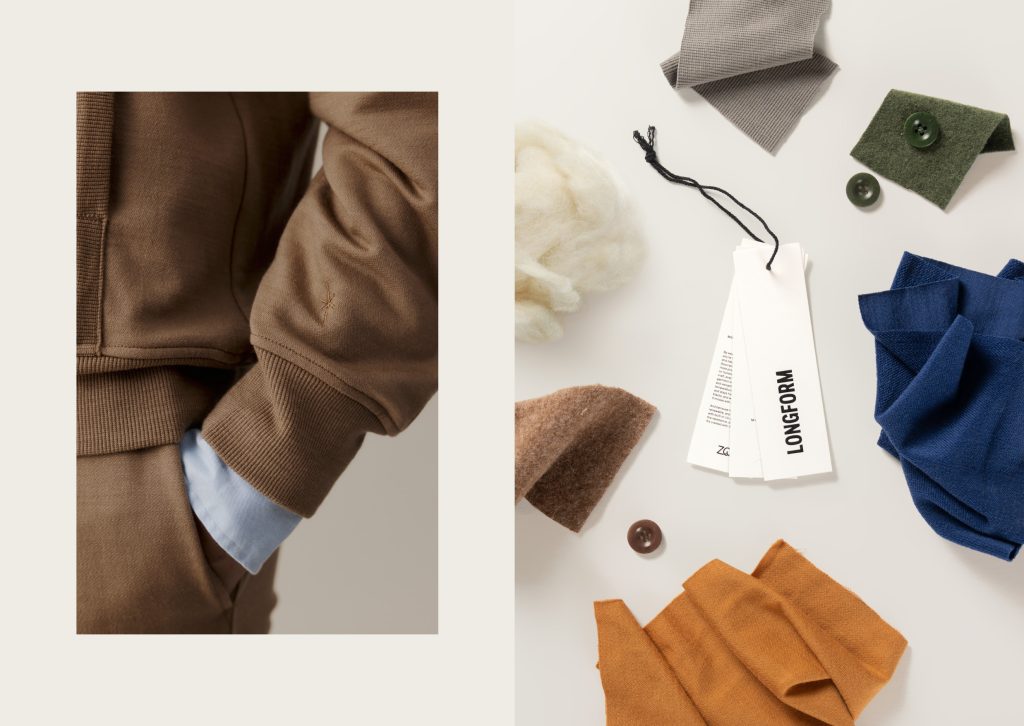
In a fashion landscape driven by urgency and excess, Aotearoa designer Des Rusk created Longform – a brand built on intention, not impulse. Crafted exclusively from renewable merino wool, Longform champions restraint over noise and permanence over turnover. Each piece is designed to last, functionally, ethically, and emotionally, for those who value considered choices and enduring craftsmanship.
The brief for True, an independent agency, was to create a brand identity that visually honoured this philosophy of thoughtful living and lasting impact. Every element needed to embody the same discipline and enduring quality as the garments themselves – from the name and tone of voice to the smallest brand detail. The identity had to feel clear, confident, and timeless while expressing the brand’s ethos.
The design response
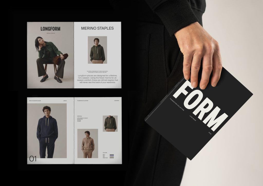
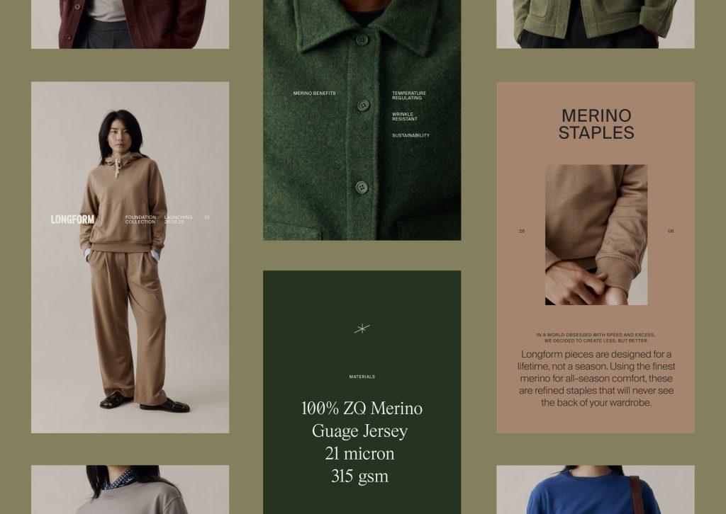
The strategy began with a clear philosophy: to create a foundation of refined merino staples that were considered, crafted and made to last.
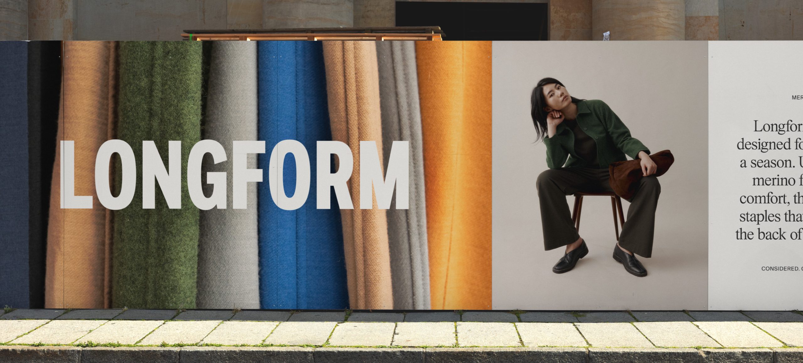
The name Longform emerged through an extensive naming process. ‘Long’ evokes time, endurance, and the lived-in stories garments gather. ‘Form’ speaks to structure, silhouette, and the discipline of good design. Together, they reflect the brand’s commitment to taking time – to design well, make thoughtfully, and build something that lasts.
From the outset, the goal was to resist fashion’s pace and volume, and instead offer a focused, singular voice. The idea of being considered, in tone, material, and presence shaped every aspect of the brand experience.
The design execution of Longform is intentionally pared back to reflect the brand’s core ethos: to be thoughtful in both voice and impact, and to create something that’s long-lasting.
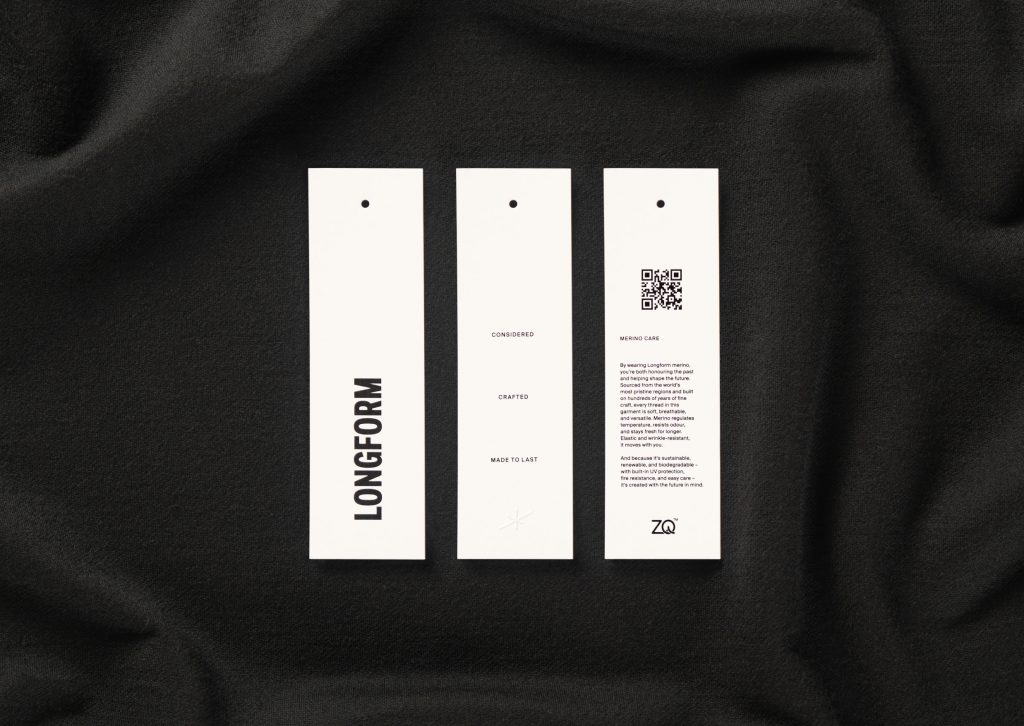
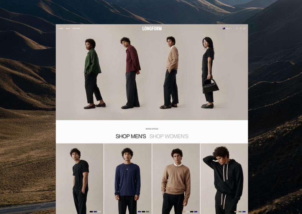
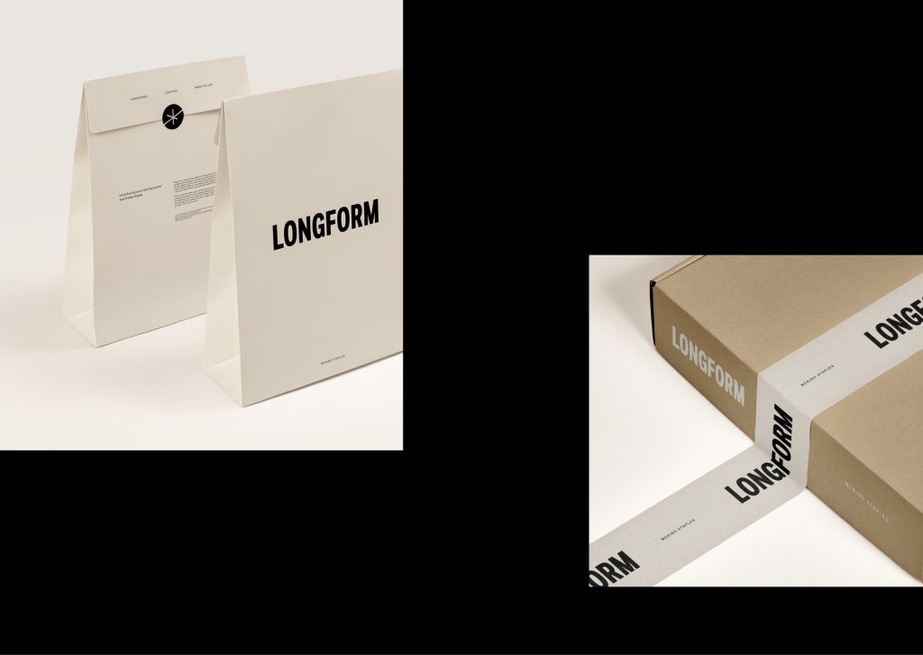
At the centre of the identity is the wordmark. Bold, grounded, and unwavering. It functions as a plinth: a stable foundation from which all other elements extend. Designed to work seamlessly across every touchpoint – from woven labels to digital platforms – it reflects the durability and clarity of the garments themselves.
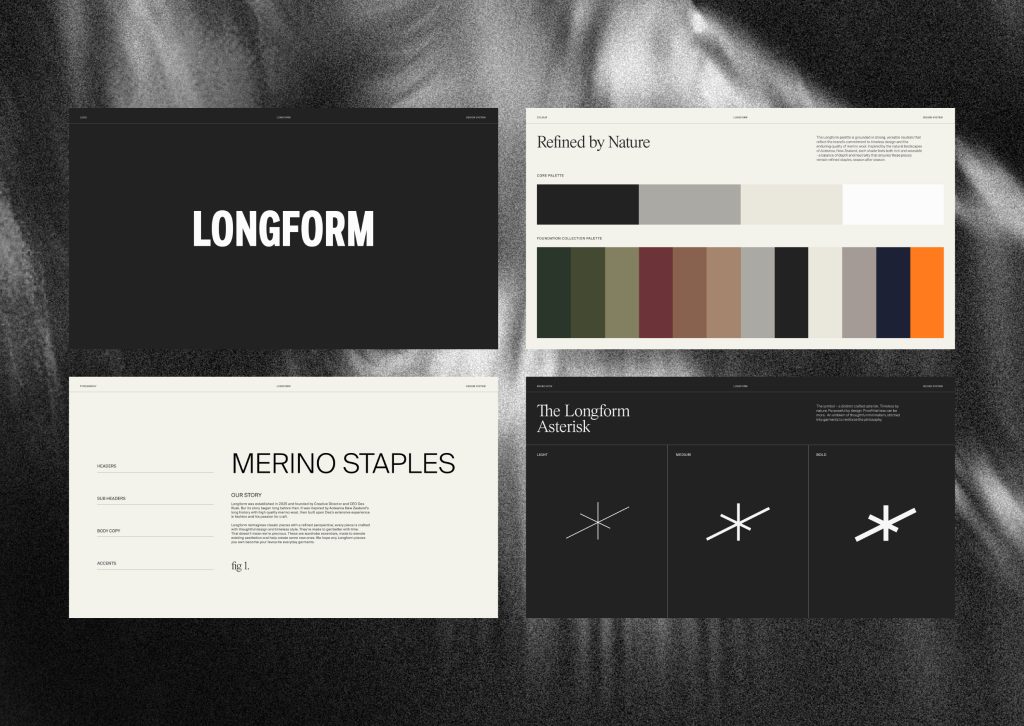
The Longform Asterisk is a distinct crafted symbol – timeless by nature, purposeful by design. It’s proof that less can be more. Designed as an emblem of thoughtful minimalism, it is subtly stitched into garments and carried through brand assets, reinforcing the brand’s philosophy with quiet confidence.
Typography draws from brutalist and utilitarian forms, paired with measured typesetting.
The brand colour palette is grounded in strong, versatile neutrals inspired by the natural landscapes of Aotearoa, New Zealand, each tone rich yet wearable, striking a balance of depth and neutrality that ensures the garments remain refined staples, season after season.
The photography and art direction approach centred on three lenses: Distance, to explore form through shape and silhouette; Detail, to highlight material and the considered construction of each piece; and Connection, to evoke a sense of community and belonging – making Longform feel both aspirational and grounded.
What sets Longform apart is the discipline behind every decision, an unwavering focus on clarity and intention. The brand design embraces this restraint, stripping away the non-essential to reveal strength through simplicity. From strategy to execution, the system is cohesive and is carried through every layer, from garment details to tone of voice, creating a brand that feels coherent, not just consistent. Longform doesn’t chase attention; it builds connection over time, offering a thoughtful, enduring alternative to fast fashion.
Design team
Matt Heays – Creative Director
Matt Dickinson – CEO
Ella Botherway – Business Director
Stacey Purdon – Senior Designer
Oska Gosling – Junior Designer
Jane Langley – Senior Copywriter
Antony Wilson – Senior Copywriter
Tom Maker – Junior Copywriter
Johlida Van Schalkwyk – Junior Art Director
Conan Gorbey – Senior Producer
https://thisistrue.co
IG – @thisistrue.co
LI – www.linkedin.com/company/true-limited
Client team
IG – @longform.co
https://longform.co
Des Rusk – Longform Founder & CEO
Fresh from the Field is a weekly article series sharing fresh and inspiring work from the Design Assembly community. Want to submit your work to Fresh From The Field? Fill out the form here.


