Fresh From The Field: Rolling Meadow — By Onfire Design
Onfire Design rolls more cheese into shopping trolleys with a new straight-talking identity that has a big heart, energy, relentless positivity.
Fresh from the Field is a weekly article series sharing fresh and inspiring work from the Design Assembly community. Want to submit your work to Fresh From The Field? Fill out the form here.
The brief
As an existing cheese brand stocked in Aotearoa New Zealand supermarkets, Rolling Meadow is an everyday mainstream range of grated and block cheeses. Its accessible price points made it a go-to Kiwi family staple. However, it was lacking a compelling customer proposition and brand identity, which led to a loss of impact instore.
With a variety of cheese options, great taste and accessible price points Rolling Meadow cheese is the perfect food and ingredient for busy families living in Aotearoa New Zealand. The products can be eaten as a quick snack, in a weekday meal or reserved for a special occasion. With this in mind Onfire Design set about aligning the brand name “Rolling Meadows” with a core brand idea ‘We keep you Rolling’ to create a new straight-talking identity with a big heart, energy, relentless positivity.
The Design Response
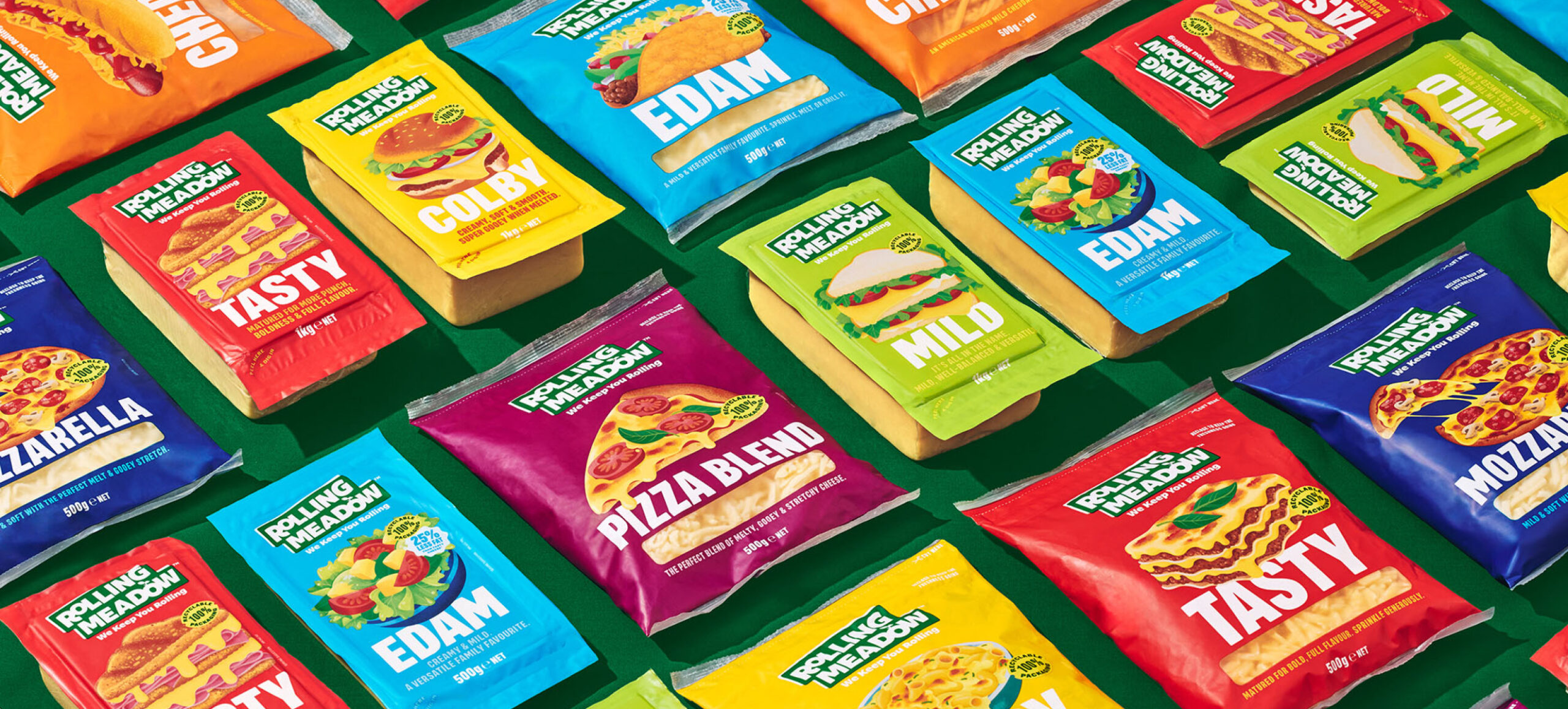
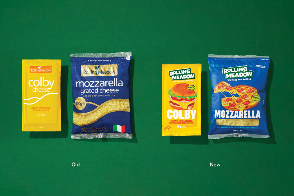
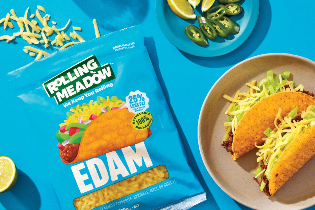
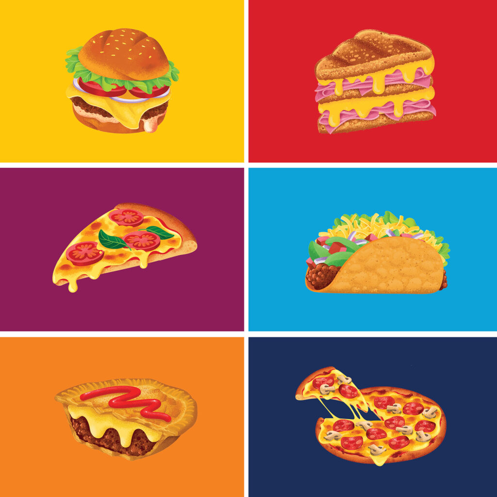
The brand’s visual language underwent a significant transformation to align with its new positioning and driving ideas of big energy, healthy fuel, and versatility. The new visual assets, anchored by food illustrations, are bold and vibrant. The new, highly stylized, colourful and textured illustrations showcase the various foods that can be created with each cheese variant. The graphic style of illustration was deliberately distorted, with playful angles and dimensions, to create a visually striking impact.
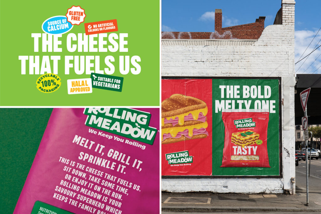
The new brand logo and messaging system are based on a sticker-style aesthetic, representing the idea of ‘good everyday value’. The new varient typography is big and bold, acting as a balance to the illustrations.
The result is a brand that now understands it’s role for today’s consumer – it is bold, energetic and always on hand to make epic dairy-powered food.
The Design Team
Creative Director: Matt Grantham
Art Director: Sam Allan
Designer: Natasha Alimova, Matt Grantham
Illustrator: James Stewart
Photographer: Yuki Sato
https://www.weareonfire.co.nz/
Facebook: Onfire Design
Instagram: @onfiredesign
Fresh from the Field is a weekly article series sharing fresh and inspiring work from the Design Assembly community. Want to submit your work to Fresh From The Field? Fill out the form here.