Fresh From The Field — Your Way | Kia Roha Visual Identity – By Studio Waru
Design Assembly loves to profile the breadth and depth of design practice in Aotearoa. For July we’re celebrating Māori design, designers, and illustrators.
Using Your Way | Kia Roha’s four core mātāpono (values) as their guiding pou— Rangatiratanga (self-leadership), Manawatoa (courageous), Whanaungatanga (connection) and Kotahitanga (inclusion) – Studio Waru developed a visual identity that speaks to empowerment, self-determination, expansion, and navigation.
The brief
We were briefed by Pōneke’s coolest creative communication agency, Five and Dime, on this project in June 2022. The client, Your Way | Kia Roha, along with Five and Dime, had just been through a rigorous discovery process and were looking to bring the brand narrative and strategy to life. “Your Way | Kia Roha is a charitable trust dedicated to helping disabled people thrive, living the lives they choose in their communities.”—Your Way | Kia Roha.
Project aim—Create a cohesive visual identity that facilitates a sense of connection and togetherness. One that breathes the guiding notion of “our collective waka”—that speaks to empowerment, self-determination, growth, expansion and navigation.
Problem Statement—How might we develop a look and feel that our audiences feel a true connection to? Where they feel represented—a space to feel they truly belong. An identity that is inclusive and empowering.
We were told that the hopes for the project were; clarity, to be for disabled people, to be inclusive, recognisable, cohesive and refreshing.


The Design Response
Research and findings from the discovery process alongside a deep dive into the tūāpapa (foundations), moemoeā (vision), kaupapa (purpose) meant we were able to paint a clear picture of where the organisation had been to determine where they were wanting to head.
The brand territory behind the new name (Your Way | Kia Roha) was: “Our Collective Waka” and was chosen because it signalled the organisation’s intent to move forward collectively with the community—charting new pathways and aspiring to move the whole sector.
“Your Way“ speaks of self-determination and refers to the fact that each person is unique. “Kia Roha“ means to spread your wings and fly. It speaks to people being aspirational, actively seeking and reaching their goals.
We used Your Way | Kia Roha’s four core mātāpono (values) as our guiding pou—all grounded in te reo concepts: Rangatiratanga (self-leadership), Manawatoa (courageous), Whanaungatanga (connection) and Kotahitanga (inclusion). Working within the realms of these words lead us to establishing a guiding whakataukī—this acted as our northern star throughout the duration of the design process.
Ehara! Ko koe te ringa e huti punga!
Yes, yours is the arm best suited to pull up the anchor!
You have it in you! Pulling up the anchor on a waka requires intention, focus and determination. You must trust yourself that you have the physical and mental strength to pull up the anchor and navigate or lead the journey ahead.
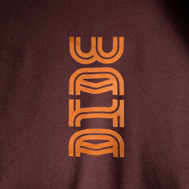
It is from here we were able to develop a visual language around the ropes and knots used to anchor the waka. The logo icon, and later the graphic devices and patterns, host details of a stylised woven rope—used to ‘lift the anchor’. Within this design we can see a twisting and a crossing of paths with no clear beginning or end. This lends itself to the idea of a path unwritten. Inspired by the whakataukī, this icon indicates that we are in charge of our own path, whatever that may be, forward moving with twists and turns.
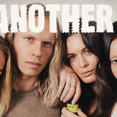
Right from the beginning, research was carried out to establish a clear understanding of what our neurodiverse audience needs were. Some of the many considerations we made during the process included but weren’t limited to; tunnel vision, loss of acuity or blurred vision, colour blindness, low vision or blindness, and visual noise levels. This research resulted in the development and considered use of a monochromatic colour palette, the choice and application of a clear geometric-based typeface and careful rules around layering or using graphic devices, image and videography.


The Design Team
Brittany Davies—Lead Mahi Toi Māori
Sophia Bishop—Colour & Accessibility Design
https://studiowaru.co/
https://www.instagram.com/hellostudiowaru/
https://www.linkedin.com/company/studio-waru/
https://www.facebook.com/hellostudiowaru
The Client Team
Your Way | Kia Roha
Client details
https://www.facebook.com/YourWayKiaRoha
https://www.linkedin.com/company/yourwaykiaroha/
https://www.instagram.com/yourwaykiaroha/
https://www.youtube.com/channel/UCUJFmP6TqNn2dkEambejqnQ
https://www.yourwaykiaroha.nz/
Collaborators
Helene Malandain and team (Five & Dime)—Strategy, Project Management, Copywriting


