Fresh From The Field — Metlifecare – By Choir
Fresh from the Field is a weekly article series sharing the fresh and inspiring work of our Aotearoa Design Assembly community.
From refreshing the identity to developing a brand hierarchy system to connect the parent brand with each village, Choir walk us through their brand identity and strategy work for Metlifecare
Want to submit your own work to Fresh From The Field? Fill out the FFTF form here.
The brief
Metlifecare has been a trusted provider of retirement living since 1984. Despite being one of New Zealand’s largest retirement village providers to over 7,000 residents across 36 retirement villages (and more on the way), awareness of the Metlifecare parent brand was very low. Conversely, the individual villages were well established, well known, and well regarded among their communities. Compounding the problem, each village had its own individual identity and messaging, so the parent brand was not only disconnected but lost in the noise. Choir was tasked to refresh and strengthen the Metlifecare brand with a strategy that established awareness, consideration, and market presence, creating a system that was anchored by the parent brand and filtered through to all villages and ongoing development.


The Design Response
Through our research and discovery with key stakeholders, staff and residents, we identified that it was the authenticity and care of Metlifecare’s people that separated them from other competitors. A new value proposition was developed that repositioned Metlifecare in the market with confidence: Welcome home.
The new Metlifecare value proposition underpinned all brand and creative that was developed, including decision making around the integration and adherence of the NZ Dementia-friendly guidelines for any design work we undertook.
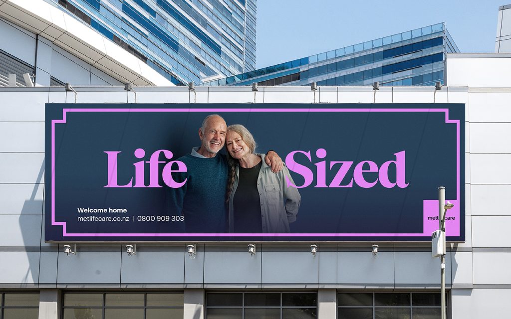
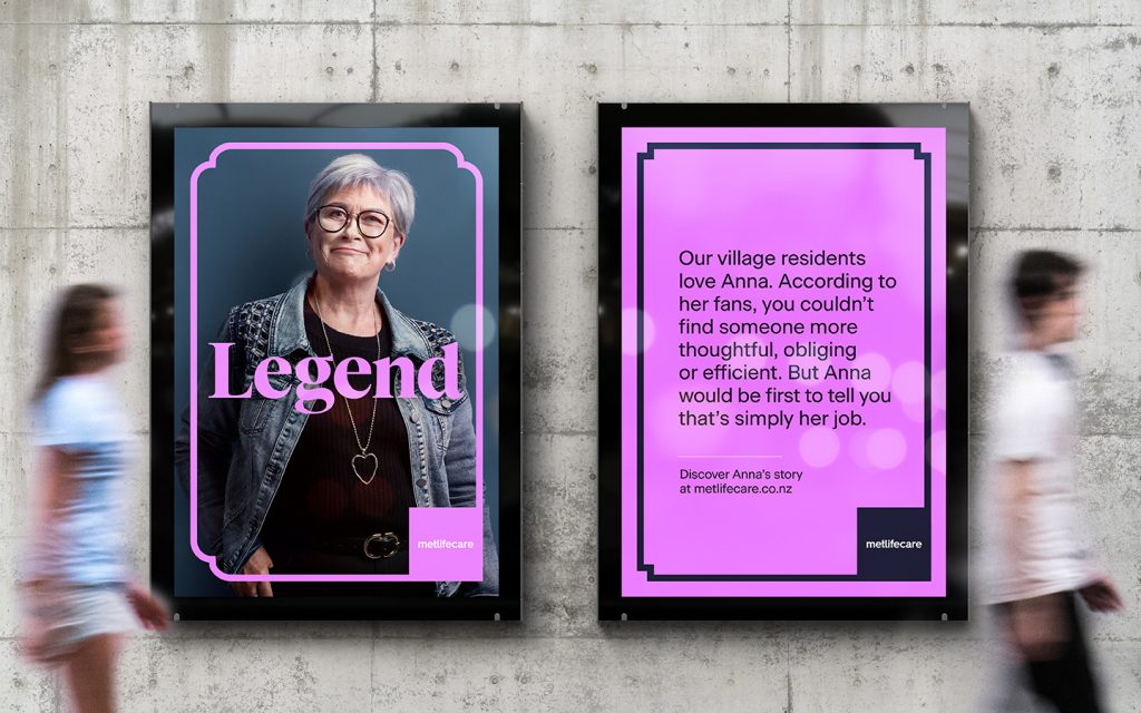
Key outputs included refreshing the brand identity, marketing collateral, photography, and key messaging. Greater emphasis was placed on the new colour palette, moving away from soft, dull pastels towards a strong deep blue that represents knowledge, security and integrity. Working alongside the blue to bring joy and energy to our brand is a set of vibrant and lively secondary colours.
These secondary colours worked in conjunction with a fluid framing device that was developed as part of the new brand identity. This is a modern take on the picture frame, an object we use to hold our memorable moments and our loved ones. For Metlifecare residents, framed pictures connect them to special people and special moments, and we wanted to show this in our creative.
We also developed a brand hierarchy system to connect the parent brand with each village, while roadmapping how new villages would fit in the new framework. The strategy and system provides a strong base for cohesion and consistency moving forward.
To officially launch the brand, Choir developed a brand launch campaign including TVCs based on an important premise – a sense of home and belonging. As an extension of this campaign, we developed print, radio, digital and OOH collateral that celebrates the residents living within the villages and the staff that support them to live the lives they want to live. The brand launch has been a major success for Metlifecare with strong awareness and increased interest in village prospects.


The Design Team
The entire Choir team
https://choir.nz/
https://www.instagram.com/choir.nz/
https://www.linkedin.com/company/choirnz/
https://www.facebook.com/choir.nz/
The Client Team
Metlifecare
Collaborators
Mark Easterbrook – Contributing Creative
Dean Mackenzie – Photography


