Fresh From the Field — Kāpiti Cheese by unified brands

The brief:
Kāpiti, a brand that sets the bar for cheese – proudly holding the title for New Zealand’s most awarded cheese company. Their product is second to none, but the brand team felt their packaging could be working harder to drive distinctiveness and elevate the brand’s cheese identity.
With such a rich and distinguished pedigree, we set out crafting a new look for their range which felt proud, distinctive and lived up to the brand’s premium reputation.

The design response:
Transforming the entire range to take on a dramatic black backdrop felt like a bold but necessary move. We wanted the range to not only come together, but make a statement. Kāpiti isn’t shy of big, bold flavours, and its packaging needed to follow with the same confidence.

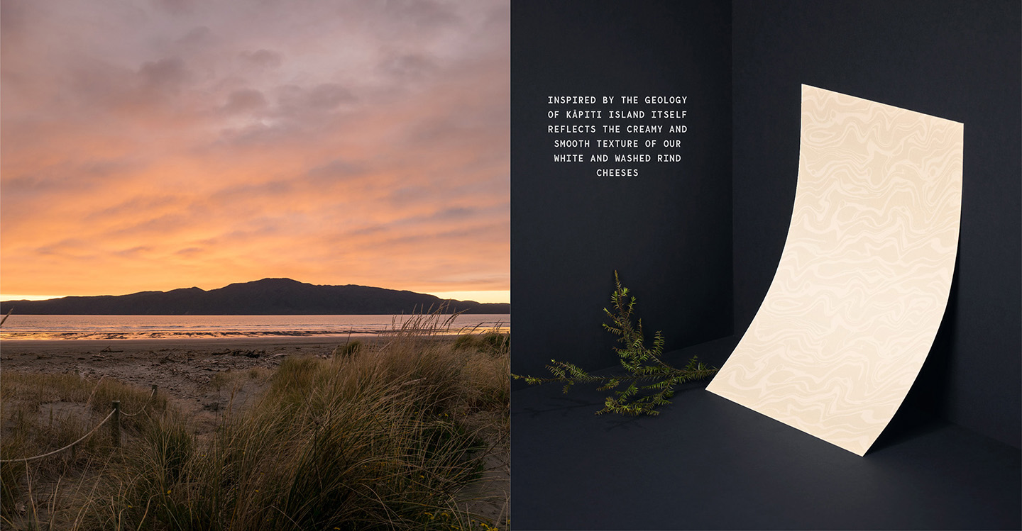
Naturally, we drew inspiration from Kāpiti Island. With its rugged landscape and wilderness, the island became our dramatic muse. Hand illustrated patterns tell the story of the coast and terrain, symbolising the rich taste profiles of each of the cheeses, and a bold crop of the island’s silhouette creates a distinctly ownable shape running across each of the cheeses.
Typographically, we saw typeface as another opportunity to speak to the brand’s rich story of New Zealand excellence; through new pronounced letter spacing and angular motifs, all building on the beauty of the brand’s Te Reo naming of its cheese.
The collaborators:
Everything was done inhouse, by Unified Brands
Instagram:@unifiedbrands
Website: https://www.unifiedbrands.co.nz/