Fresh From The Field — Hope St by South
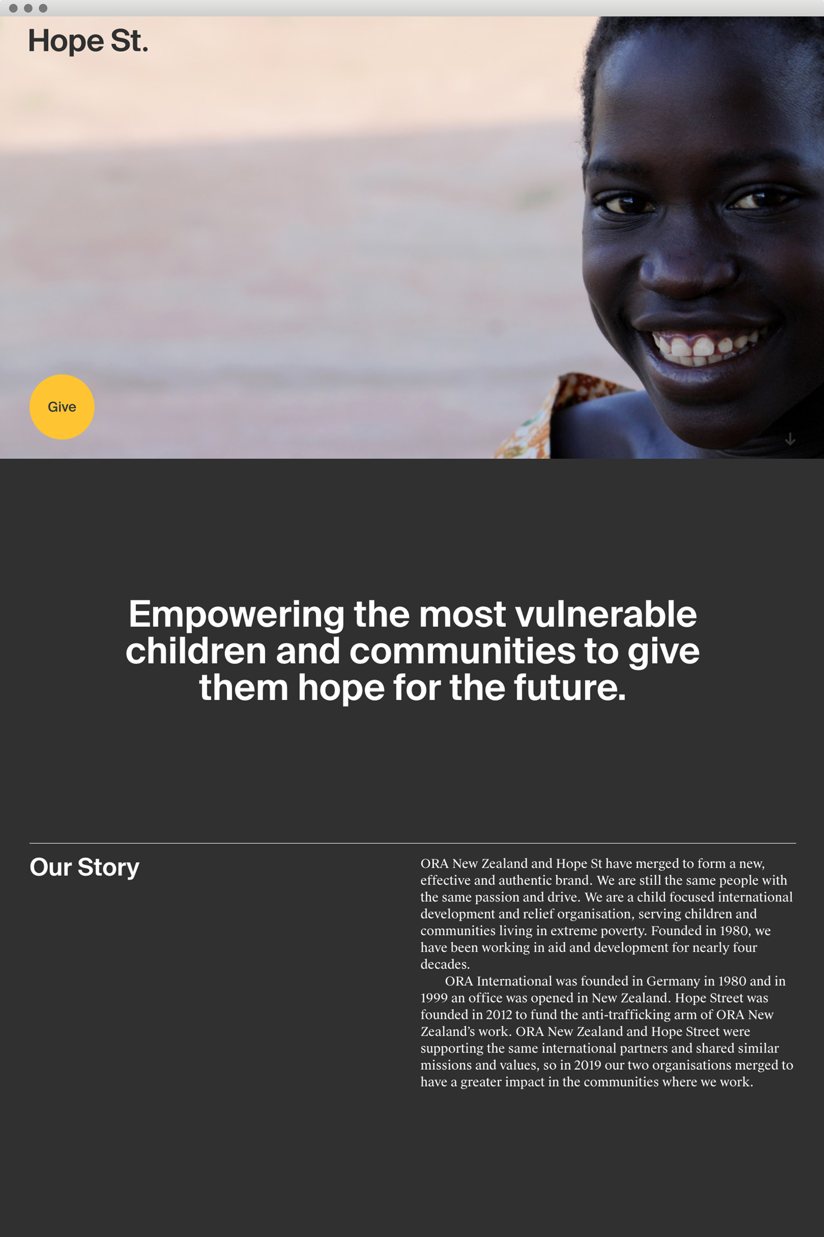
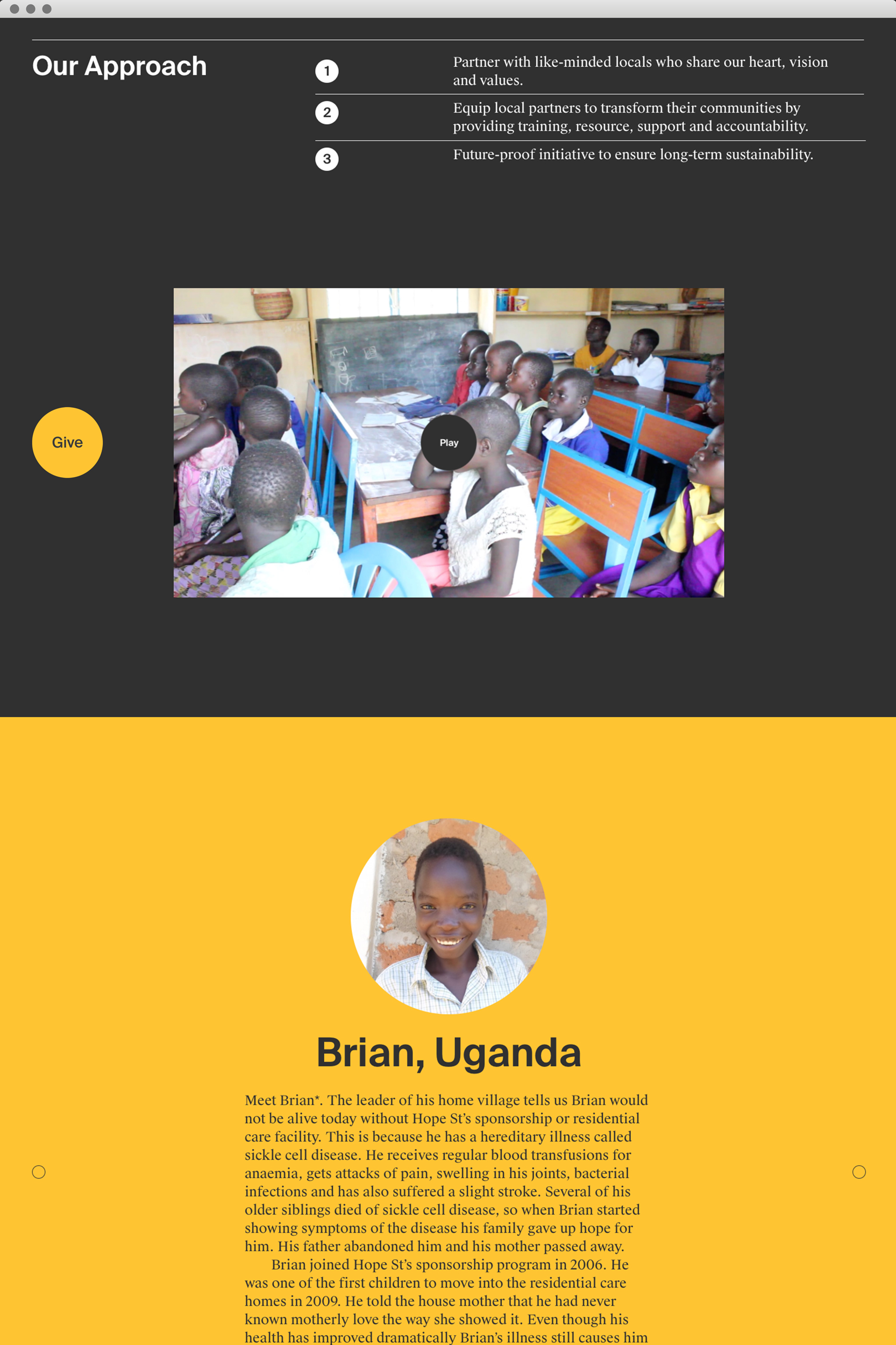
Hope St empowers the most vulnerable children and communities to give them hope for the future. Studio South created a colour based brand system that speaks to the power of both giving and receiving.
If you have new or recent work that you would like to share in Fresh from the Field email nicole@designassembly.org.nz for details.
The Brief:
Redefining a brand system to reflect human connection on a global scale.
Hope Street & ORA merged in 2019 having recognised both organisations were supporting the same international partners. A new brand identity was required to communicate a single, strong voice going forward. Hope Street are a child-focused international development and relief organisation, serving children and communities living in extreme poverty. Founded in 1980, they have been working in aid and development for nearly four decades.
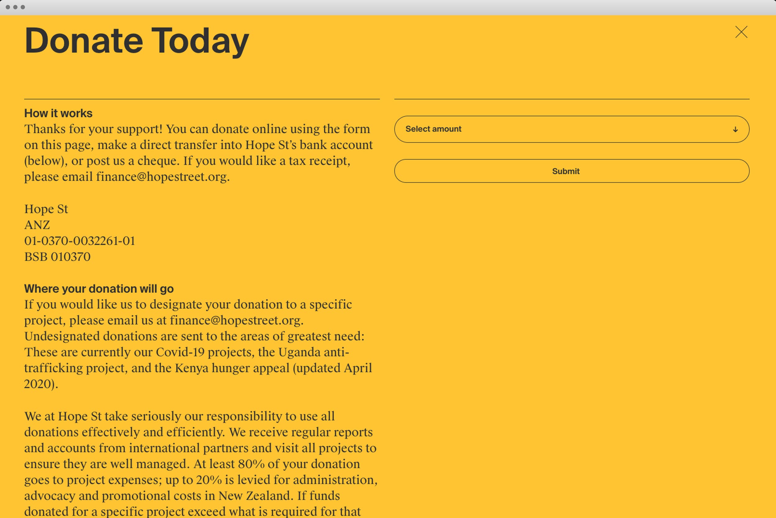
Hope Street is now dealing with extreme impacts on already struggling communities following the COVID-19 outbreak. We kindly ask the wonderful creative community to support and donate via their website if you are able – visit hopestreet.org to donate. Together, we are one.

Design Response:
To capture Hope Street’s story and vision, South designed a brand system that speaks to the journey of candidate (giving/green) to candidate (receiving/red). The graphics can move across a number of points across a modular grid to create thousands of unique shapes and journeys. The visual language is balanced with moving photography, ensuring the children remain at the core of the brand’s communications. After the launch of the new brand, Hope Street have received an incredibly positive response to the new aesthetic.

Website:
hopestreet.org
Photography:
Hope Street Organisation


