Fresh From The Field — Western Springs College by Jasmax
Flexible place responsive design, well-crafted built outcomes and vibrancy are the hallmarks of the Western Springs College signage undertaken by Jasmax, a poutama pattern adapted from tukutuku panels express the story of consistent learning and intellectual achievement, while bold colour and clear directory information allow students to navigate an adaptive and ever-changing learning environment.
If you have new or recent work that you would like to share in Fresh from the Field email nicole@designassembly.org.nz for details.
The Brief:
To develop a cost-effective signage system which worked in harmony with the architecture and could be easily updated within a building designed for new ways of learning.

The Design Response:
The new Western Springs College Ngā Puna O Waiōrea campus is designed for contemporary educational philosophies where traditional classrooms have been exchanged for open interactive learning and meeting places.
Due to the everchanging learning spaces, a cost-effective and flexible signage system was required to enable names and addresses within the buildings to change. The other core element of the signage family is their alignment with the schools architecture and visual identity.
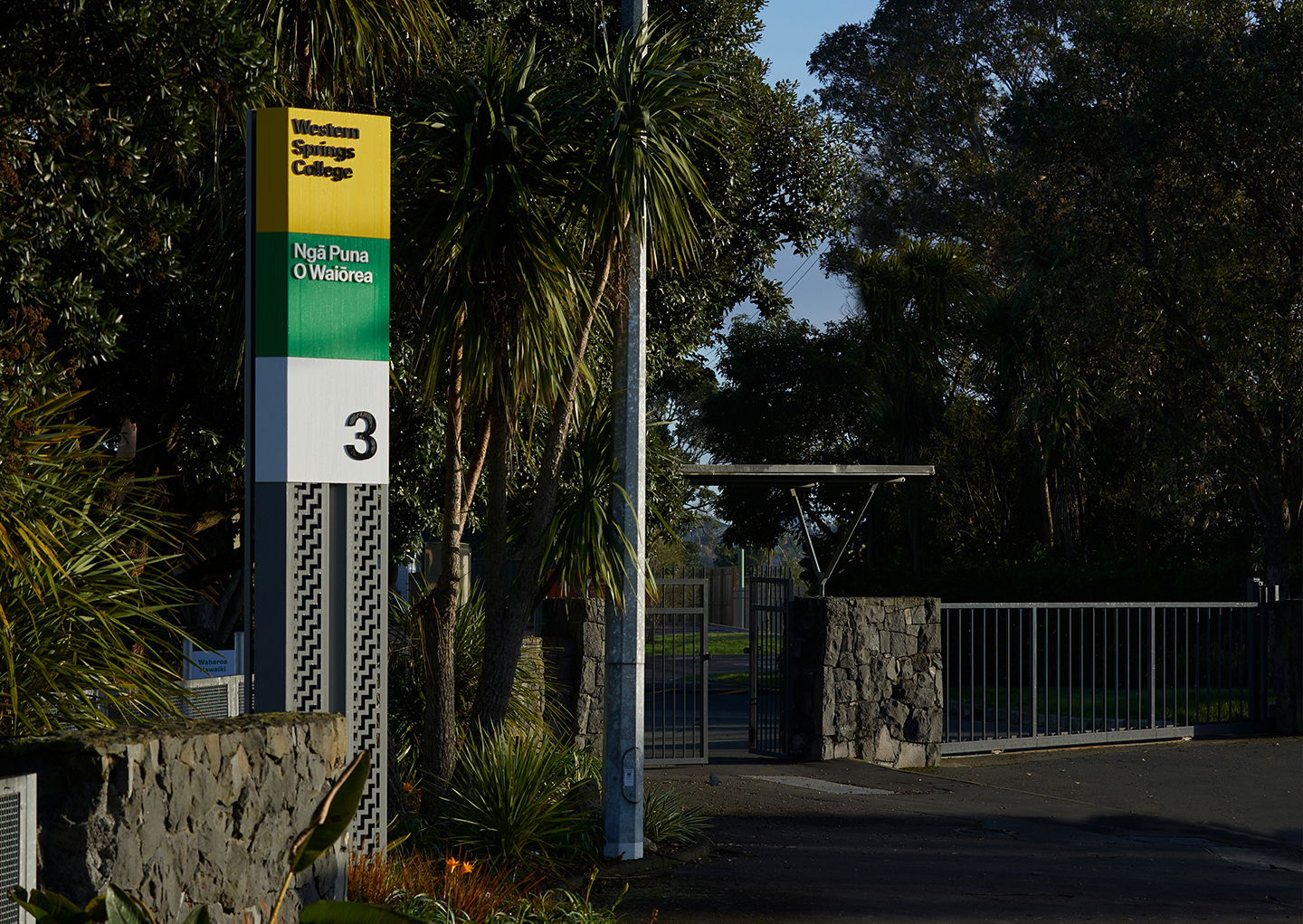
The exterior beacon and totem signs are modelled from the custom sunscreen louvres attached to the exterior of the Ken Havill Centre, with the cranked steel pou’s featuring a water cut poutama pattern adapted from tukutuku panels which express the story of consistent learning and intellectual achievement.
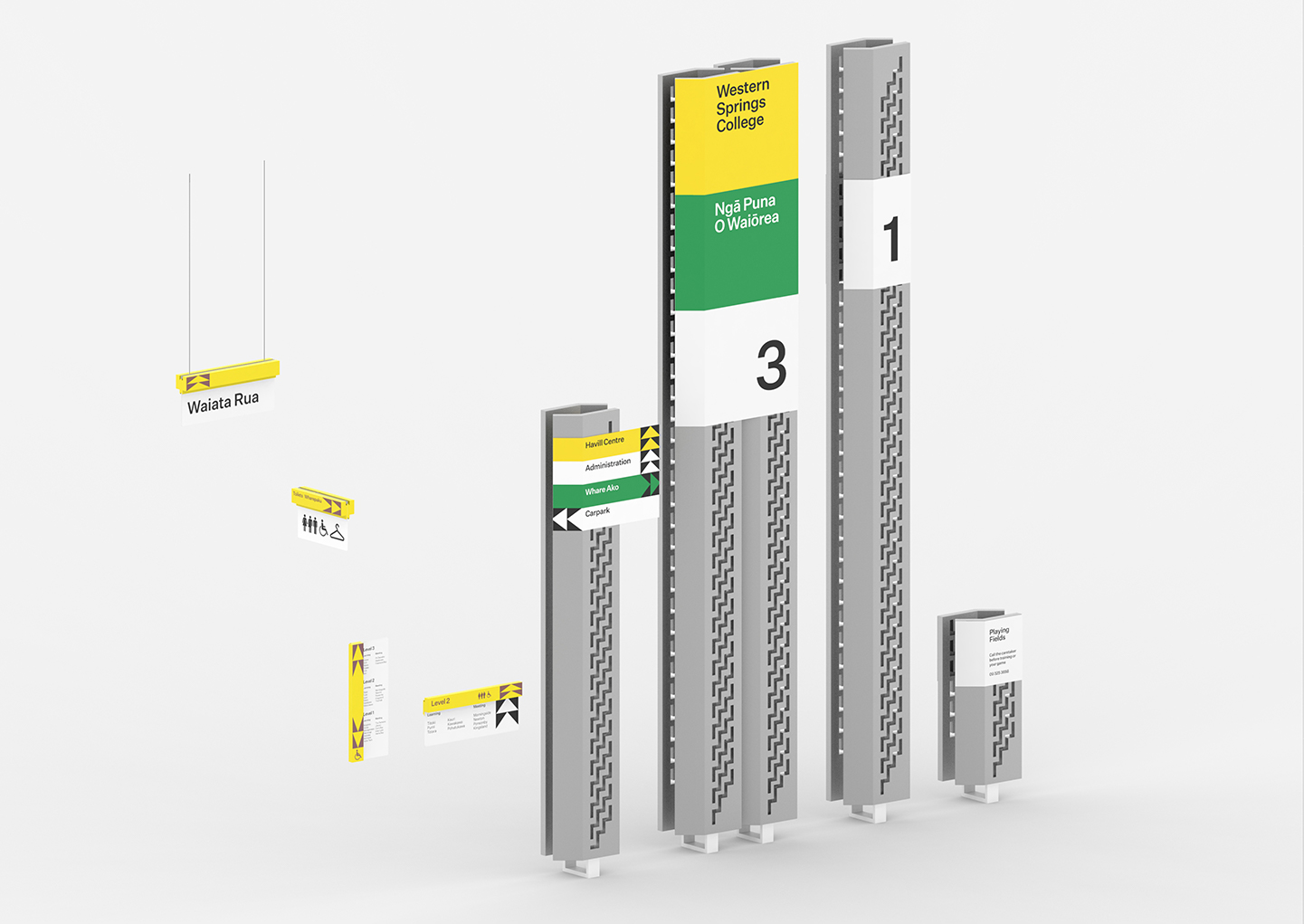
Interior signage types use a small suite of ‘off the shelf’ materials to exhibit how they are made. Each of the timber profiles used in the family is a standard exterior cladding profile from Abodo Timber which have each been painted and laser etched to reveal the required directional information and the natural timber finish.
The use of these timber profiles, which are specifically designed to nest within each other, allows a hierarchy of information to be ‘stacked’ on top of each other for some signage applications. Sandwiched between the timber profiles is a powdercoated steel panel to which low-cost digitally printed magnetic sheets are attached. These magnets will enable easy change out of content as spaces change over time.