Fresh From The Field — Signifier by Klim
This Fresh from the Field features Signifier, a new font designed by Klim Type Foundry’s Kris Sowersby, that intersects the design territory of 17th-century typefaces with digital rebellion and a brutalist binary ethos.
If you have new or recent work that you would like to share in Fresh from the Field email nicole@designassembly.org.nz for details.
The origins:
John Fell was an English bishop, academic and publisher. From 1666-1669 he served as the vice-chancellor of the University of Oxford and established the renowned Oxford University Press. The Fell types refer to a series of printing fonts commissioned by or acquired for Bishop John Fell which he later bequeathed to the Oxford University Press in 1686. The Fell types were a hybrid of both Dutch and French styles which gave OUP texts a distinct visual personality. Sowersby describes seeing the original printed forms as magnificent, they have been long-admired in the typographic community. Jonathan Hoefler, Igino Marini’s and Frank E. Blokland have created digital revivals of Fells type; each is a loyal representation of a 17th-century Fells printed specimen. Kris Sowesrby took a different (and incredibly exciting) approach to his reimagining.

The design response:
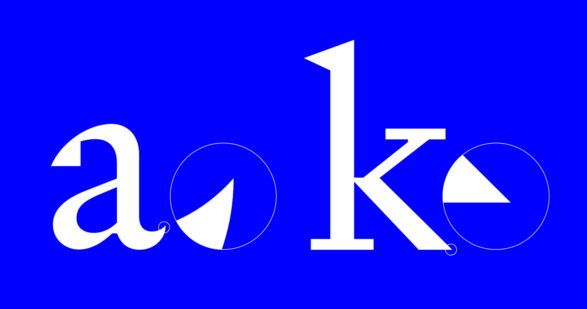
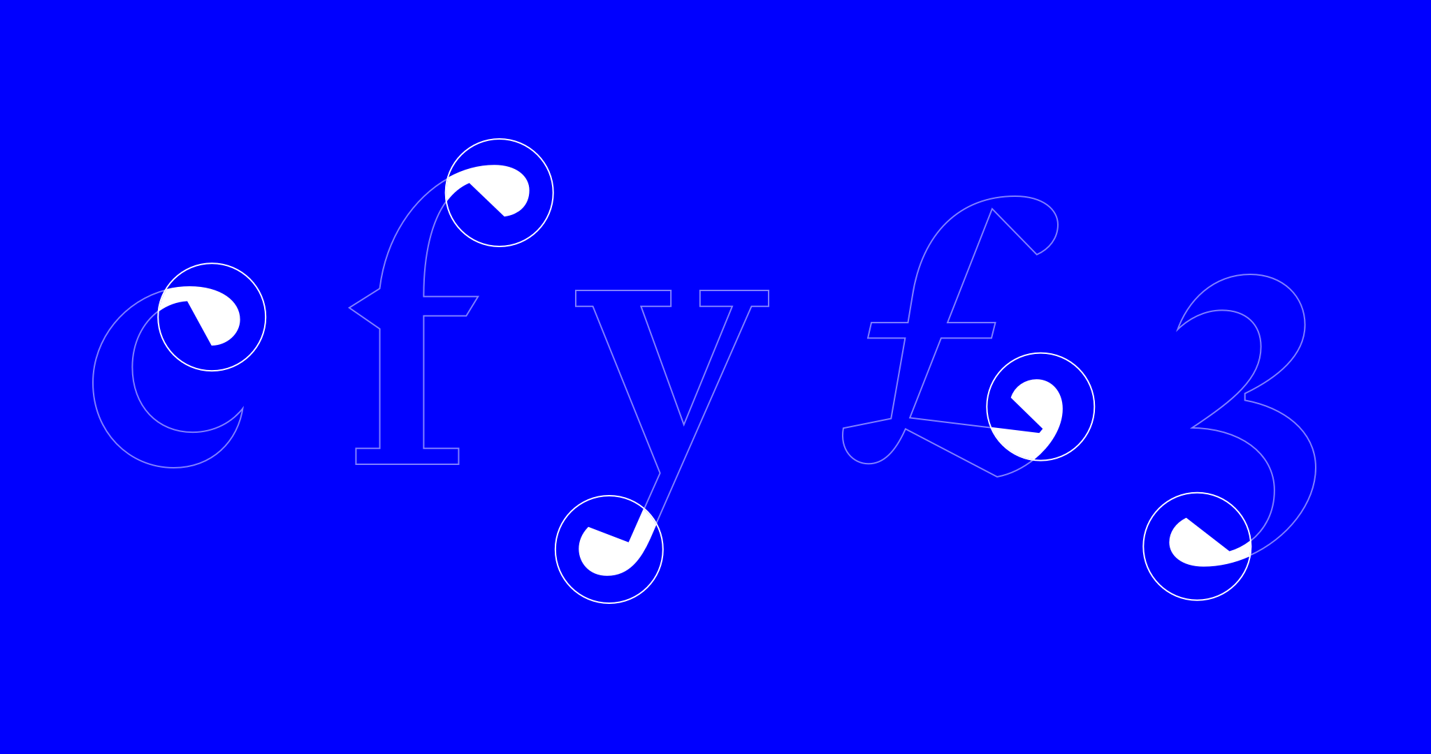
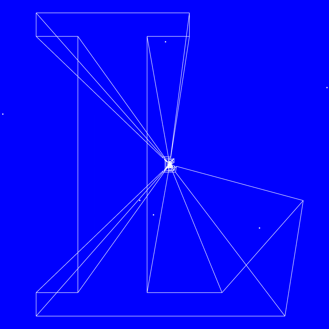
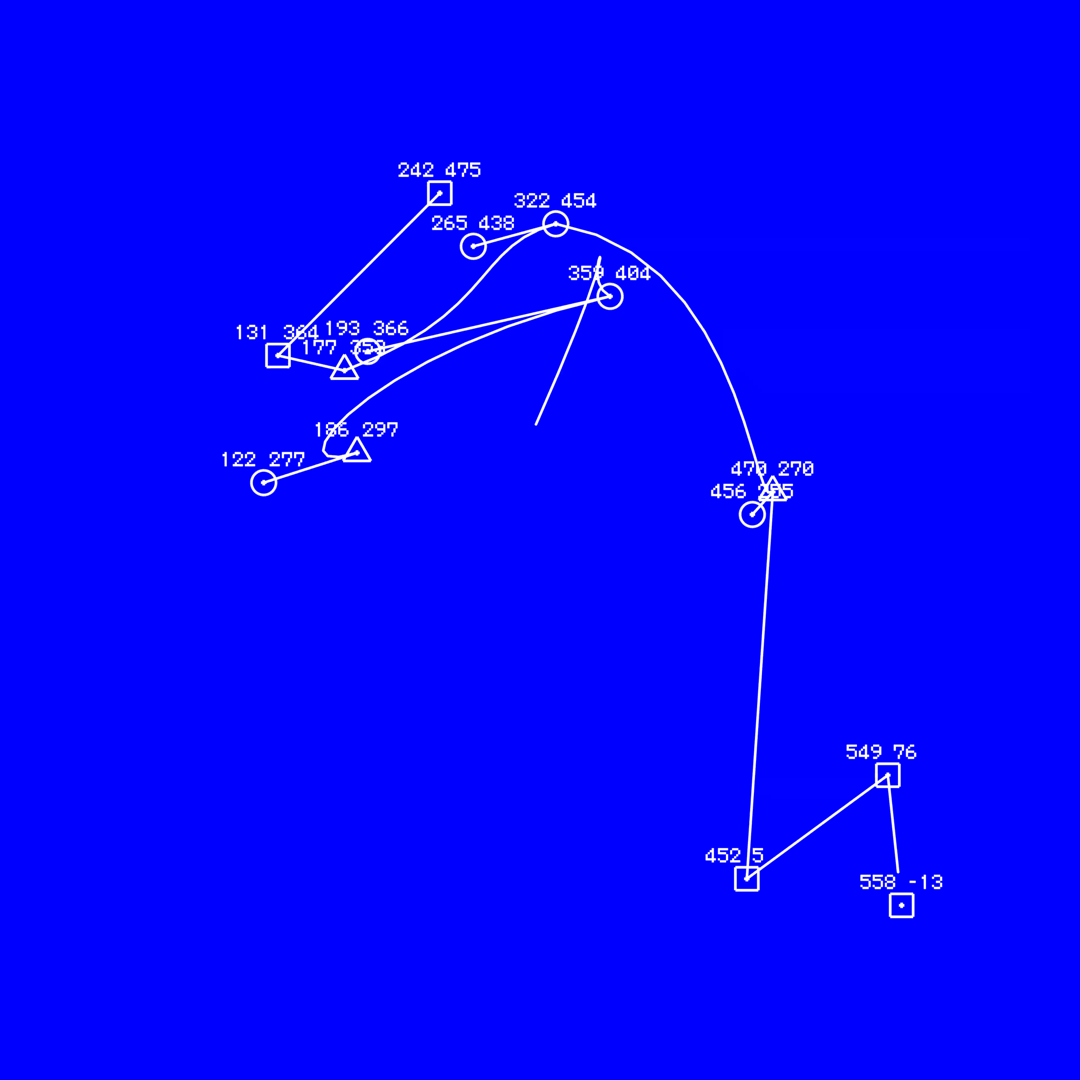
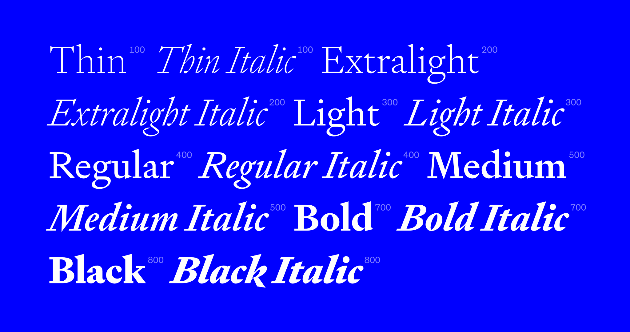
Typefaces of the 17th-century, are still widely used today. Originally, punchcut and cast in lead by expert craftspeople, to be typeset and printed by hand with tacky ink on coarse stock, these entirely analogue forms were translated and reinterpreted through technological advancements into the assets we have in our digital design tool-kits today. Signifier began as a revival of English Roman from the Fell Types. But that is not where it landed! Signifier’s forms are daring, precise and refreshingly radical. Its digital construction is laid bare. Signifier is a typeface of today, shaped by contemporary technology.
Signifier’s digital immateriality draws on a deeply material past. Acknowledging the processes and tools of digital form-making, Sowersby “recast” each glyph in the binary language of ones and zeros. Signifier emerged from this alchemy with Bézier curves and sharp vectors determined by machine logic and a Brutalist ethos. Sowersby notes that there was an epiphany, central to Signifier’s development: “I finally realised that searching for the essential materiality of digital fonts was misguided. Their essential nature, like all things digital, is immaterial. Form is the void and void is the form.”
Sowesrby writes, “I came up against the age-old revival problem of “which is the true source?”One of the decisions revivalists face is which font to base their design on. Before digital fonts each point size was cut specifically to create necessary optical adjustments in letter shapes, spacing and proportions. A typeface might be made up of several sizes of regular, for example. Even if a letterform is exactly the same shape, printing ink on paper creates variation. The numerous variations provide options, but only within the parameters of the original metal shape.”

Learn more about Signifier’s design process, the typefaces and art movements which informed its development in Sowersby’s detailed essay on the Klim site.
The campaign:
The notion of ‘void is the form’ also scaffolds the Signifier launch campaign directed by Kelvin Soh. The motion graphics amplify the idea that digital fonts are strings of co-ordinates and use Signifier to transcribe French Artist Yves Klein’s musings on Immateriality, The Void, and the metaphysics of absence. Klein’s signature colour International Klein Blue plays a critical role here too, represented in the campaign with pure RGB blue, “irreverently conflating Klein’s infinite void with Microsoft Windows’ ‘Blue Screen of Death’. This reference brings us forward in Signifier’s cosmic timeline to ’80s computer graphic aesthetics and early digital fonts like Matrix by Zuzana Licko and Charter by Matthew Carter, which also informed the development of Signifier.”
These early digital references extend to the audio of each video. Featuring sound by Sines and Cymbals and animations by Seskamol. The animation soundtrack features bent, twisted, stretched and distorted sounds native to Apple computers, while the French voiceover used in the subtitled prelude videos is digitally synthesised.
The campaign began on 4 August 2020 with five prelude teaser videos being released across Klim’s social media accounts. From 26 August, a new series of videos reveal the typeface and launch it officially for purchase.
The collaborators:
- Signifier is designed by Klim Type Foundry’s Kris Sowersby (Signifier is Klim’s 27th font release since the foundry began in 2005.)
- Signifier’s launch campaign is directed by Kelvin Soh from DDMMYY studio in collaboration with Klim;
- Sound by Sines and Cymbals
- Animations by Seskamol.