Fresh from the Field — HumanForest by Studio South
The innovative brand identity for HumanForest featured in our July Under the Hood Event, we asked Studio South senior designer Elliot Stansfield to share more about this project.
If you have new or recent work that you would like to share in Fresh from the Field email nicole@designassembly.org.nz for details.
The Brief:
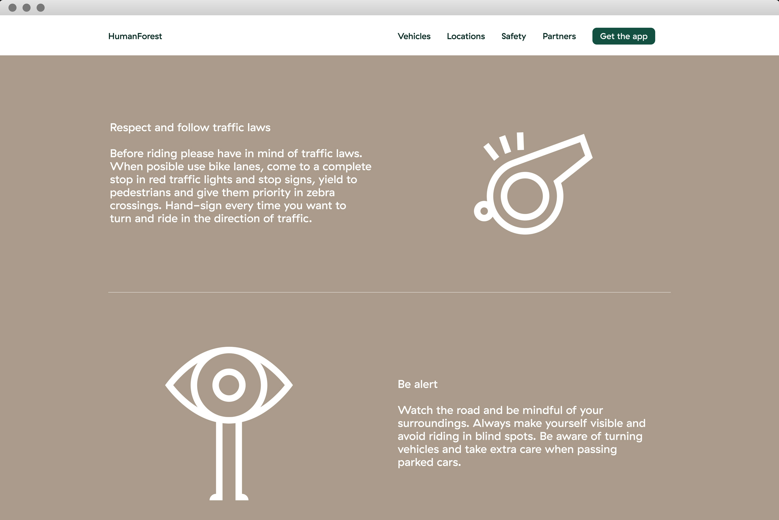
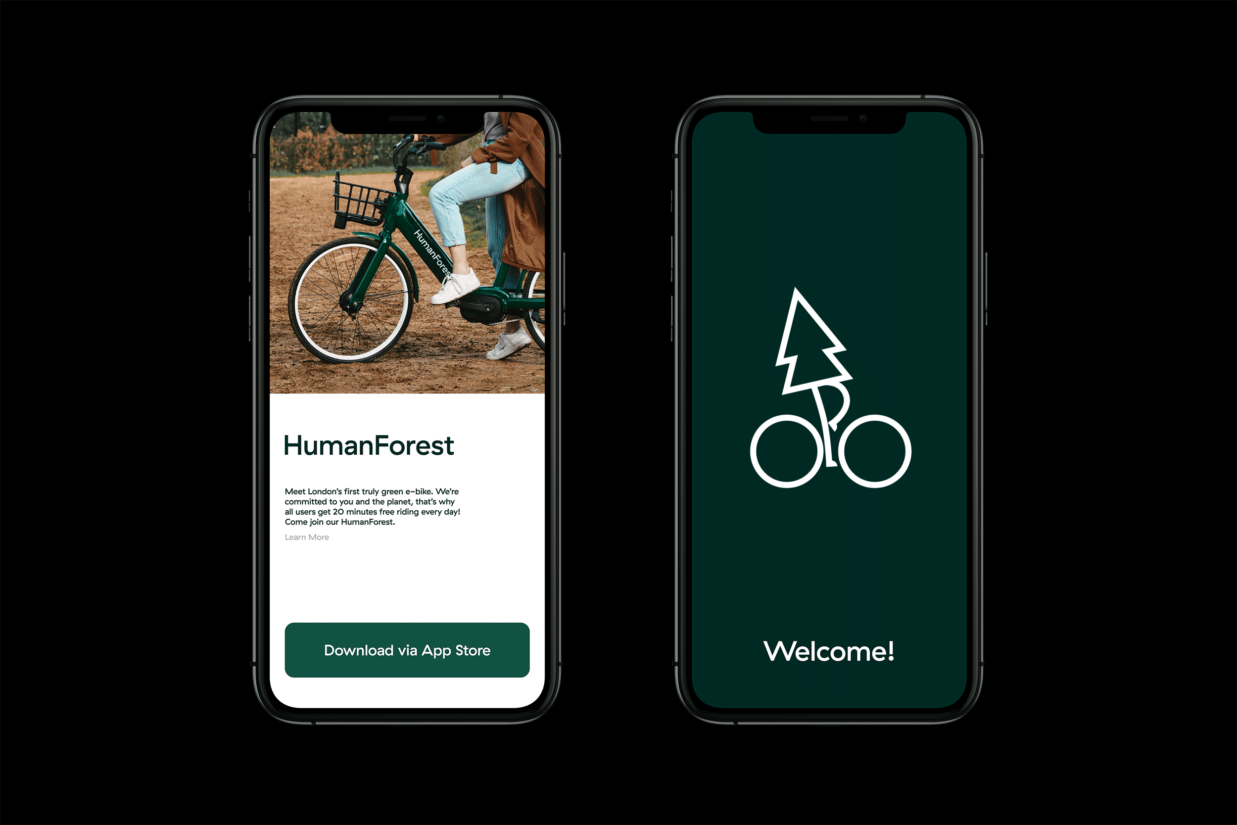
HumanForest is a new mobility company focused on helping cities around the world reduce CO2 emissions and become greener, healthier places to work, live and play. They were looking to launch a new brand in a loud market and establish a clear point of difference – ensuring that the brand complemented it’s environment and culture. The brand needed to communicate their environmentally conscious values as a standalone identity and extend to include their electric bikes (powered by renewable energy) and future transport initiatives.

The Design Response:
A collection of whimsical animated characters personify the brand concept and create a sense of community and collective effort. Key design considerations around colour and messaging represented an opportunity to capture classic British culture and ensure the brand complements the environment – a definitive aesthetic point of difference to competing brands.
The primary green (inspired by historic British racing hues) gives the bikes an understated and fashionable look. A supporting palette of organic tones look to add a natural feel across digital and physical outputs. The logotype and core messaging is set in Haptik, offering a charming set of letterforms to communicate the light-hearted copy.
The Collaborators:
Design – Studio South
Character Animation – Parallel Teeth
Web Development – New Territory