Fresh From The Field — Don’t settle for ‘meh’ by Curious Design
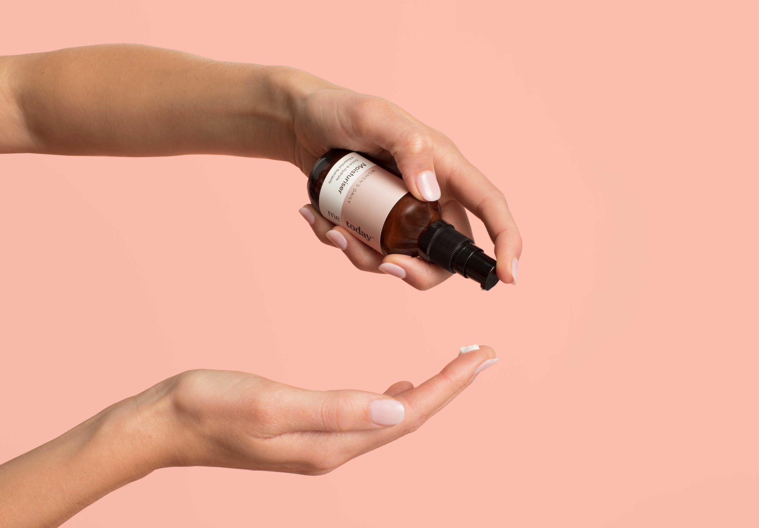
This Fresh From The Field by Curious Design features a beautiful warm palette, sophisticated typographic treatment and a nod to old-school apothecary aesthetics while ensuring these premium products are fresh and distinctive in the wellness category.
If you have new or recent work that you would like to share in Fresh from the Field email nicole@designassembly.org.nz for details.

The Brief:
Personal best feels different to everyone, but we all know when we’re not feeling our best. Being busy is a daily reality, yet the funny thing is when life says slow down, we say no. Why? Because we don’t want to. Life shouldn’t force us to compromise or make sacrifices. We want to live our best life in our own way.
Enter me | today. They’re here to help you unlock your best tomorrow by giving you the best products for your body’s needs, whilst also nourishing and empowering your mind through education.
Their skincare range is proudly cruelty free, contains no parabens, sls/sles or phthalates and is rich in botanicals, antioxidants & vitamins. While their supplements are made from premium quality formulas with highly absorbable ingredients for easy ingestion and maximum efficacy. And here’s the clever part. me|today have created targeted categories that allow specific products to be ‘paired up’. For example if you are taking the Women’s Daily essential vitamins and minerals in the supplement range, the Women’s Daily moisturiser and serum in the skincare range have been carefully fomulated to act as a perfect complement. Nice.
Curious was approached to create a premium lifestyle brand that could provide a modern alternative to consumers health, wellness and beauty needs.

The Response:
The process started with creating a name that encapsulated the brand essence of ‘living our best life without compromise or making sacrifices’. After exploring many different territories and collaborating closely with our client, the final result was the beautifully evocative and inspiring me|today.
To set the tone for the visual language, it was essential that the transparent values of the brand and its close connection to each individual consumer was reflected in the me|today marque. This was achieved through the introduction of an elegant serif font featuring lower case characters and thoughtfully considered spacing. A typographic statement that speaks in a very personal and quietly authoritative tone of voice. A simple vertical bar was then integrated between the two words to add a memorable graphic element and to ensure that each key word could be considered independently, as well as a holistic statement. This simplicity and clarity of message was then applied to both the supplement and skincare packaging.

All of the ‘physical’ packaging is either made from glass or recyclable cardboard, which is a direct correlation to the brand’s environmental values. The amber glass also adds an undercurrent of integrity and apothecary-inspired tradition. The contemporary lifestyle ethos has then been folded in via a sharp graphic design programme, which creates a balance of powerful shelf impact with an ease of navigation for the consumer.
Distinctive colour blocking clearly differentiate each category and clean, ‘white space’ panels house all key information in a functional coherent manner. Simple icons were also created to visually support the product benefits and increase consumer interaction.

The overall colour palette for the supplement range was very carefully considered, as colour psychology plays such a huge role in the consumer’s decision-making process. The final executions for each category were strong enough hues to denote efficacy, but subtle enough to engender a sense of comfort and reassurance. The products in the skincare range were then closely aligned to the relevant supplement categories, but their tonal values were made lighter and a pearlised varnish was added. This created a softer, ‘beauty oriented’ mood that is relevant to the more female skewed target demographic.
Finally all of the labels and cartons were finished with a soft touch matte effect and selective embossing was introduced to increase the premium cues.


