Fresh From The Field — Kiwi Spirit Distillery by Plato Creative
This Fresh From The Field features a brand strategy with refined typographic detailing and packaging design that instills ambition for a craft-focused local distillery by Plato Creative.
If you have new or recent work that you would like to share in Fresh from the Field email Louise for details.
The Brief:
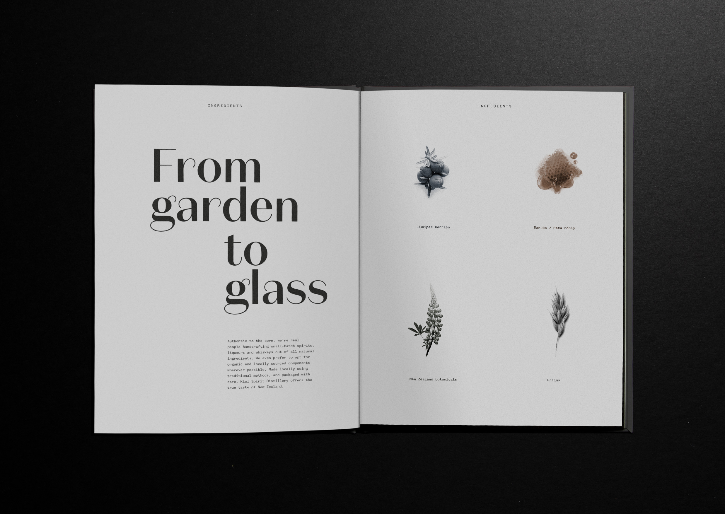
Kiwi Spirit Distillery are artisan producers of high quality spirits, liqueurs and whiskeys, handcrafted in small batches. They believe in quality over quantity above all else; a value that touches every part of what they do and who they are – from natural homegrown ingredients to traditional artisan methods and sustainable practices. They had a pure story to tell, with a pure range of products to match. The challenge lay with bringing these two together using a parent brand at the top to oversee future change while speaking to past foundations.
The Response:
For the pure of soul — Audience research revealed there’s a special type of person who indulges for the same reason as the owners. These people with similar beliefs felt appropriate to refer to them as ‘the pure of soul’ – an audience who understand they have one life to live by seeking quality and goodness in everything.
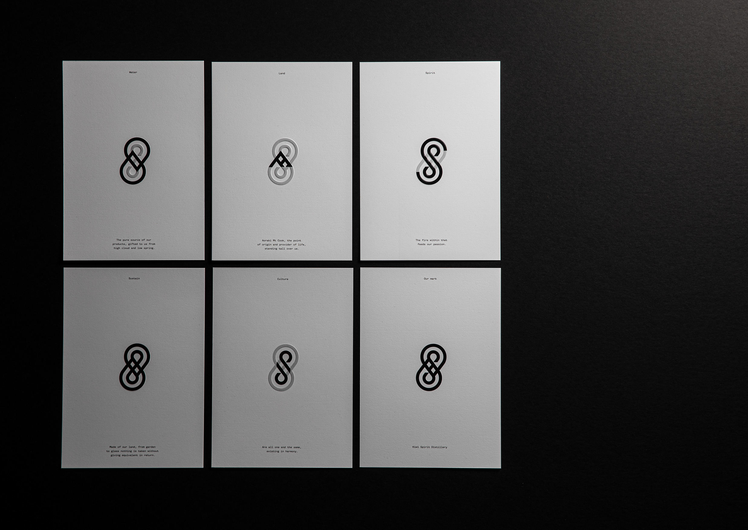
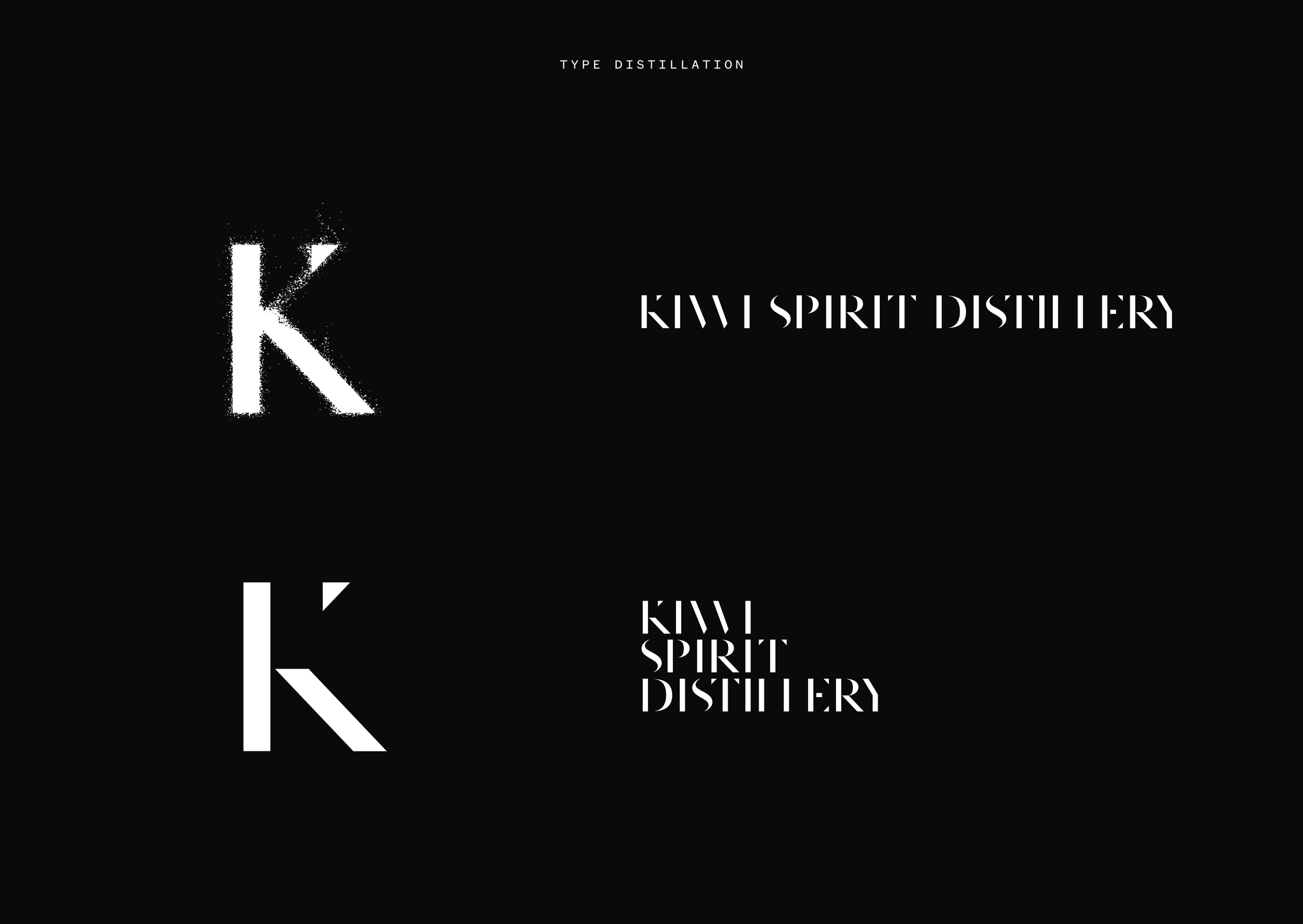
The motif was the first point of connection for these consumers on their journey for quality. It had to be a symbol of craft and sophistication in its simplicity; imbued in it the pillars of the brand.
Designed to stay in the mind and be a beacon of good taste for anyone hunting for a good drop. The logo speaks more to the process, standard typography distilled down into its purest form becoming something different, something new.

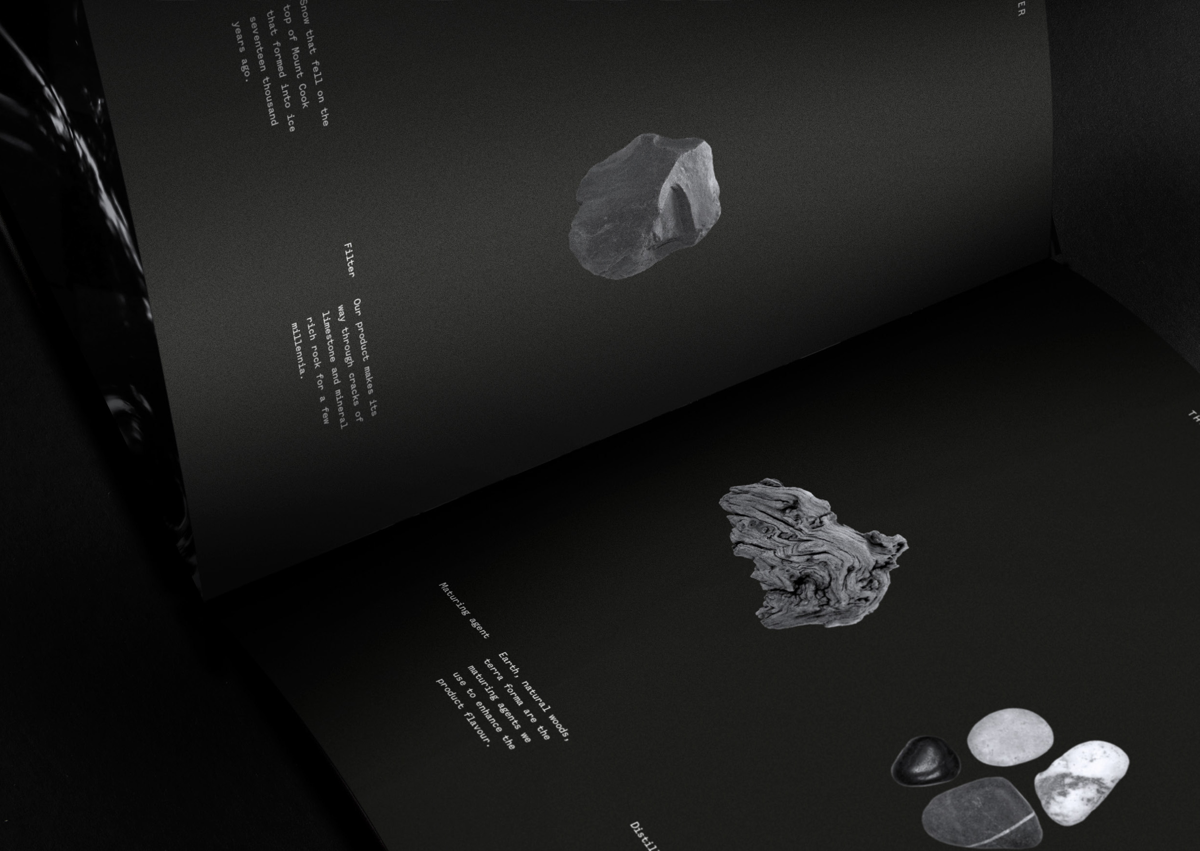
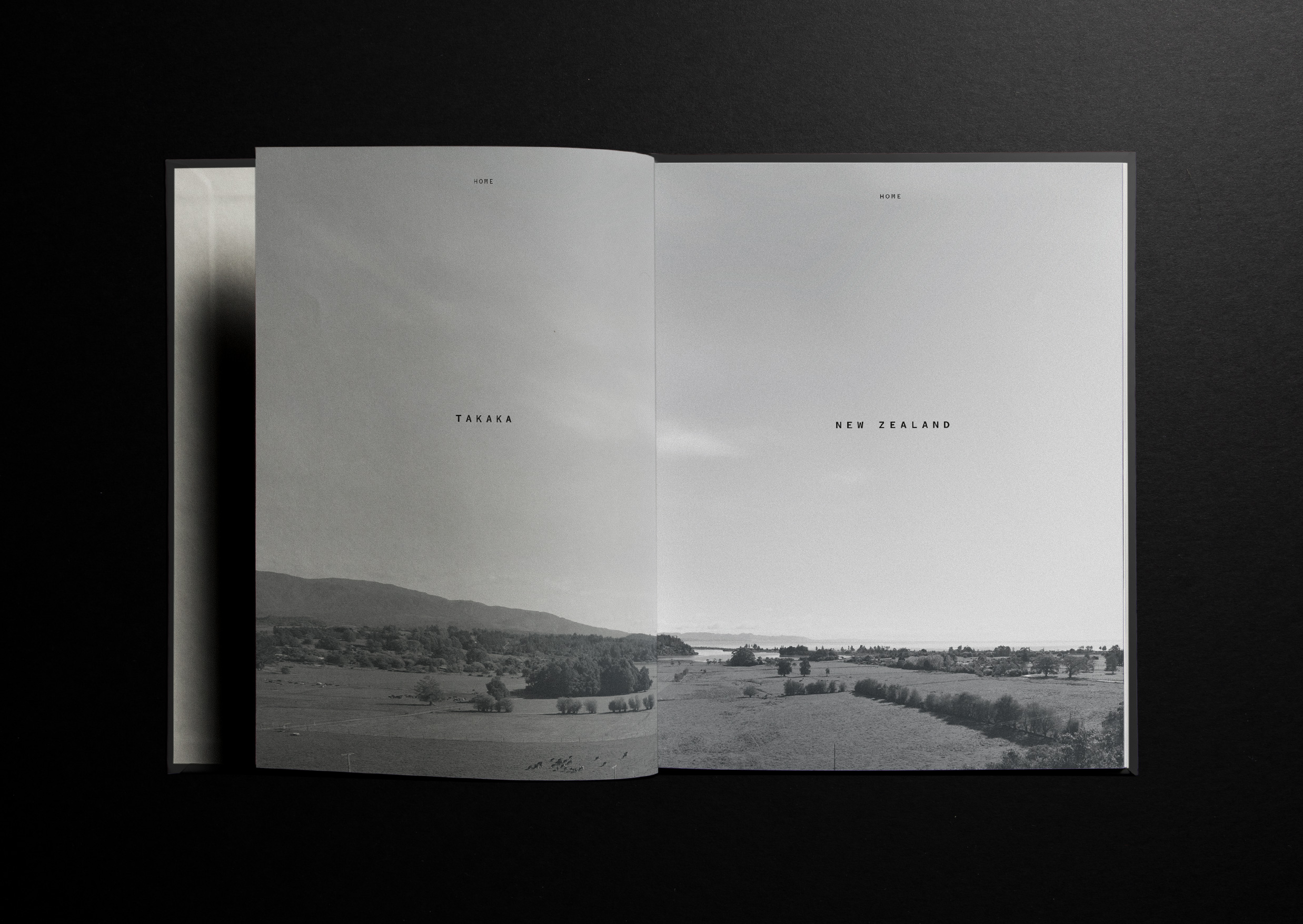
There’s something in the water — Water is the brand’s key influence; going on a journey for thousands of years before rising as the purest element of our land. It determines the calibre of the products and it is ingrained in the Kiwi Spirit Distillery story. Complex – water is fluid yet determined; carving stone and feeding the land. It dictates the design through the use of natural elemental textures from nature and a colour palette that brings strength, mystery and elegance.
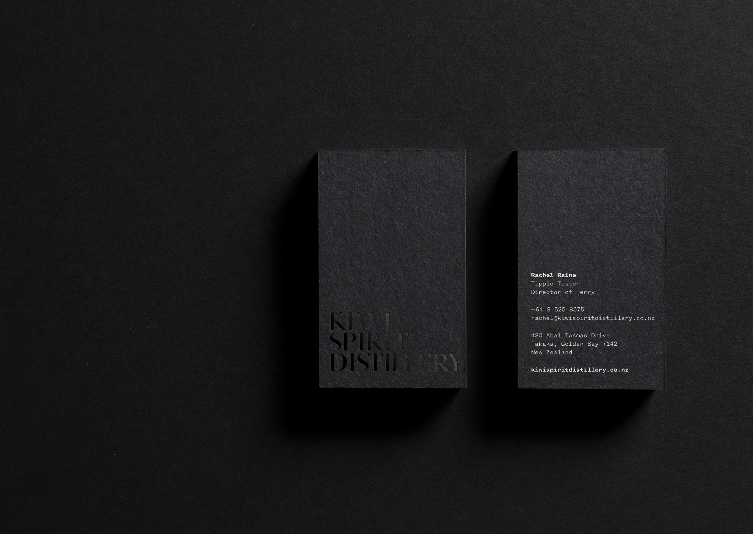
Adaptable across a range of Kiwi Spirit Distillery’s products as well as their sub-brands, the parent brand is quietly bold and timeless, and truly exemplifies the passion, ethics and ambition inside each bottle.