Fresh From The Field — Supertrash by Seachange
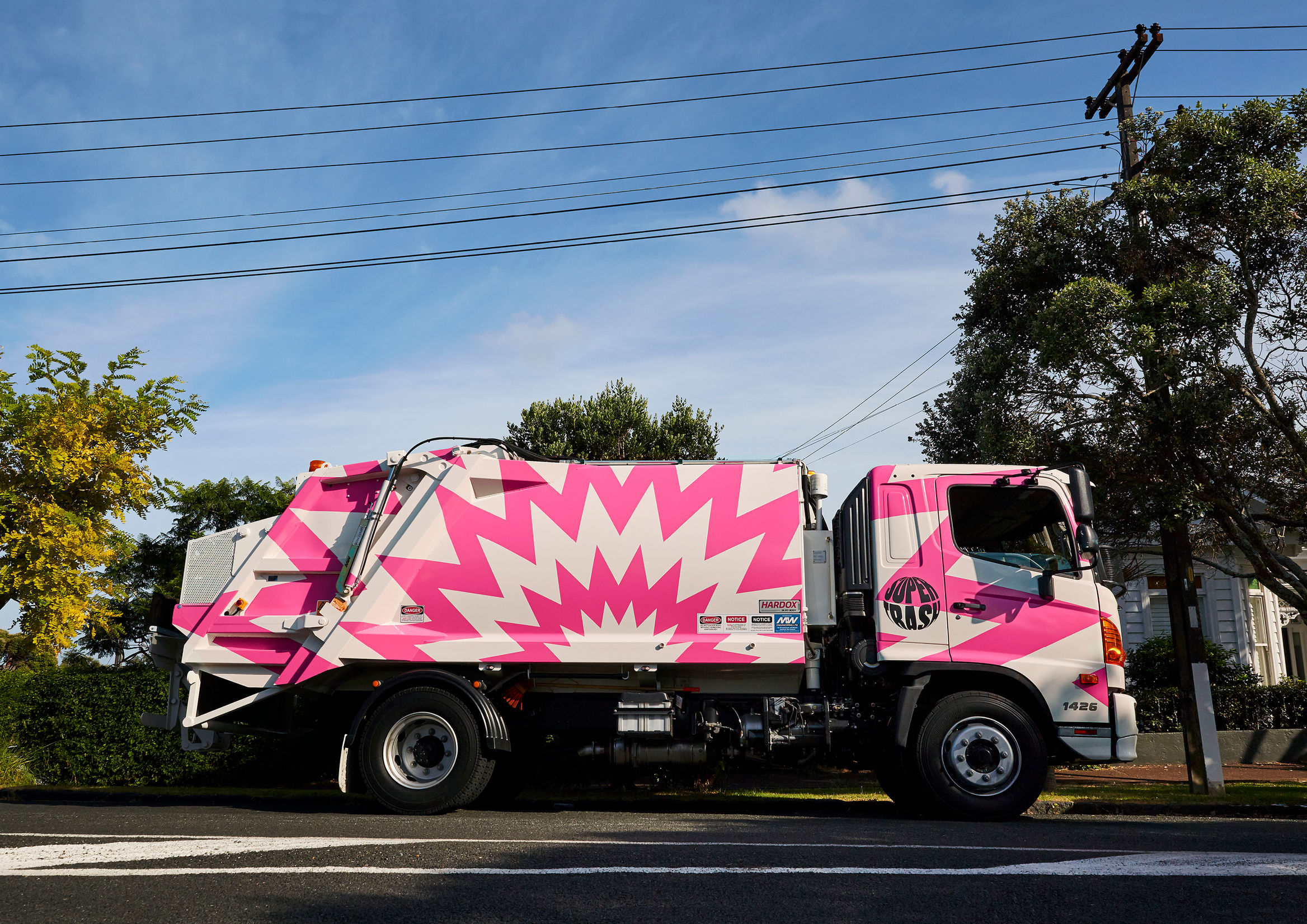
This Fresh From The Field features bold branding by Seachange Studio for an awesome company reducing the load on our planet, diverting waste from landfill.
If you have new or recent work that you would like to share in Fresh from the Field email Louise for details.

The Brief:
Supertrash is a small, family-run collection service with a big purpose; to help divert waste from landfill through circular solutions. Since 2012 Supertrash have diverted almost 6 million kg of waste from going to landfill.

The Response:
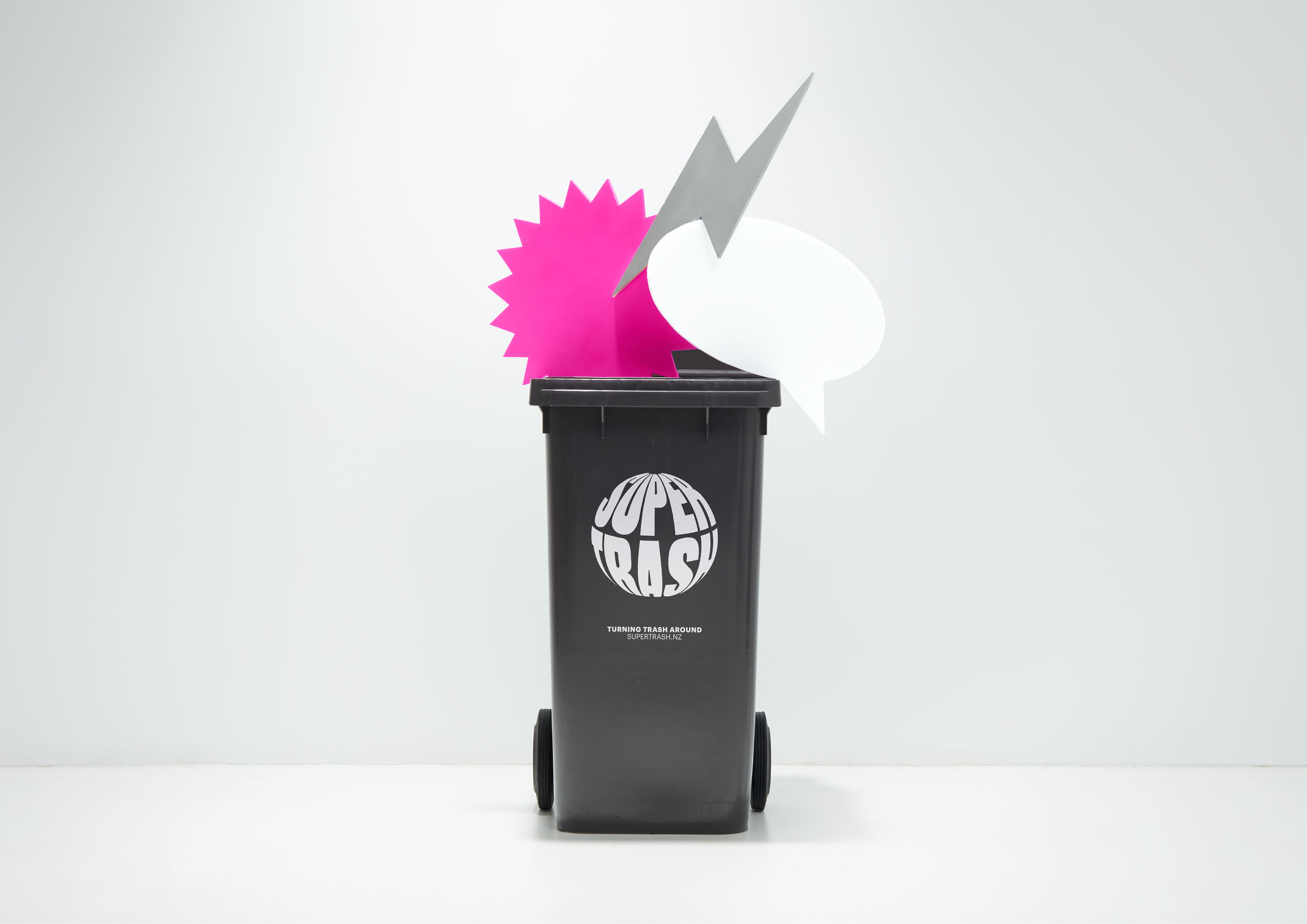
Seachange Studio’s strategy was to position Supertrash as the new-school, innovative, energetic and youthful player, who truly embrace the idea of a circular economy.

They wanted the entire brand to be informed by the concept of a circular economy, something Supertrash is working hard towards. At its heart, this is expressed with an iconic globe logo underpinned with our brand proposition; Turning Trash Around. The logo animates in digital environments by spinning, referencing the global scale our actions impact upon. The identity adopts fluro pink, a colour that has never been used in this sector and was completely unexpected.
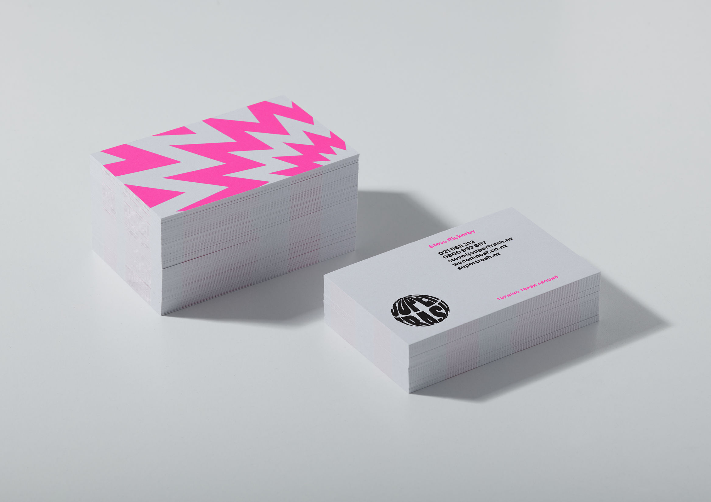
Seachange distilled reference points of ‘superheroes’ (stretched and distorted typography), ‘pop art’ (bold shapes and disruptive messaging) and ‘repurposing’ by overprinting typography and graphic elements to suggest recycling and reusing.