Fresh From The Field: photoED Logo Update – By Tanker Creative
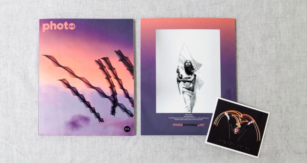
Sometimes the smallest changes make the biggest difference. Tanker Creative’s refresh of photoED builds on a familiar foundation while creating a stronger, more contemporary identity.
Fresh from the Field is a weekly article series sharing fresh and inspiring work from the Design Assembly community. Want to submit your work to Fresh From The Field? Fill out the form here.
The brief
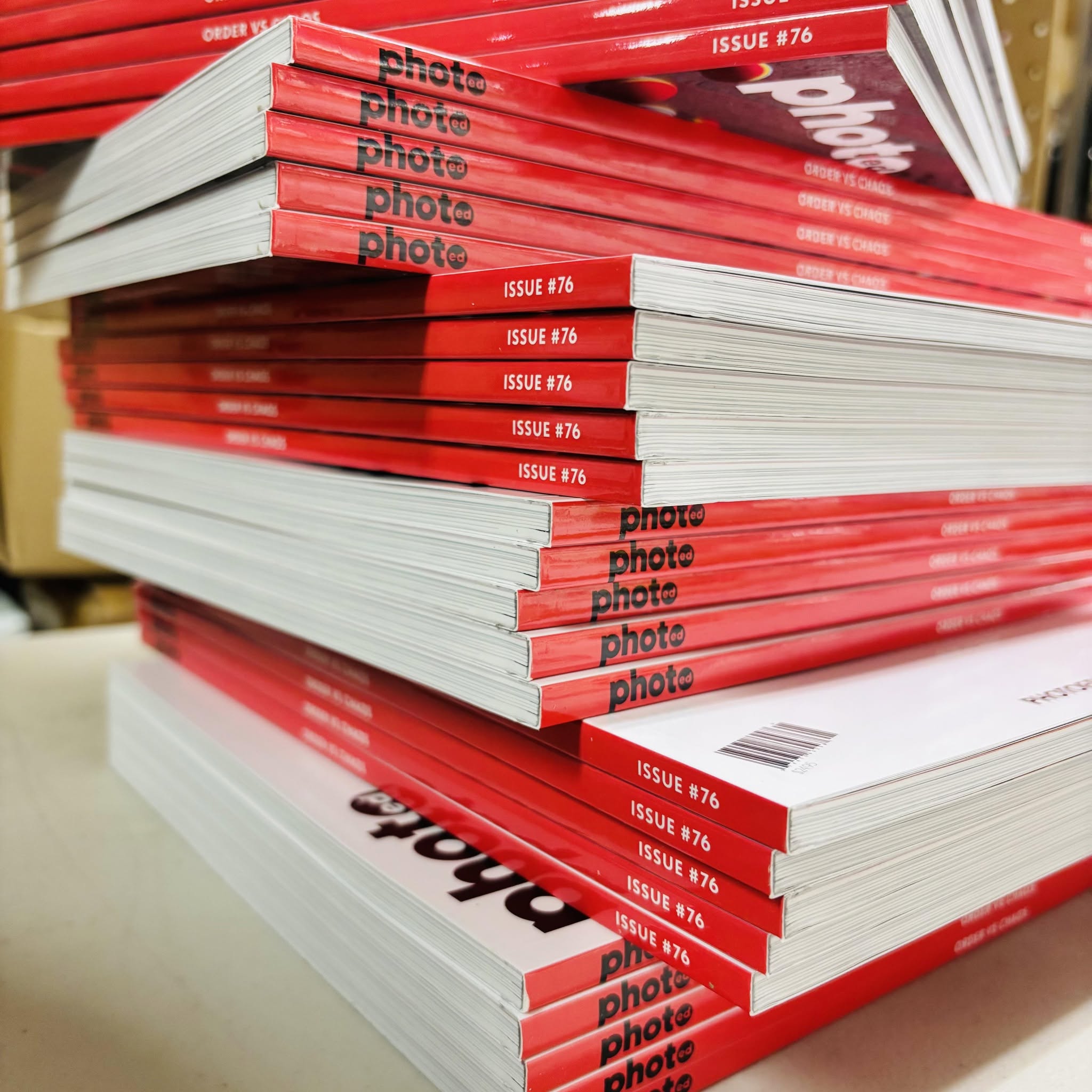
photoED is a leading creative content publisher in the editorial photography space based in Canada with a global reach that spans print, digital, and social media worldwide.
First established in 2001, photoED delivers insights to professionals, students, educators, and enthusiasts internationally through its website and thematically focused print magazine, featuring the work and interviews of photographers alongside photography-based educational resources.
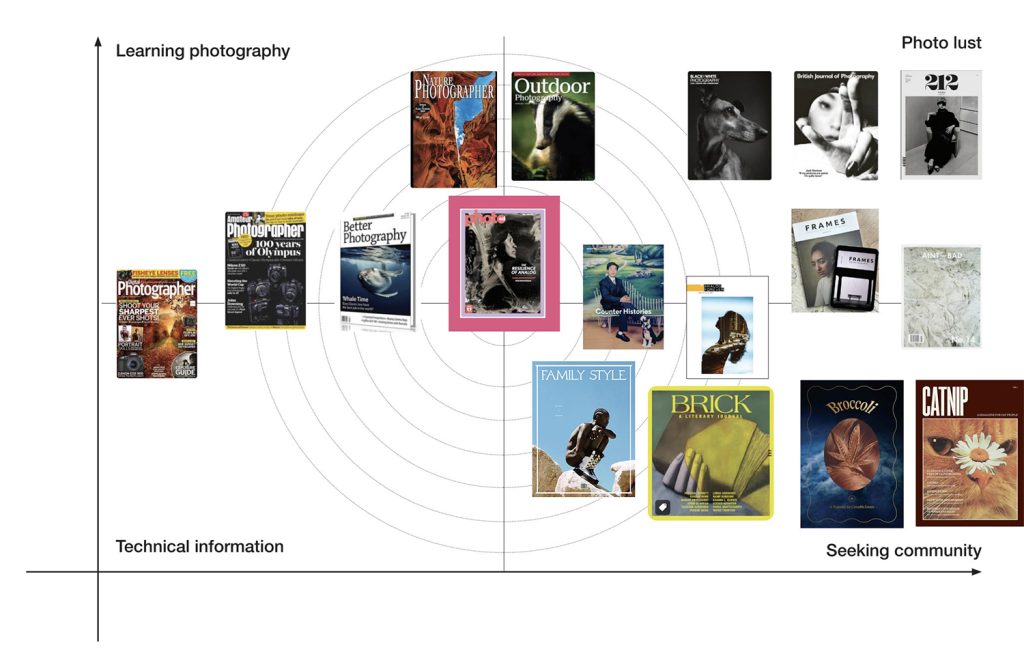
The brief for refining the logo began with a branding analysis of both the print edition logo and website design. This included a review of the organisation’s mission, vision, goals, target markets, and broader ecosystem to better understand where photoED sits within the editorial photography landscape.
From this research, the team at Tanks developed recommendations and a strategy for approaching the brand refresh.

The design response
The refresh process included the development of Semantic Differentials to guide and evaluate the design direction. The desired positioning centred around Community, Photography, Curatorial/Expert, and Editorial.
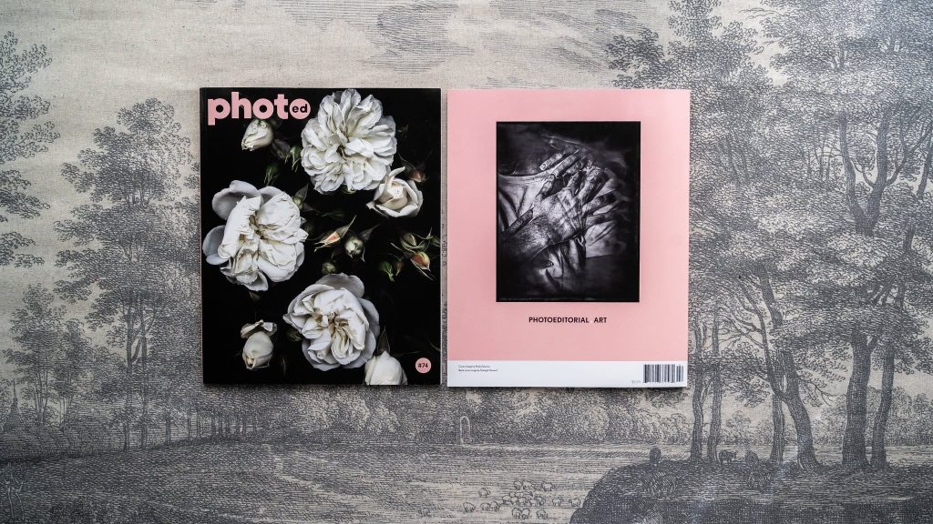
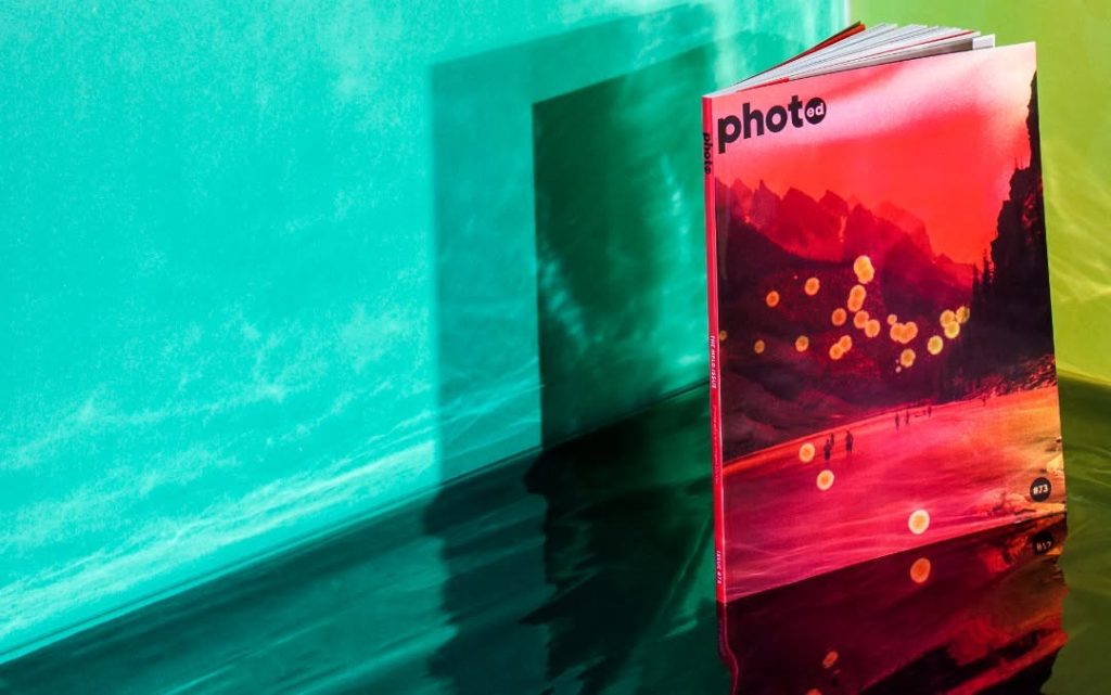
From this foundation, the team developed and refined a solution that referenced the original logo while introducing subtle updates to strengthen its impact. Adjustments to the typeface and customisation of letterforms created a rounder, more spacious, and contemporary identity while maintaining familiarity with the existing brand.
The result is a refined visual identity that better reflects photoED’s position as a trusted voice within the global photography community while supporting its continued growth across print, digital, and social channels.
The design team
Nicola Devine in collaboration with Melanie Hight
PhotED Case study
LinkedIn
Instagram
Facebook
The client team
PhotoED for Intentional Photographers: seeking authentic, process-driven stories;
Culture Vultures: who feel good about surrounding themselves with quality content and ideas.