5 minutes with… Nick Kapica
We chatted with Nick Kapica, Principal at Isthmus Group ltd, about working at the interface between visual and urban design.

What is your background and how did you get into design?
I studied Visual Communication at Ravensbourne College of Design and Communication. I originally wanted to study filmmaking but saw a type class taking place and decided on the spot that was for me. I think I have always been surrounded by design, my father was an architect and consequently the home was an ongoing exploration. Later I became involved in theatre and I really enjoyed the way a theatre constantly adapts and changes, each production a prototype, each audience are participating in the result.
Working in a multidisciplinary practice like Isthmus enables you to cross-pollinate into other areas of design – what do you find most exciting about the intersection of graphic and urban design?
I was always missing something with graphic design and I think it was scale. I used to use slide projectors to put type and graphics onto buildings just because I wanted to see them really big. I love cities and I have always been attracted to them so being able to combine graphic design and the city is really appealing. What I really like about working at Isthmus is we don’t talk about ‘multi’ disciplinary, but rather ‘inter’ disciplinary — we are integrating knowledge and methods from different disciplines, we are all working in the overlap. I bring some specific skills but we are all working together to challenge a problem from all viewpoints until we find the best solution.
What does a typical working day at Isthmus involve?
I have been with Isthmus six weeks now, I don’t think I have had a typical day yet, I am not sure there will be one either! Today I got up early and came down to the Auckland studio where I have been working with a project team exploring font choices for a typographic installation on a very long handrail. This evening I am with another project team in Dargaville preparing for a community engagement workshop that will help deliver a township masterplan. Tomorrow we will be in an all day workshop with Dargaville residents and on Friday I will be back in Wellington working on an integrated public transport hub.
What project, personal or professional, are you most proud of and why?
I do believe you are only as good as your last project, I haven’t been at Isthmus long enough to complete one so I guess I need to look back to the work I was doing at Wellington City Council. As Design Lead with the Design Team I was involved in many great projects but perhaps I am most proud of growing the capability of the team towards an outcome focus rather than an output focus. That involved pushing design thinking into all areas of the city council and helping all teams take a people centred approach to what they are doing.
How did you get involved with SEGD?
In 2010 I was teaching at Massey University and setting up a new course called Spatial Typography aimed at Visual Communication and Spatial Design students who wanted to learn more from each others specialist areas and combine this knowledge to tackle environmental graphic design challenges. While I was researching resources I stumbled across the Society of Experiential Graphic Design (SEGD) website which was full of great information and projects. I went to their annual conference and met the really friendly membership and really enjoyed the conference, I decided to join. As I realised this was the best design association that I have been a member of (I have tried 2 others) I decided Wellington needed its own chapter so together with Jo Bailey we set one up. We have 3 events a year and have organised 2 Off Grid conferences.
What advice do you have for designers getting started with environmental graphics or visual design for the built environment?
Make sure you put people at the centre of your thinking, especially if you are developing wayfinding or interpretive signage. Practice understanding physical space, you might be great at working in a book format or poster but pay attention to how spaces work. Make sure your typography is spot on, mistakes look worse when they are the size of a building.
In your opinion what 3 factors will have the greatest impact on New Zealand’s design scene in the next 5 years?
- Changes in design education programmes are resulting in designers with a stronger people focused approach and a less discipline output specific focus.
- The ongoing convergence of design disciplines towards interdisciplinarity and transdisciplinarity.
- Clients embracing design to help understand and define what the real problems are before asking for specific solutions. Designers are getting asked to help define outcomes before producing outputs.
And finally, where to next for you? What areas of your work or personal development are you hoping to explore further?
I joined Isthmus because I wanted to get closer to influencing the cities we live in. I wanted to find somewhere that would challenge me and my thinking and make sure I keep learning. At Isthmus I can work together with architects, landscape architects, and urban designers and together explore the subject that I am currently fascinated with — cities.
Wellington City Council Design Team
City Wayfinding Prototype, Building the Blue, 10 Year Plan, and Pedestrian Safety were completed while I was Design Lead at the Wellington City Council. These projects were realised with the fantastic design team: Jacob Howard, Darren Switalla, Margy Davenport, Isaac Laughton, Johannes Bay, James Calcinai.
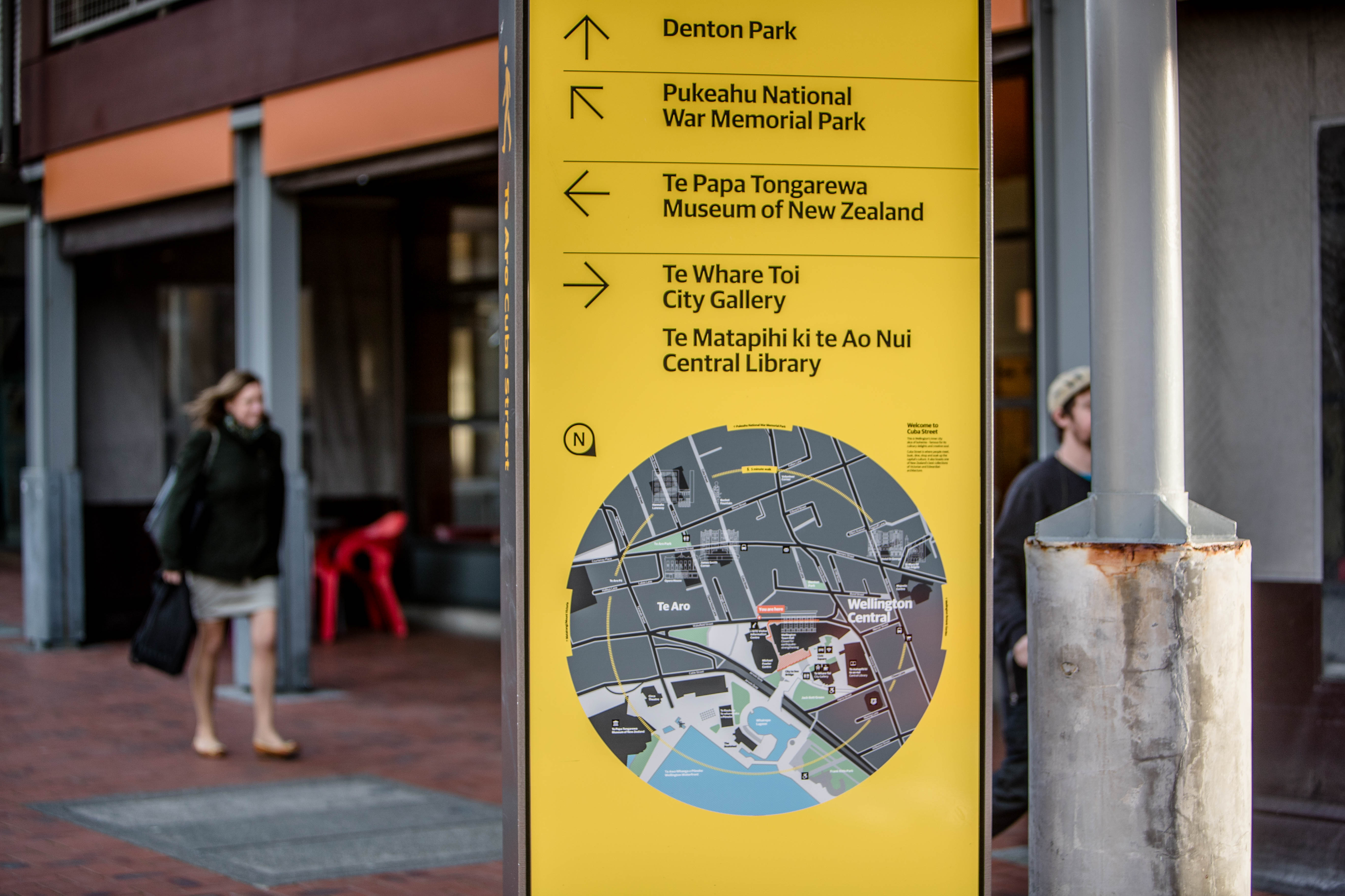
City Wayfinding Prototype, Wellington City Council was looking to address a range of needs: Encourage walking as a mode of transport, Help Wellington become a te reo Māori city, Enrich the tourist experience, Improve public health through exercise, Reduce car use for trips under 2km, and Increase retail spending. Walking is healthy, free and good for the environment. More people walking is good for the business and the public transport system. More people on the streets means a safer environment. City wayshowing systems can help first time visitors gain a better understanding of the city, and help residents discover new places and stories of the city. Quick prototype signs was installed to test user needs and explore how to modify existing street furniture to provide an improved wayfinding product.

Pedestrian Safety, Wellington City Council rolled out a pedestrian safety campaign aimed at encouraging pedestrians to actively look both ways before crossing the street. After the ‘Now You See Me’ campaign had been in place for a number of months a short survey explored reach and understanding of the campaign’s meaning. 1 in 10 of those who had visited the Golden Mile in the six months prior recalled seeing advertising featuring a yellow eye. Of these, almost a third correctly identified the meaning of the campaign without any prompting. When presented with the images used in the campaign, the ‘eye’ and ‘look’ images had the best recognition, with around two-thirds of the group recognising each. Images on the footpath and on posters were the most commonly recalled, and 85% agreed that the campaign images were eye-catching. The survey findings provided insight into the reach and likeability of the campaign with support for simple messages being placed on the kerb.

Building the Blue, The Wellington City Council internal visual identity has been built directly from their values. Reduced to simple shape representations to form the building blocks for illustration. For their internal voice, blue provides the primary colour, while still linking to our core Wellington city colours of yellow and black. Grey and white are used for versatility. The circle represents people: He tangata, he tangata, he tangata — We put people at the heart of what we do. The cross represents collaboration: Mahi ngātahi — We collaborate. The triangle represents improvement: Whakapai ake — We’re always improving. The square represents place: Mana tiaki — We care for our places.

10 Year Plan, The design team at WCC were asked to provoke a more diverse array of submissions on the Council’s Long-term Plan and increase engagement with younger generations. Working with the wider project team we initiated a co-design process and identified that the voice of the Wellingtonian resident was missing from the collateral that had already been produced. Using the city as a canvas, we projected grand-scale quotes from everyday Wellingtonians onto landmark buildings, including the Railway Station, Westpac Stadium, Town Hall and Te Papa. The projections ran a few evenings every week for a month during events with a lot of foot traffic. The project a triumph: there were more than 2000 public submissions on Our 10-Year Plan — more than double the number for the Long-term Plan 2015–25. Most interestingly, while 19 to 30-year-olds make up only 19 percent of the population, they accounted for 24 percent of the submissions. In fact, half the overall submissions made were from people under 40.

Isthmus Group
Design Team: Sophie Jacques, Aaron Miller, Andre de Graaf, James Pattullo, Ralph Johns, Earl Rutherford, Michael Strack, Daniel Males, Stefan Beconcini.
Folding Planes, North Kumutoto
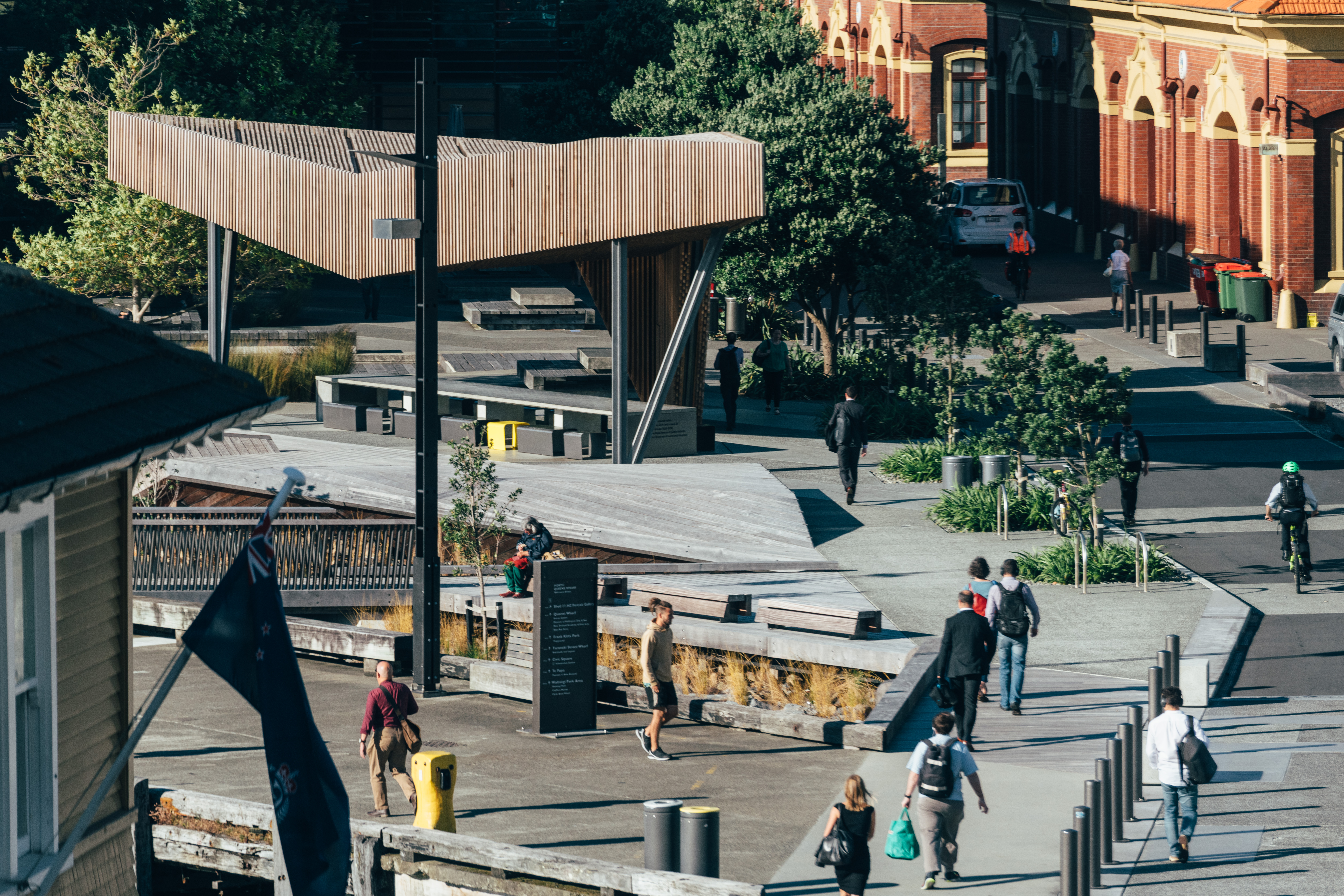
North Kumutoto is a series of flexible public spaces providing new opportunities for leisure activities and a chance to get right down to the water. A key piece of the work is the folded-timber deck that transitions seamlessly into with a small pavilion – a place for shade and partial shelter; respite from the elements. The pavilion, with its playful design and warm surface textures is composed of a matrix of timber battens formed into cassettes and attached to steel-lattice trusses. Wellington City Council shared our commitment to the specification of materials and systems with low environmental impact and design detailing that minimises waste and simplifies maintenance. Illumination of the public space beneath at night was set at ambient levels to minimise light pollution and reflected the dappled light that penetrates the canopy by day.
The Wellington Waterfront is an environment of extremes. From crystal clear summer days to bone chilling winter storms. The pavilion is a permeable structure that shades and protects while being allowed to ‘breathe’ with the changing environment. The inclined timber decking creates areas for informal play and social interaction as it dips down to the coastal planting amongst the riprap. Seamlessly integrating seats into its folds as users tuck themselves out of the wind. The crafted steel structure supports 9,860 cedar battens which hover lightly overhead a community dining table for people to once again gather in a place where land meets the sea.
A decade ago, the first phase of work at Kumutoto tied the waterfront back to the city and acknowledged the history and cultural importance of the area. The Kumutoto Precinct sits on reclaimed land; since the 1840’s and 1970’s, this has moved the water’s edge almost 300 metres from the historic shoreline. A change in emphasis from a working port to a recreational, cultural and commercial area, the Kumutoto Precinct (completed in 2006) and this new build have balanced the expression of the historic character with new public amenity.
The original success of Kumutoto’s design is derived from both its flexibility and the way it incorporates the characteristics and materiality of the pre-existing working waterfront. Although new at the time, it was also familiar and appropriate. Stage two also adheres to this theme. Folded timber decking forms much of the ground plane metaphorical of the ever-present tectonic forces, and is at the same time playful in nature, creating a landform that floats above the coastal edge protecting and creating habitats for both fauna and flora below. The inclined timber decking creates areas for informal play as it dips down to the coastal planting amongst the riprap.
North Kumutoto Pavilion itself is an upward abstraction of the folded ground plane. In doing so, the surface undergoes a distillation to lightness as it is transformed into an overhead canopy casting dappled light while providing shading and visual containment. It was conceived as a reinterpretation of Wellington’s wharves, the public space ‘floating’ above the coastal edge to shield and create habitats for flora and fauna (including kororā – little blue penguins).
Importantly heritage advisors and archaeologists have been key contributors ensuring the significance of the heritage buildings, features and elements are recorded, restored and protected. The area continues to be a working port, and this provides a vital historic link between the past and the present. Subtly represented we have traced the original footprint of Custom House, which also helps frame the laneway. The 1903 seawall trace is continued using an oxide concrete kerb. The original heritage wharf gates aligned with Ballance Street (once a less significant entrance to the working waterfront) have been kept closed, restored and retained in their current (original) configuration with associated planting.
Wellington City Council, as long term stewards of the environment, shared our commitment to the specification of materials and systems with low environmental impact and design detailing that minimises waste and simplifies maintenance. The cedar battens were PEFC (Programme for the Endorsement of Forest Certification) sourced and prefabricated into frames off site, the controlled environment allowing a high quality, accurate finish while minimising timber wastage. Illumination of the public space beneath at night was set at ambient levels to minimise light pollution and reflected the dappled light that penetrates the canopy by day.
