Fresh from the Field — Vitafresh by Onfire Design
This Fresh From The Field features Branding for Vitafresh by Onfire Design which seeks to Revitalise a lacklustre product category
If you have new or recent work that you would like to share in Fresh from the Field email Louise for details.
The Brief:
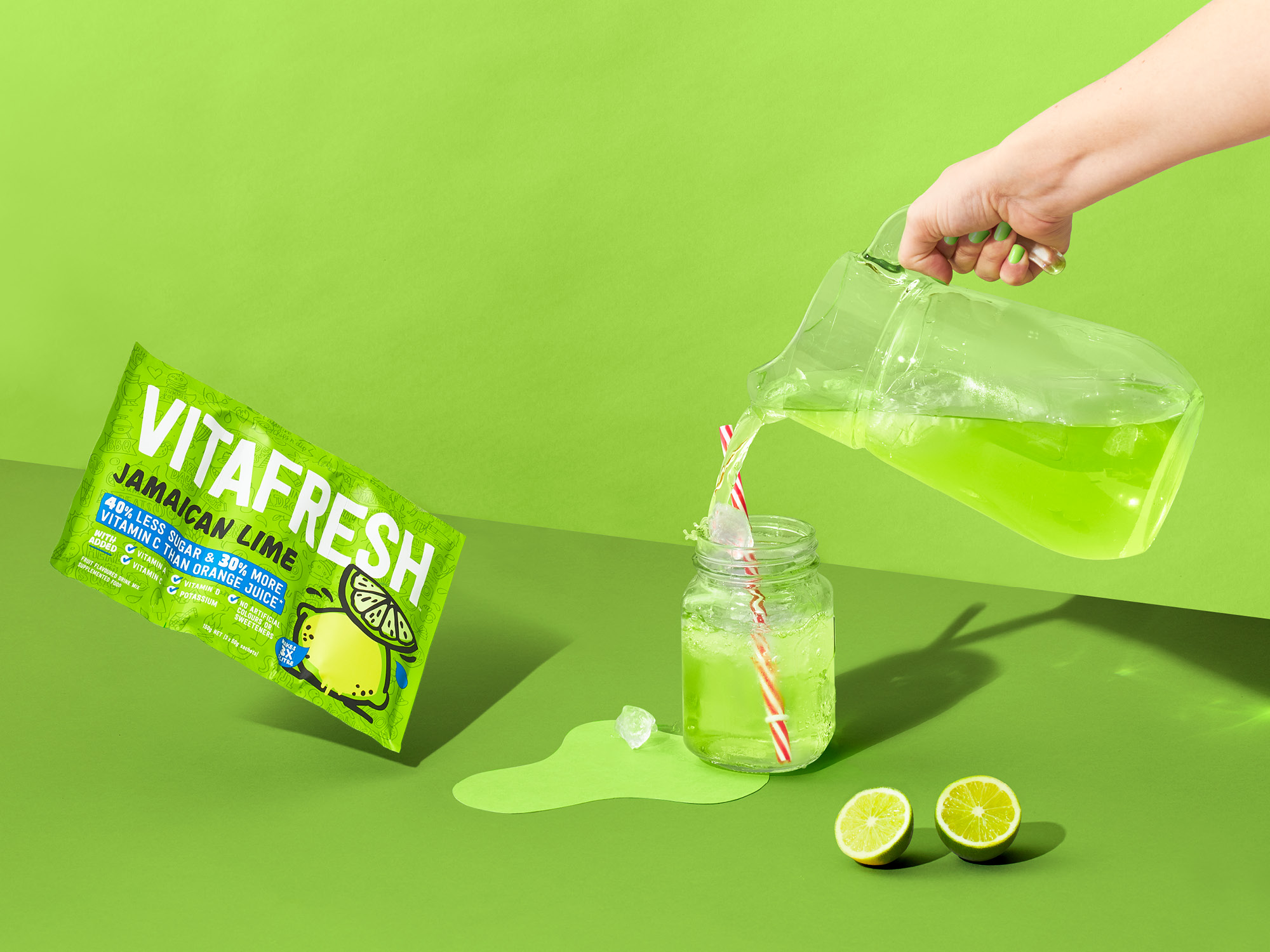
Known for its range of flavours and ease of use, Vitafresh flavoured water powders have been a firm favourite for Kiwi families since the 1980’s. The supermarket flavoured water category is a confusing mix of pack formats and brands with a mass of product messaging. The aisle was also often overlooked from a brand maintenance point of view and had also attained a reputation of products high in sugar and lacking any health benefits. Walter & Wild saw the opportunity of revitalising the category by rethinking the Vitafresh product formulation, fortifying the products with vitamins and minerals, and a new packaging format which cut down on materials and manufacturing costs. In doing so the brand would raise the bar for the category and improve the shelf impact which needed to be refreshingly bold, fun and aspirational.
The challenge for Vitafresh was to remain true to its core roots while embracing the daring and bold new vision for the brand.

The response:
Onfire Design recreated the brand into a simple, tall and proud brand mark which stretched across the entire new 3 sachet pack format which shouts out of a new brighter colour palette. A new cartoon-stylised illustration set of flavour callouts were created which added the fun factor back into the packaging. A subtle background illustration helped tell the Vitafresh lifestyle story, all based around vitality, summer vibes and the products multi uses. These new elements put the serious fun and enjoyment back into the brand and seriously shakes up the category with new energy.


