Fresh from the Field — Real Rad Food by Afternoon
This Fresh From The Field features branding and packaging for Real Rad Food by afternoon.co.nz
If you have new or recent work that you would like to share in Fresh from the Field email Louise for details.
The Brief
Real Rad Food is a raw/plant-based deserts and treats brand based in Mt Maunganui. Hannah approached Afternoon to create a visual identity that captured the essence of her raw products while avoiding cliche natural elements. With a strong social media presence, it was important to create a unique brand that could be identified instantly while scrolling amongst newsfeeds.

The Response
When designing the visual identity for Real Rad Food, Afternoon founder & creative director Cambell Attwood focussed on two keywords, ‘Rad’ and ‘Raw’.
— Rad
Creating a logotype and typeface that communicated a playful and fun nature to their audience. Cambell wanted to keep these bold so they were still very legible and brought plenty of personality to the varying viewing sizes of print and digital.
— Raw
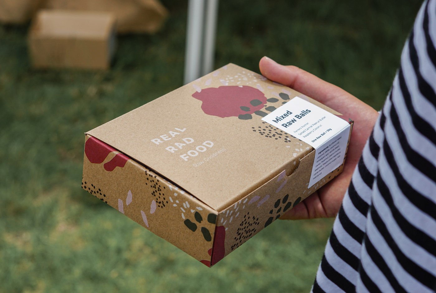
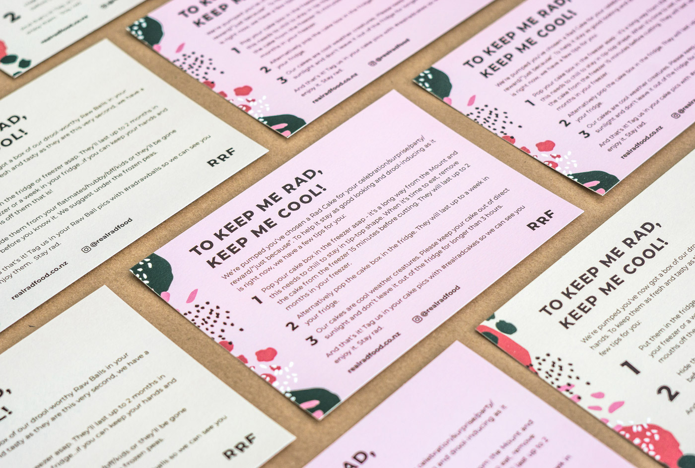
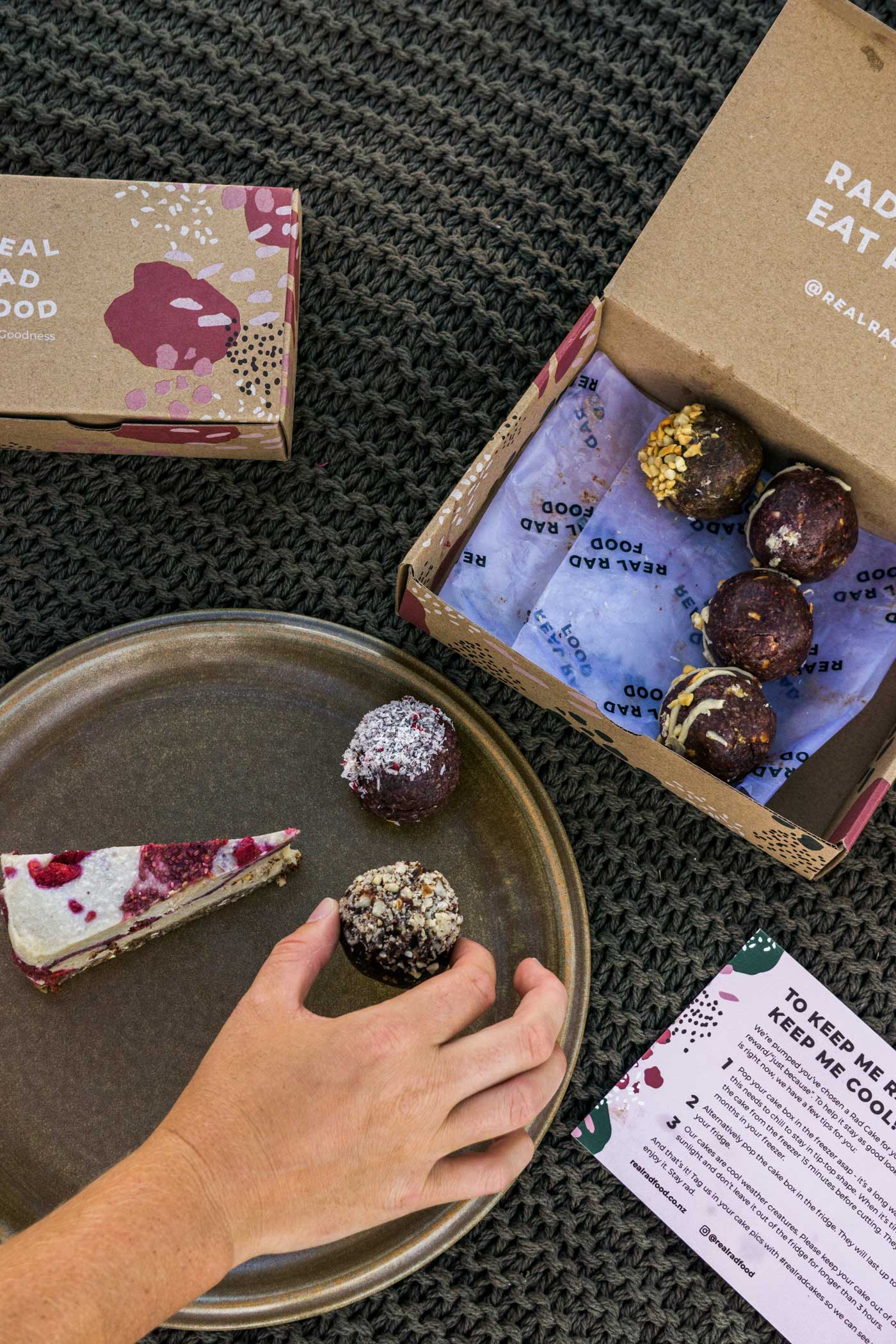
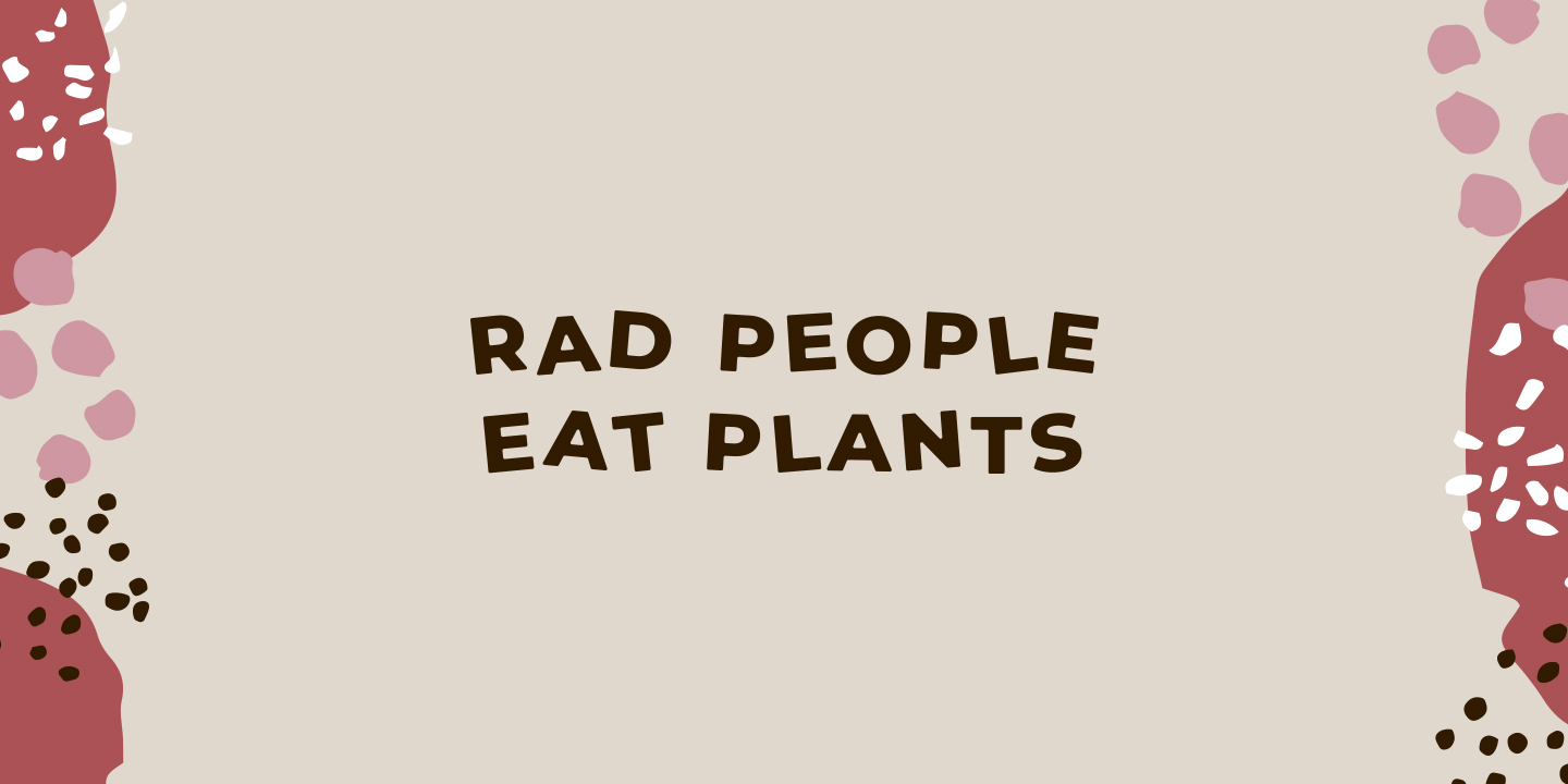
The raw nature of the brand is showcased through the use of pattern. The pattern was created by arranging shapes from crushed and flatten ingredients used in Real Rad Food’s treats and desserts. Pairing those shapes with a colour palette selected from nature and keeping the pinks from the existing brand to help with familirity. By selectively arranging these shapes and colours Cambell was able to create a pattern that not only feels raw but gives the brand a unique personality.
It was important when it came to the packaging that it was instantly identifiable as a lot of customers shared the RRF products over social media. Cambell specified a raw looking material and then arranged the brand pattern over it to further express the raw nature of the brand’s identity.
The Real Rad Website was developed by Webbros Digital https://www.webbros.co.nz/