Pepeha.nz – An internal kaupapa by Designworks for Aotearoa
Interview by Louise Kellerman
Supported by Creative New Zealand

This year Designworks undertook a personal studio project and created Pepeha.nz – a website to help all New Zealanders introduce themselves in Te Reo Māori, through pepeha. Encouraging everyone to learn the stories behind their pepeha and share them with pride.
In this article Anzac Tasker, Design Director at Designworks talks about the project, its intent, the design elements and where it will go from here.


How did the idea for creating these Pepeha prints come about?
A pepeha has been used for centuries here in Aotearoa to introduce yourself. The concept and meaning behind a pepeha is so beautiful and unique to both the individual delivering it and, to New Zealands cultural identity. We wanted to pay tribute to it’s strength and significance by giving people the opportunity to share it in a well crafted and considered way with the power of design.
How does the website work?
We’ve designed the interface to make it both educational and simple to use. Firstly it’s about giving everybody an understanding of what a pepeha is all about. How it connects you to people and places that are important to you. From there the user can then develop their own pepeha by populating the relevant layers of a pepeha, unique to their story. Once they’ve completed the journey, it designs you your own pepeha and translates it into English. From there, you can download a free jpeg for your device or have it printed as a gift for a loved one or for yourself as a more permanent artwork.
Can you tell us more about the typography for Pepeha.nz? What was the process you went through?
Anthony Hos, Designer and typographer at Designworks:
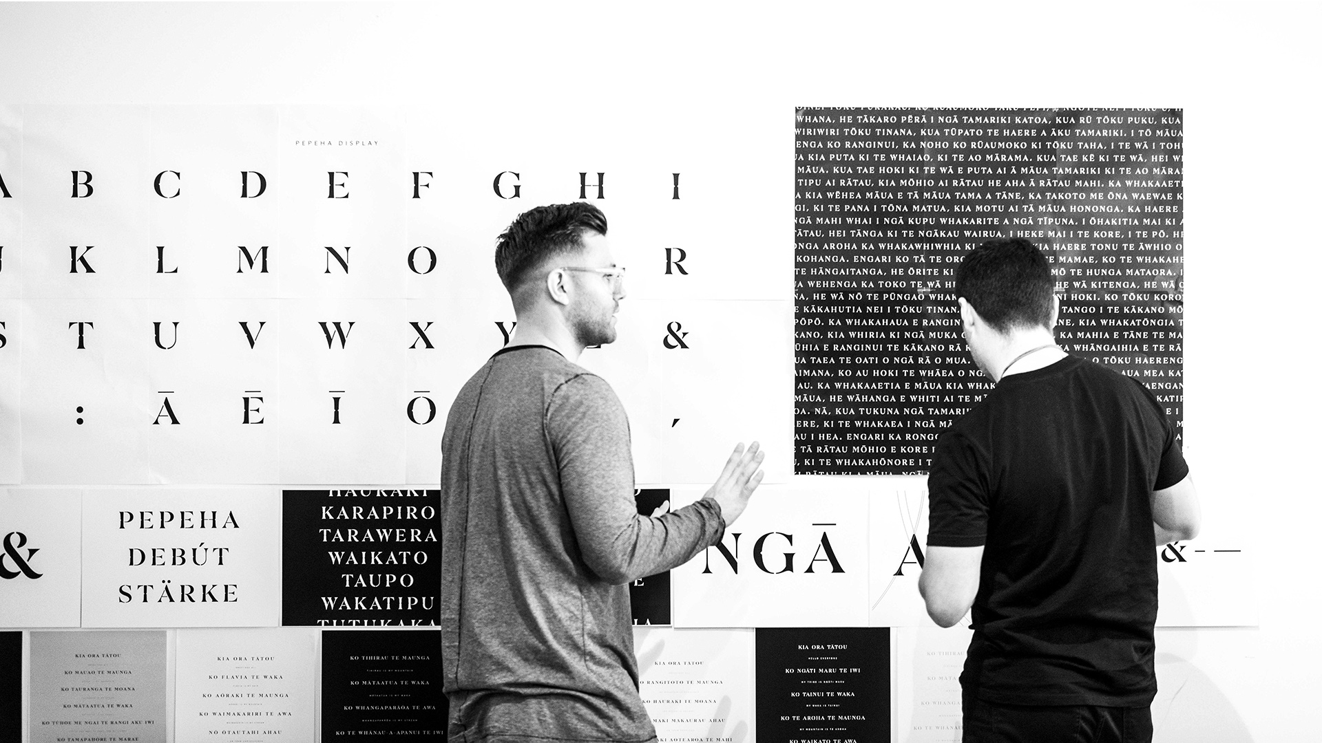
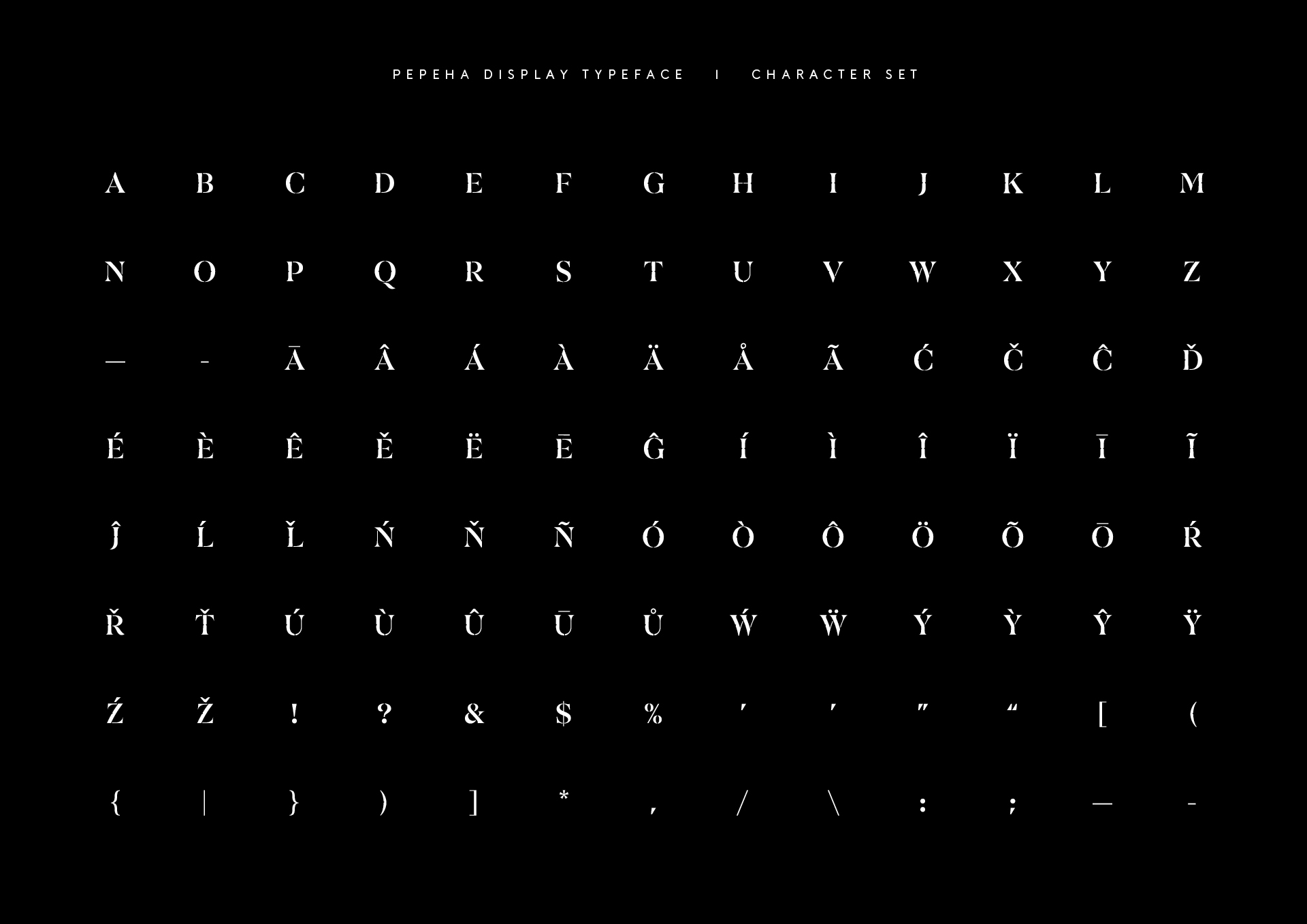
‘The Pepeha typeface was specifically created to embody all of what a pepeha is. To achieve a character reminiscent of the land, the culture, the people and generations that have gone before us. The culmination of personal information we use to introduce who we are.
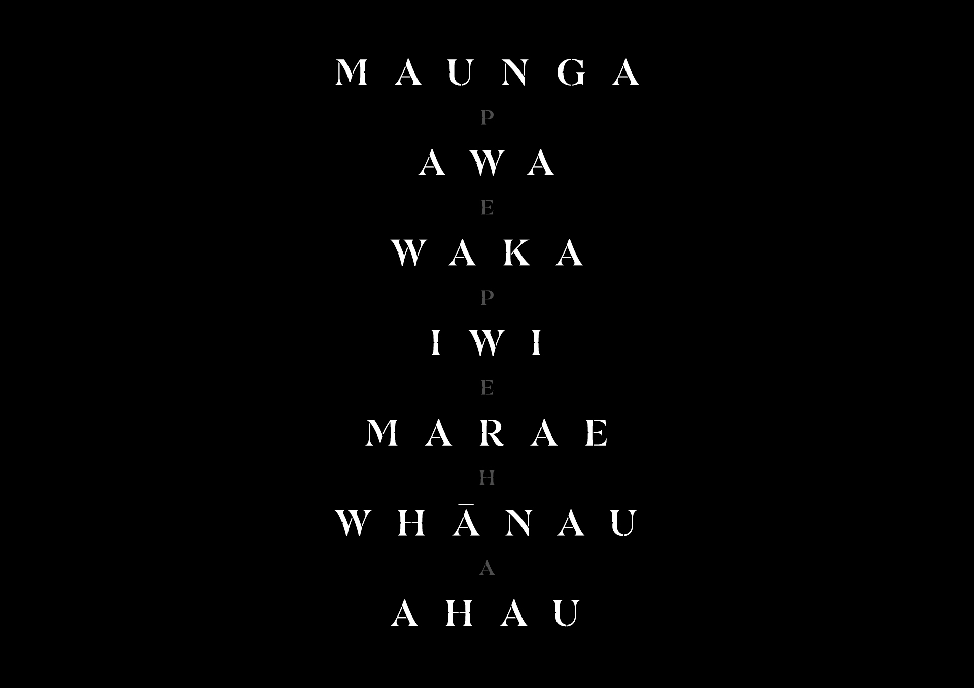
Pepeha is an expressive serif typeface, both modern and timeless. It’s comprised of capital glyphs and is always used with generous letterspacing.
The letterforms themselves are as organic in form as they can be. Limiting the use of straight lines meant we were creating something that felt like each glyph was carved from the land itself. Something natural and formed organically.’


How do you hope the prints will influence people’s behaviour or attitudes towards Te Reo Māori?
We hope the pieces will sit in pride of place in peoples homes and spark conversations that speak to the heritage of the individual and their story. We also hope it will encourage the owner to deepen their own understanding of where they come from and learn about the significance of the beautiful names of Aotearoa.
From a design perspective, how did you go about choosing the typography, colour and placement of the words?
At Designworks, we’ve been fortunate to be able to tell New Zealand stories for 40 years. Throughout those decades we’ve learned how powerful design can be, when paired with rich story telling. Each Pepeha has a unique story to it and is expressed through the names of this land and the people within it. We felt a real need to do these names justice, so designing a bespoke typeface to house and present these stories was a big part of the project. We consider typography to be the waka of our language, so it made sense for it to be the core design component to express our collective identity.
What will the profit for every print purchased go towards within the Pepeha Project?
It is important to us at Designworks that this is a not for profit initiative, so all proceeds generated from this Kaupapa will be put back into the Pepeha project itself. We want to take it into schools to help as a resource for education and connection. It will allow us to fund further projects intended to help Te Reo Māori thrive.

Do you have any plans to develop this initiative further in the future?
Yes we’ve got big ideas to further expand this initiative. All of them are focused around providing knowledge to all New Zealanders so they can learn more about this beautiful country we call home. Keep an eye out for us on instagram as it unfolds @pepeha.
What do you hope people’s main takeaway will be from this project?
We’ve had a massive, positive response since the website launched. With over half million impressions in the first 10 days. The majority of the feedback has been around how people are feeling a real sense of re-connection to their roots as a result of designing their pepeha. For us, understanding our past and rich history will only provide more depth and clarity for us as a nation, moving forward.
Koinei tā Aotearoa whakamihi.
This is how New Zealand introduces itself.


