Fresh From The Field — East Street Cider Co by Makebardo
This week’s Fresh From The Field features the brand and packaging for East Street Cider Co by Makebardo
If you have new or recent work that you would like to share in Fresh from the Field email Louise for details.
About
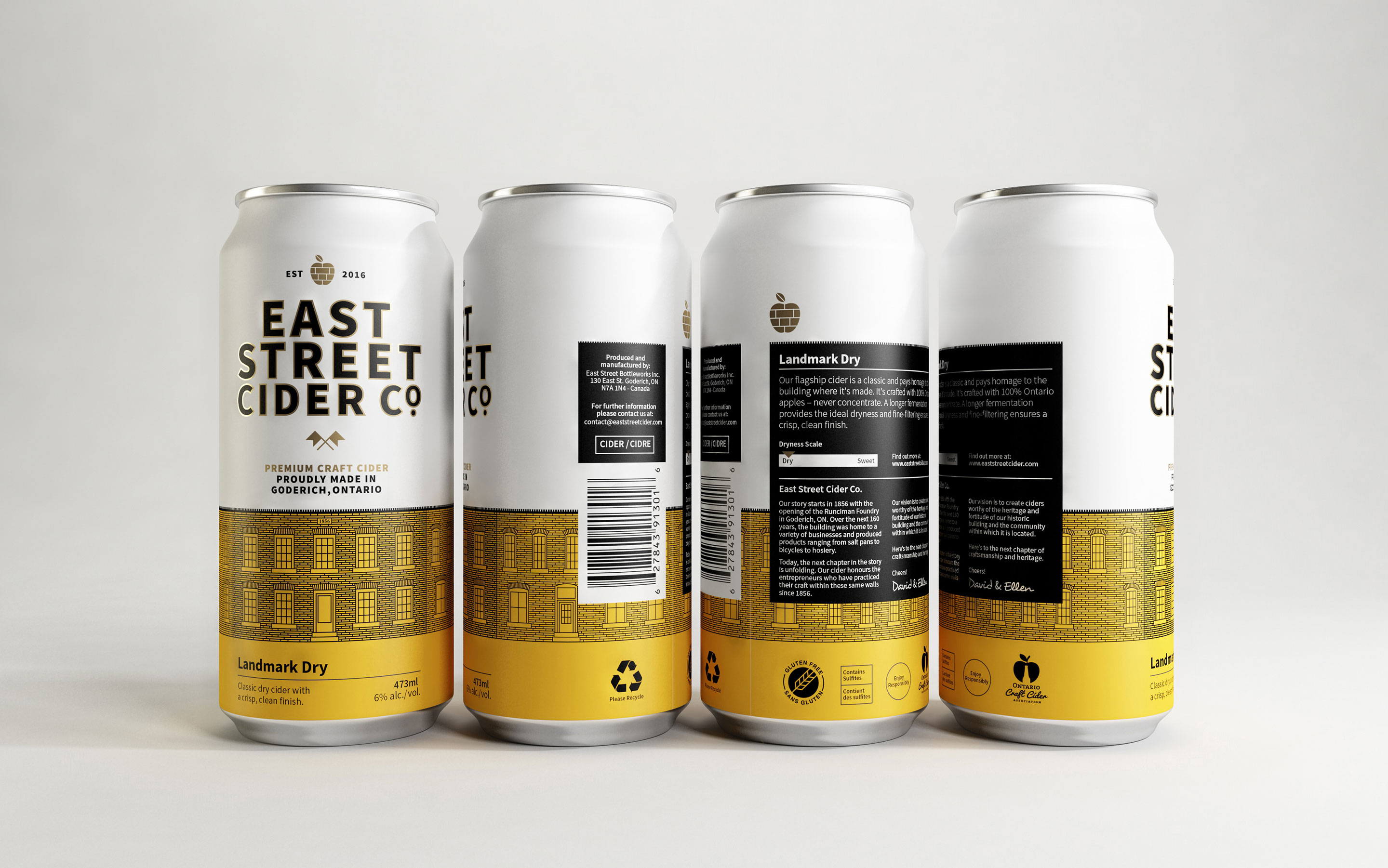
East Street Cider Co was established in 1856 with the opening of the Runciman Foundry in Goderich, ON. Over the following 160 years, the building became home to a variety of businesses and products ranging from salt pans to bicycles and hosiery.
Today, the next chapter in the story is unfolding. Their cider honors the entrepreneurs who have practiced their craft within these same walls since 1856. Their vision is to create ciders worthy of the heritage and fortitude of their historic building and the community within which it is located.
Design Strategy
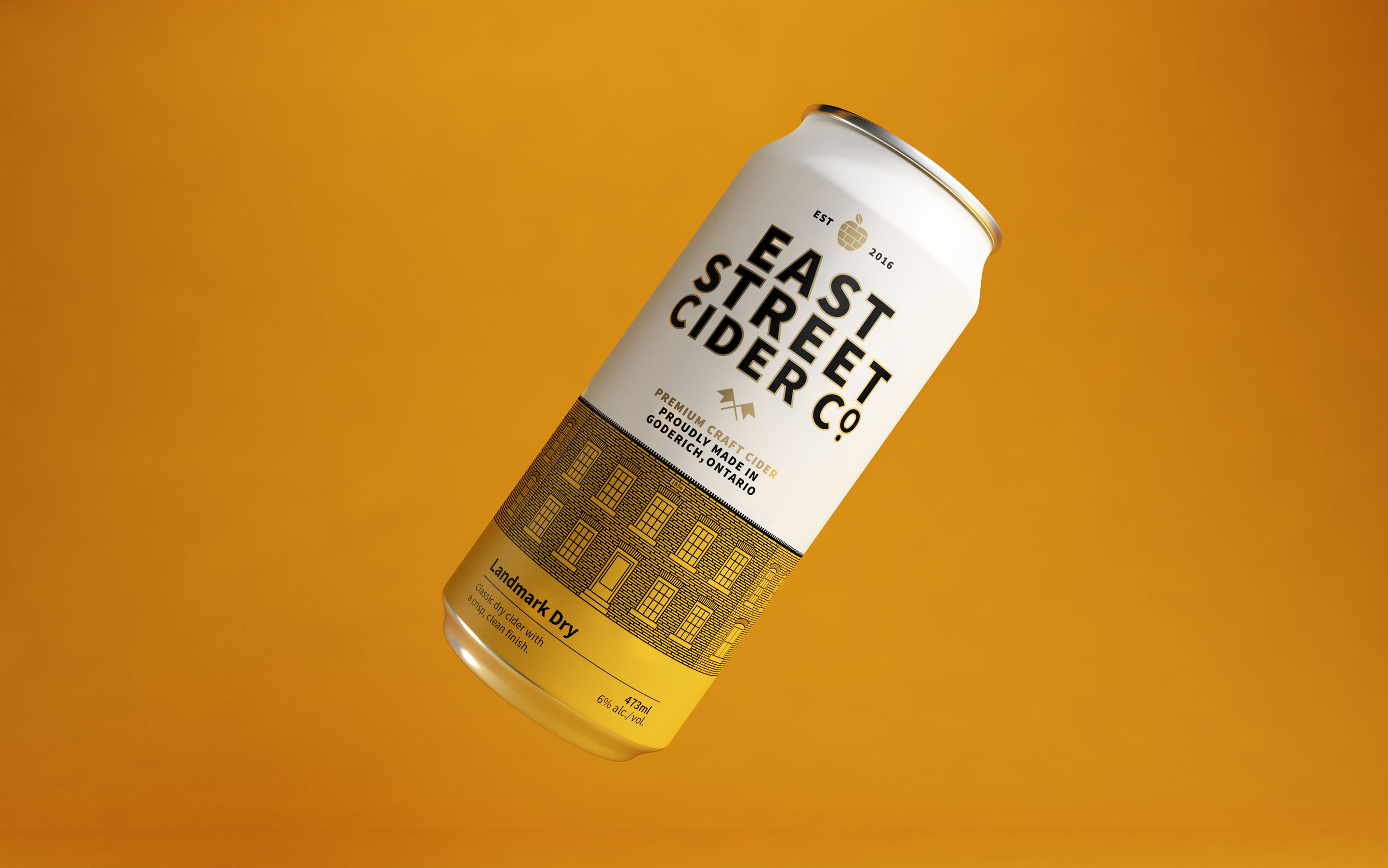
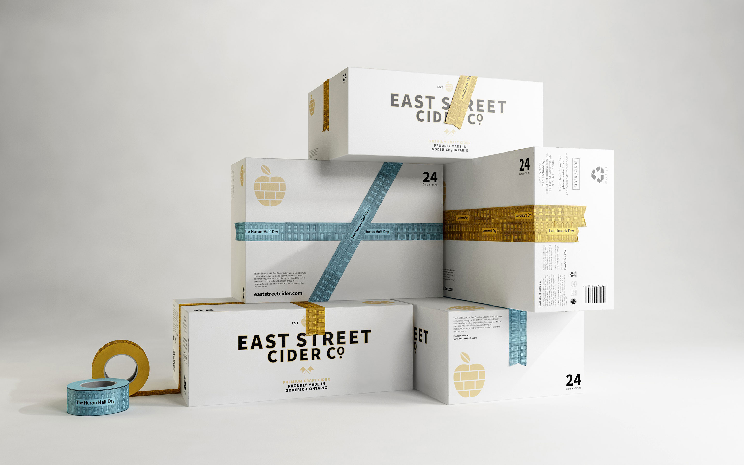
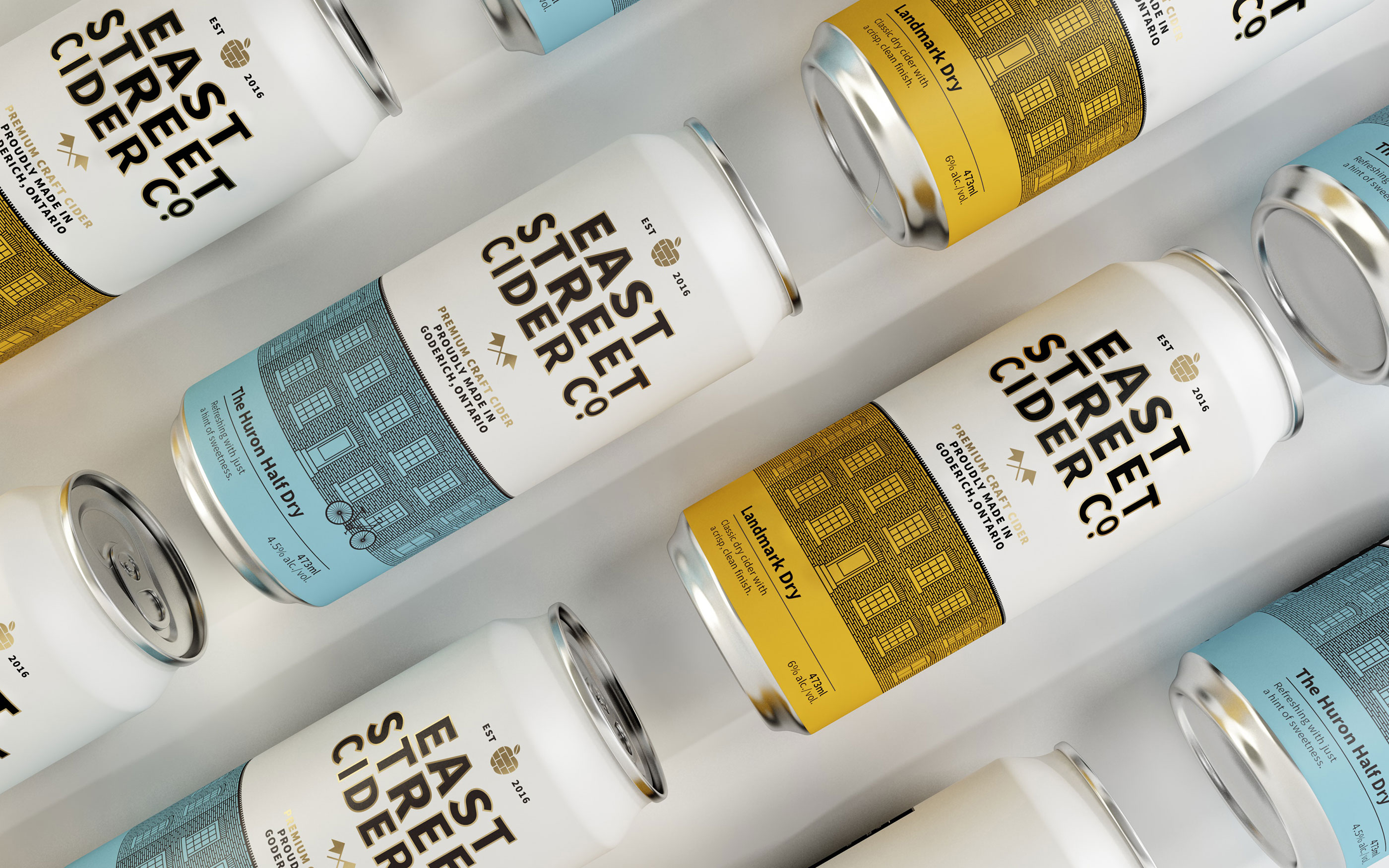
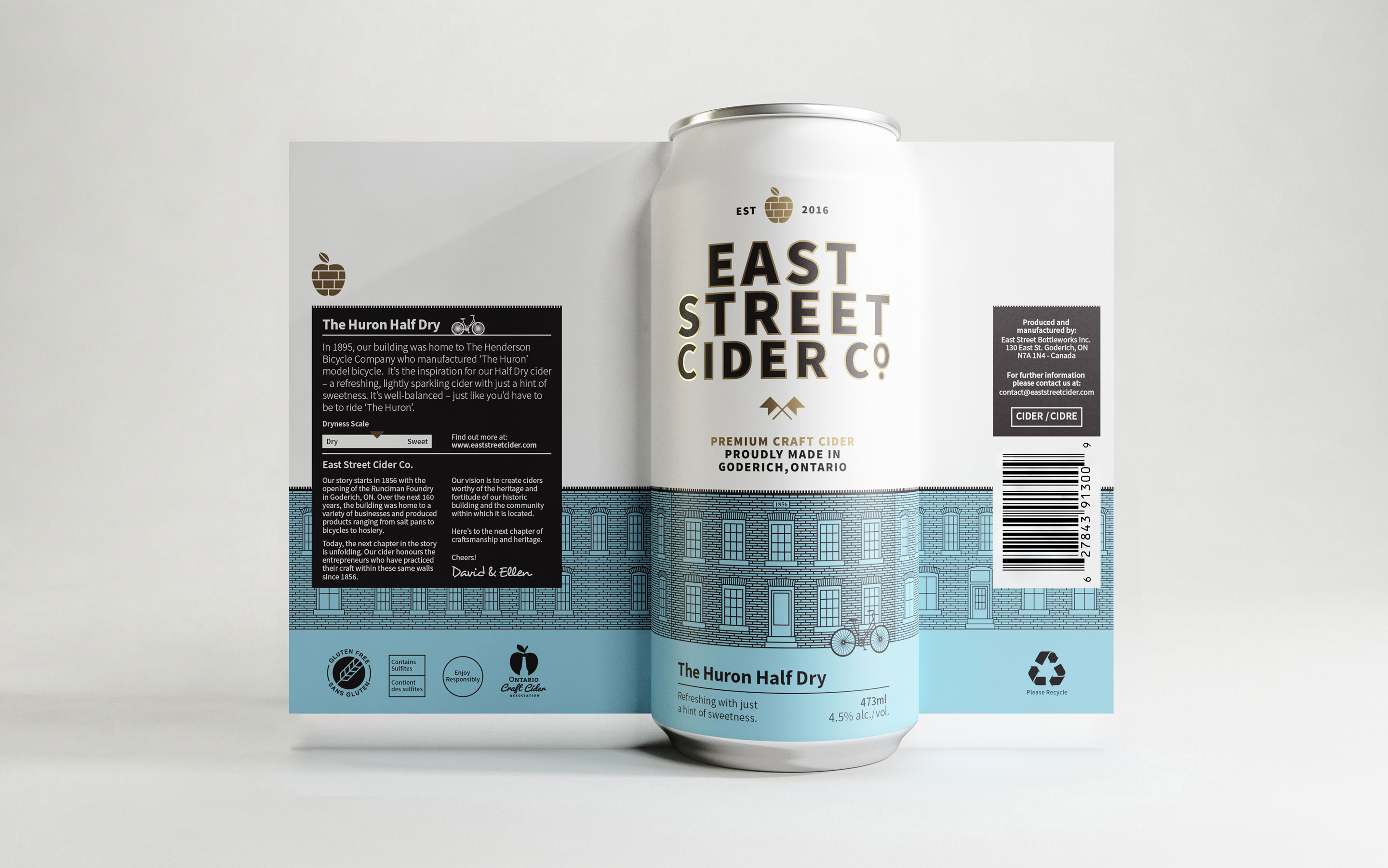
Our strategy was to highlight the historic building at the visual identity because it is a source of pride for the family and is a concise visual expression of a story, product provenance and brand value. We worked with exceptional illustrative detail throughout over the building’s illustration to highlight the power of this landmark. A notable detail of the building’s illustration is that we worked with different scales of bricks, which relates to the difference between the stone facade of the main entrance and the bricks on the rest of the building. This is one of the main attributes of the building and is reflected over the pictorial mark too. in addition, being a building highlighted by its horizontal architecture, we used this property to create a 360 degree game on the can. This allows the consumer to discover the building when rotating the packaging, or when several flavours of cans are combined, we can create the illusion of the construction of the building. In short, the proposed identity gave us a lot of flexibility to play with brand identity.
Regarding the colour palette we avoided naming it to avoid creating more rules into gender definition, however it’s a palete that appeals to all consumers. We picked a bright palette with rare colours in this product category, providing a unique personality and moving away from the cliché pallettes generally used for cider’s. Also we worked in some details with a gold foil to give a sophisticated feeling to the brand.
We are proud that we’ve achieved a perfect balance between heritage and modernity with a totally gender neutral design aesthetic which creates a strong impact to the eyes with finer illustrative, typographical and storytelling detail up close.