Catching up with Greg Straight
Design Assembly recently caught up with Auckland-based, illustrator/designer Greg Straight to find out more about what he’s recently been doing. (Seems like he’s been keeping pretty busy!)
So, what’s been happening in the world of Greg Straight?
It’s been another busy year and I’ve been trying to expand on what I do and what I can offer, as well as keeping up with the art prints and moving things forward.
Recently I created a pretty complex illustration for the cover of the Generousity Journal for their fourth issue. The concept was to show how New Zealand would look in a perfect world with clean waterways, no pollution, no homeless, with healthy humans and animals.
The awesome people at Fox&Co animated the artwork and it turned out pretty nice. So cool to see my clean vector graphics mix with reality…


Another interesting project was when the lovely ladies at Mamas Brew Shop approached me to paint a mural about Kombucha in their newly opened Helensville Cafe called The Kombuchery (it used to be the local butchers!). I drew it all in Illustrator and then blew it up on the overhead projector and used paint pens to ink it up.

Earlier this year I hired Tim Wightman to help me out two days a week, and we drew the mural up together. We had a few technical difficulties, but it all worked out in the end. I really missed that Command Z button!
Hardedge is an agency in Melbourne and asked me to create a bunch of illustrations based on one of their client’s staff members. It was a pretty fun job. I usually find it quite challenging illustrating people but after a while it came together.


Stoked to have a couple of things I worked on in the Best Awards this year. The McDonalds Summer Campaign with Fly & DDB and a Tamaki Regeneration Development project with Insight Creative.


On the art front I tried to keep the Golden Summer going as long as I could and created a range of locally inspired prints for the five Texan Art School stores. Looking at places like Takapuna, Chelsea, Piha and Ponsonby Road.


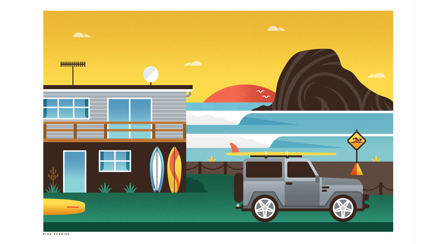
And, when the temperatures dropped, I decided to make three new prints focusing on winter and the South Island.

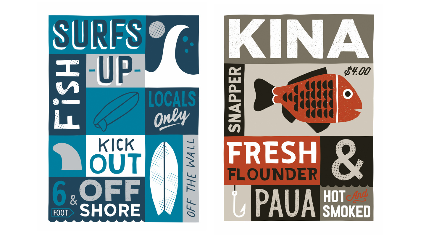
A lot of my artwork and commercial illustrations have a strong hard-edged, geometric feel which can sometimes mean a long time at the computer. To counter this, and free up my style a little, I’ve started working on some artwork that is more hand-drawn and has more of a painted feel. These ones are all A2 in size and inspired by old hand-painted signs and that movie Sign Painter. A friend lent me the book and it really is a bit of a forgotten art and very inspiring. The idea behind these prints is to mash up kiwiana with hand-drawn type and give it all a more original and organic feel.


See more from Greg at: gregstraight.com
Or, if you’d like to purchase visit: gregstraightshop.com
