Fresh from the Field — Lunchclub, Transformer
This week’s Fresh from the Field showcases the Lunchclub initiative devised by the fun-filled creative folk at Transformer.
If you’ve got new or recent work that you’d like to share in our weekly Fresh from the Field series email Zoë for details.

Lunchclub transpired after a few Friday lunches out, having had an itch to work on a web project, with free rein to exercise our full creativity. We’re a passionate bunch of foodies here in the studio and very much attached to the ‘gram for the latest in delicious-looking dishes and new openings, so we added fortnightly outings to our team activities, heading out to a different eatery each time (picked democratically through our #lunchclub Slack channel). What started as an excuse to try new places prompted another idea: what if we were to record our experiences in the form of a website?

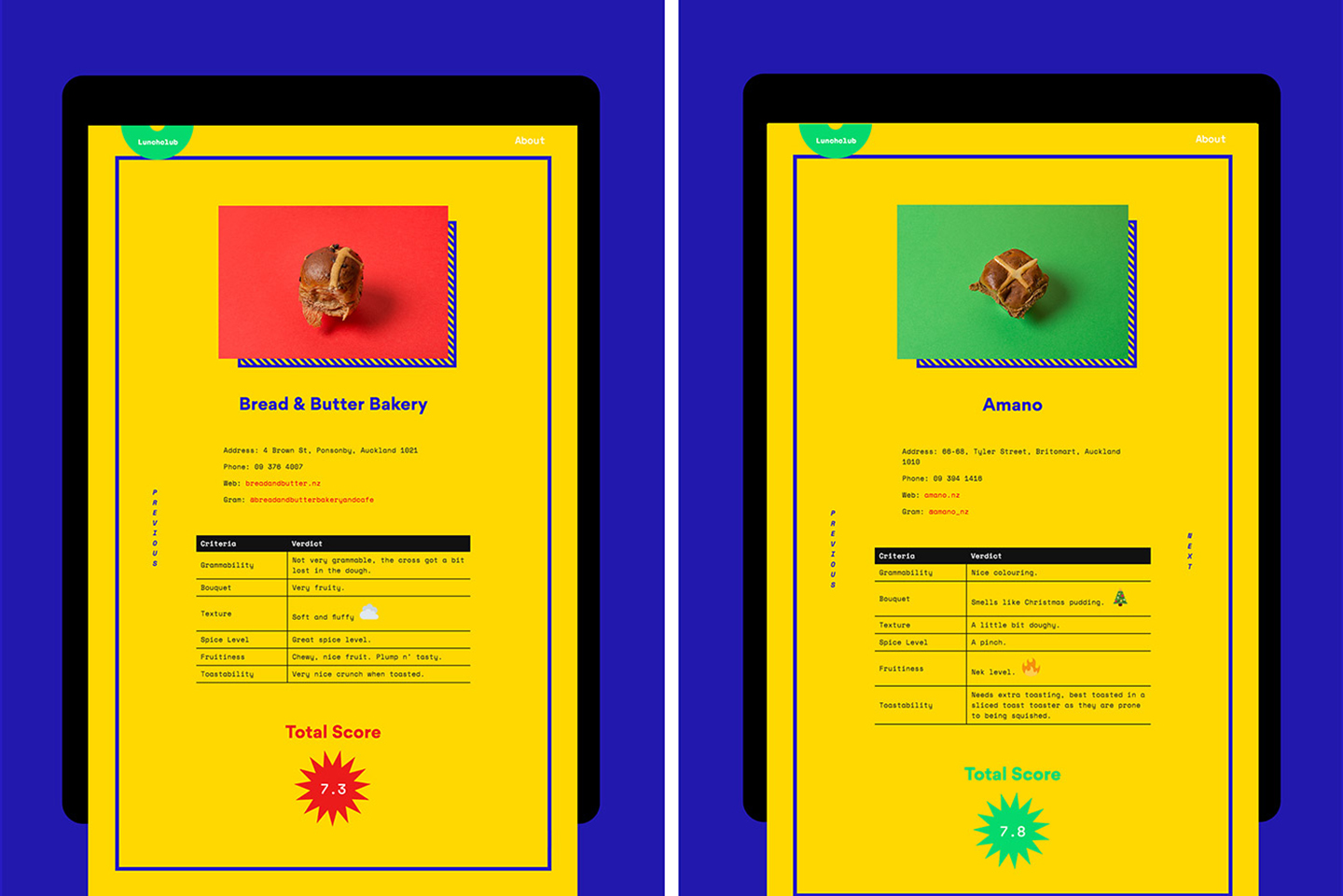
The design of Lunchclub is relatively simple; it consists of a styled directory of the places we visited, and posts of our ratings for each place plus a few photos. What was to set it apart from another lifestyle or food blog was that it was to communicate our collective sense of humour and fun as a studio. Visuals were driven by our predilection for eye-searing primary colours and novelty animations of the 2000s.
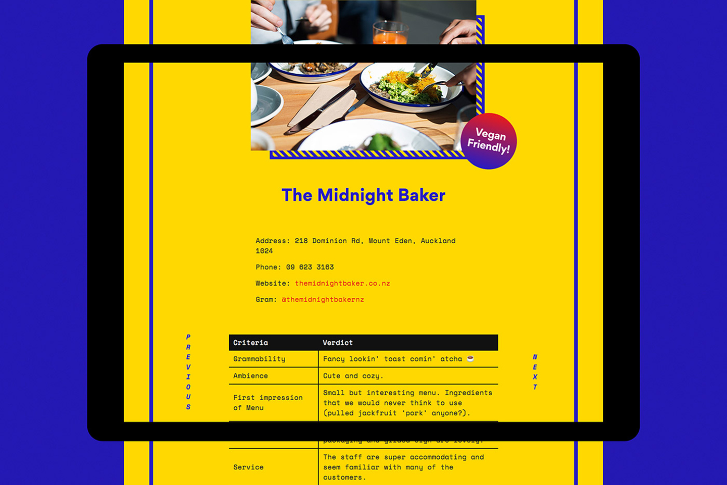

The two typefaces we used were Gordita from The Designers Foundry and Space Mono designed by Colophon for Google Fonts. Another key component to the style of Lunchclub was the unapologetic use of emojis.
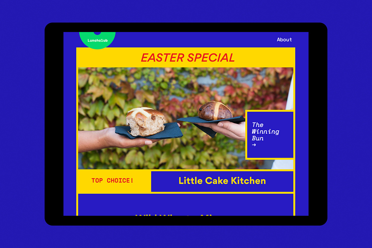
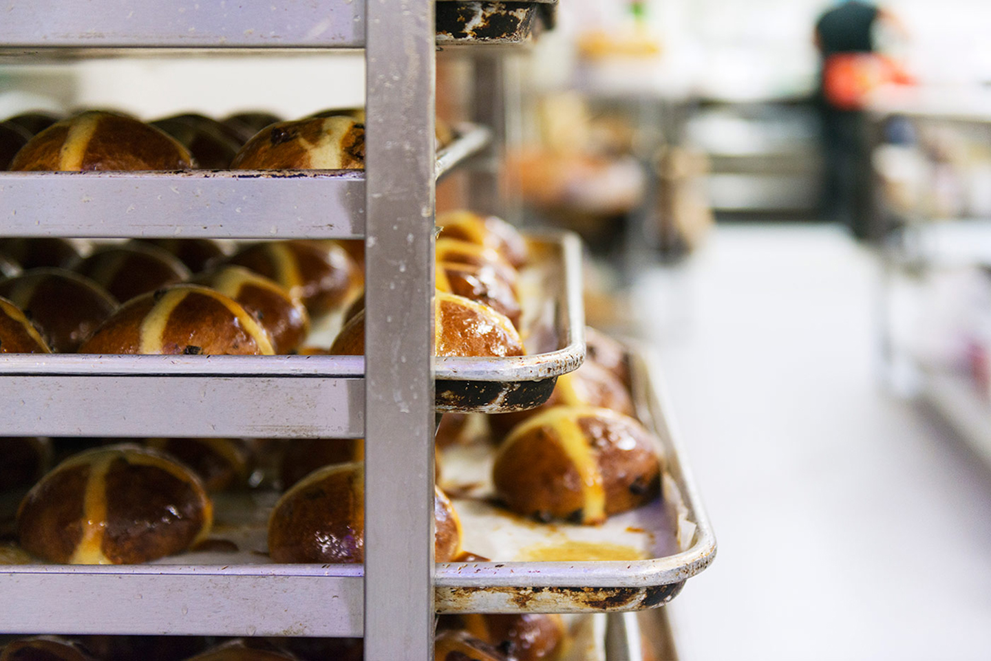
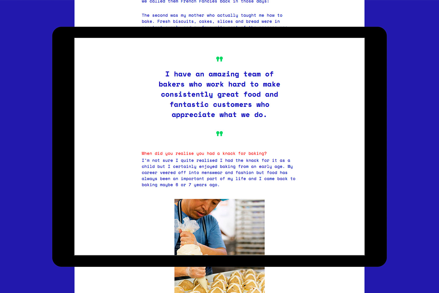
Lunchclub is also host to ‘special occasion’ features such as the recent Easter hot cross bun contest, which we thought played nicely into the concept of the website being one full of ‘easter eggs’ and little surprises. We spent several weeks taste testing hot cross buns and chose a winner. As as show of our appreciation, we visited the bakers of the winning bun and spent a morning interviewing the owner and documenting the sights.
See more from Transformer at: transformerdesign.co.nz

