Fresh From The Field: Koko Body Brand Refresh – By Hula
Discover how Hula translated Koko Body’s slow-care soul into a refined visual identity that champions everyday ritual.
A breathing wordmark, earthy palette and emotive ritual icons come together to turn skincare moments into micro-meditations.
Fresh from the Field is a weekly article series sharing fresh and inspiring work from the Design Assembly community. Want to submit your work to Fresh From The Field? Fill out the form here.
The brief
Koko Body began as a kitchen-bench experiment in organic skincare. Five years on, the brand had a devoted following but no clear story to rally the next wave of believers.
The brief was challenging: give a small-batch brand the presence of a global wellbeing movement without losing its slow-care soul. The new identity therefore, had to bottle a feeling.
The design response
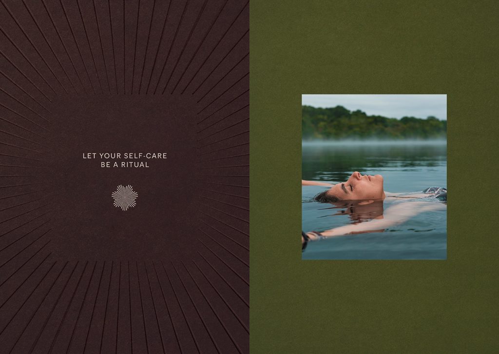
We framed the creative strategy around a single invitation: Let your self-care be a ritual.
Our purpose became championing everyday ritual – tiny, repeatable acts that align body and mind – and signalling that promise in every touch-point.
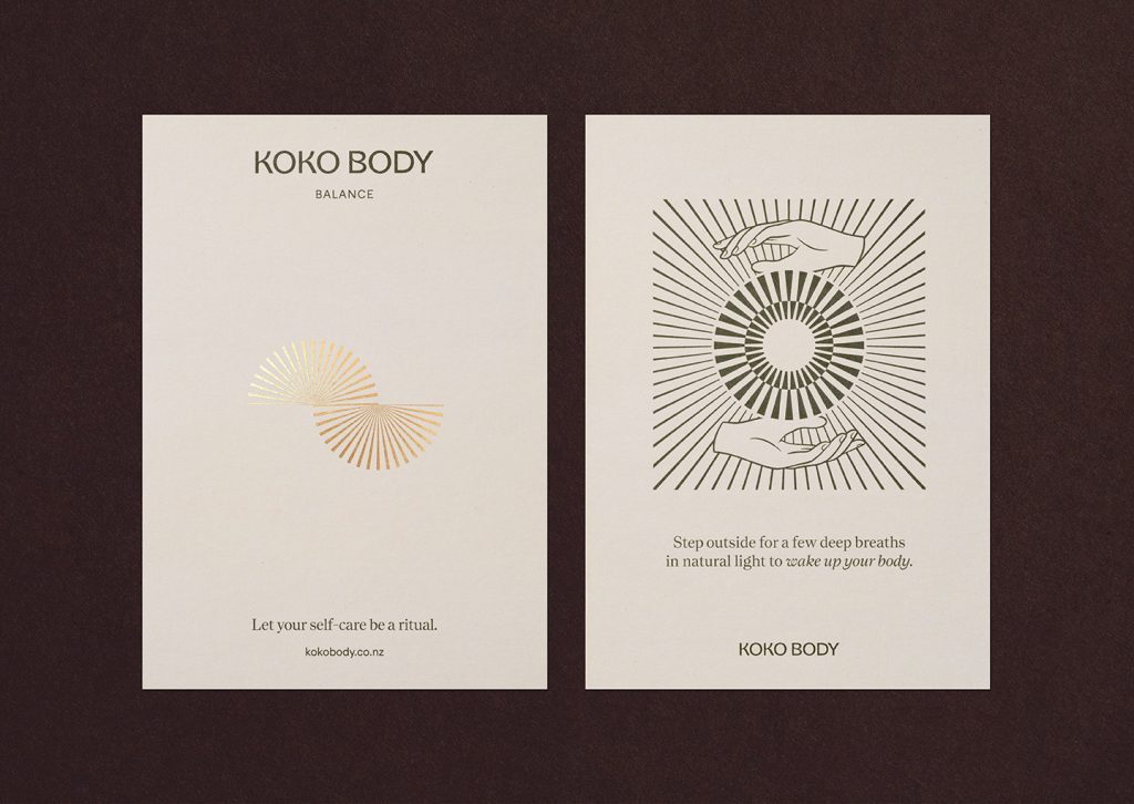
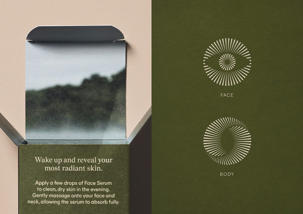
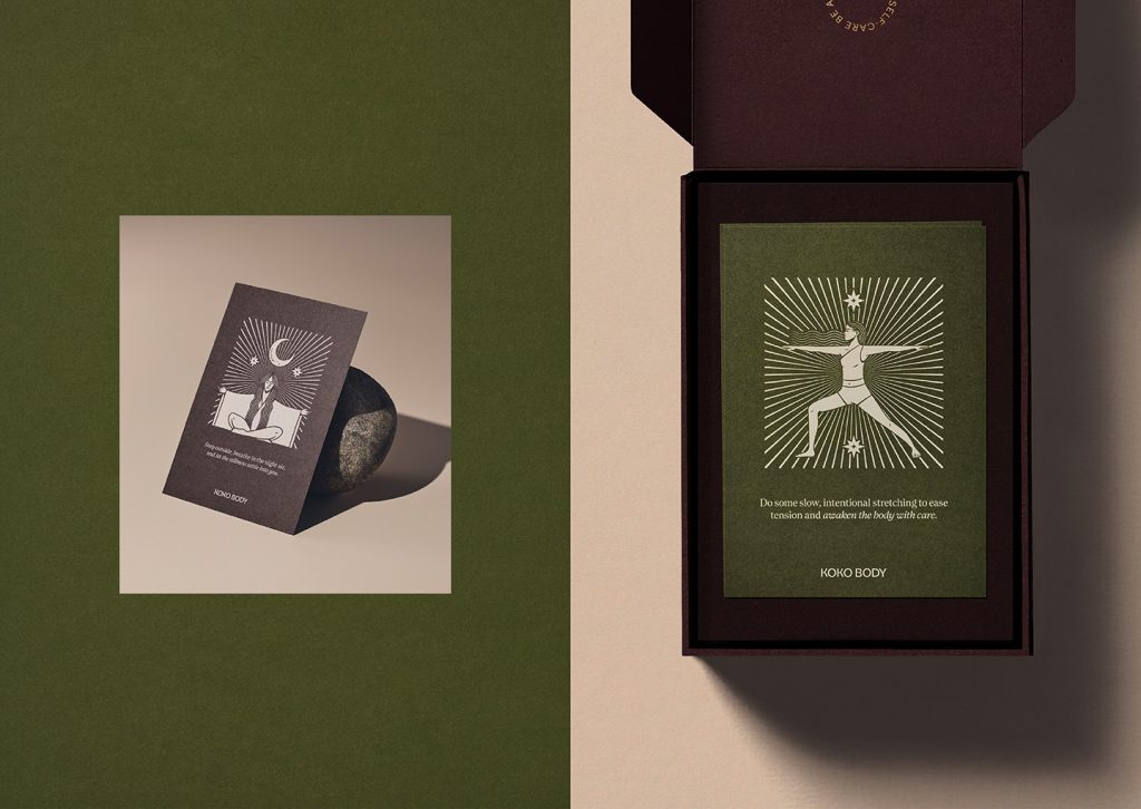
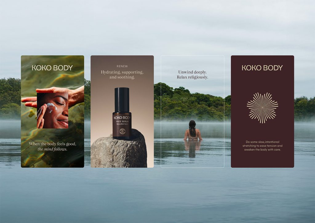
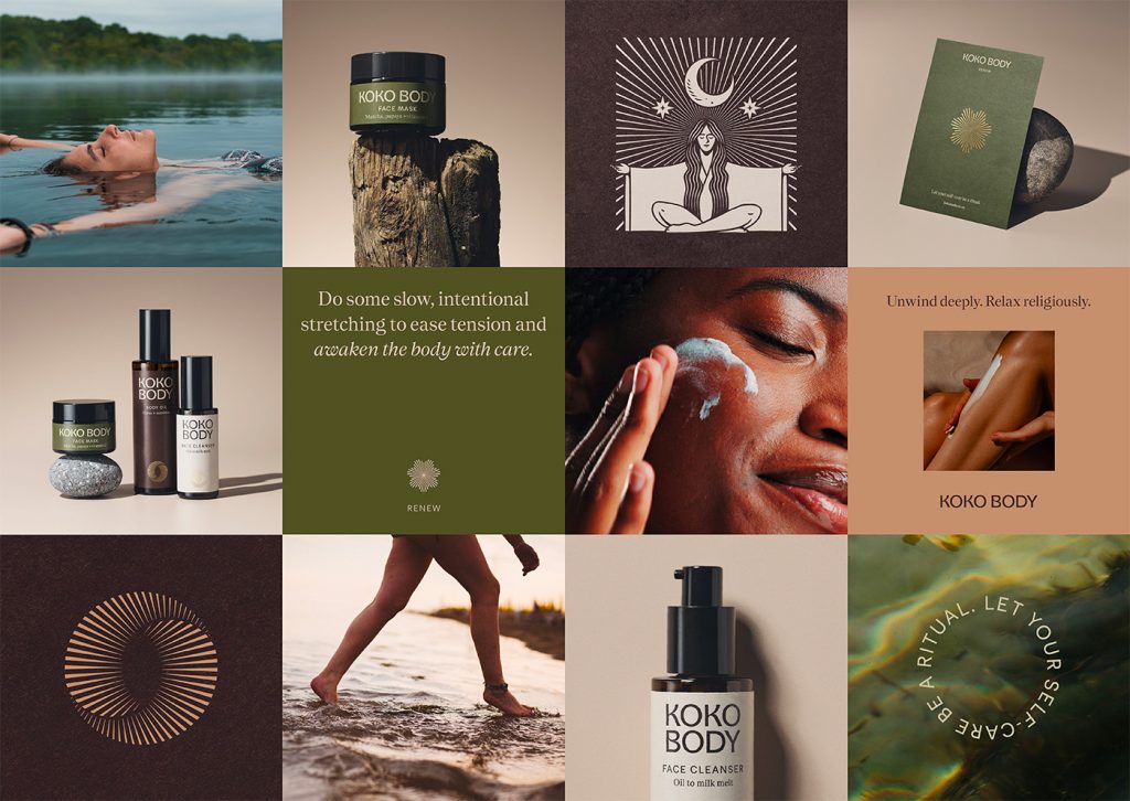
Instead of pushing product benefits, we told a story of optimistic pause. Three hero rituals (Balance, Renew, Nourish) anchor the range and give shoppers an easy way to self-prescribe. Each ritual borrows from the language of aromatherapy families (citrus, floral, earthy) to cue mood as much as function. Ritual cards prompt activities that align with each category, building everyday rituals that go beyond product. By making the brand a gentle coach, we turned skincare steps into micro-meditations and opened the door to future extensions: breathing guides, playlists, or in-store ritual bars.
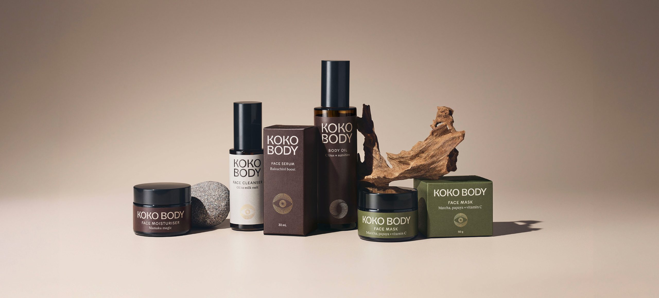
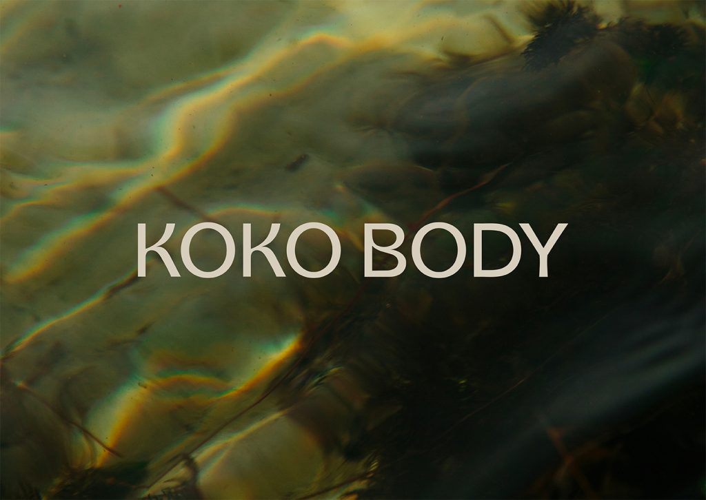
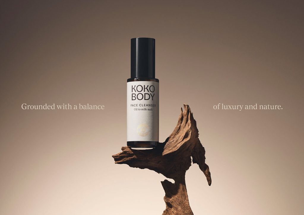
A word-mark with breathing room leads the system – its rhythmic letter structure echoing the inhale/exhale rhythm. The mark pairs geometric rigour with hand-drawn warmth, striking a balance between modernity and humanity. An earthy, sun-baked palette, touched with freshness, keeps digital applications calm while giving packaging the confidence to pop on shelf.
Custom icons distil rituals to their essentials, doubling as on-pack categorisation tools. Their radial, tapered lines create a sense of harmony and zen, which is also present within the illustration style. Photography follows suit: ritual vignettes, tactile application shots, and crisp product portraits form a three-tier library.
The design team
Creative Director: Mark Benseman
Principle Strategist: David Lyall
Creative Lead Content: Sokpart Pao
Senior Design Lead: Ann Davenport
Intermediate Designer: Jenna Billman
Copywriter: Sophie Hickey
Strategist: Marela Glavaš
Senior Account Director: Gabrielle Lawlor
Account Manager: Amy Salmon
Website: https://www.hula.nz
Instagram: @hula.nz
The client team
Koko Body
Instagram: @koko_body
https://www.facebook.com/kokobody
https://www.kokobody.com
Collaborators
Yuki Sato (Photographer)