Fresh from the Field — Newsroom, Sanders Design
This week’s Fresh from the Field showcases the branding and identity for Newsroom by Sanders Design.
If you’ve got new or recent work that you’d like to share in our weekly Fresh from the Field series email Zoë for details.

“Last month two of the country’s heavy news hitters launched Newsroom; an independent news and current affairs site. Tim Murphy, former editor in chief of the NZ Herald and Mark Jennings, former head of news at Media Works are at the head of a 16-strong team of experienced, award-winning journalists. Already, they are producing quality written and video stories that set the national news agenda and inform intelligent conversations at every level of New Zealand life.
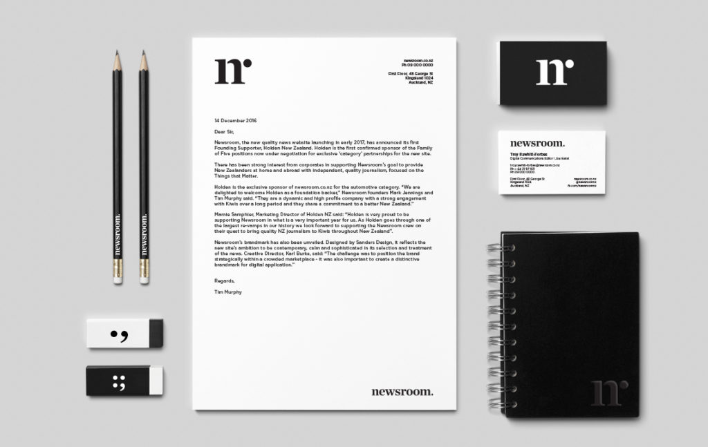
Newsroom is a serious news tank with a team that knows what to deliver and how to deliver it. The branding had to be strong, calm and sophisticated.
Sanders Design was involved from the early stages. We sat in on staff meetings and storyboarding sessions to get a feel for what the team was about. This was news with a point of difference, it required considered and identifiable branding in order to stand out amongst the ‘fake news’ and click bait articles saturating the market.
Influenced by ‘good old fashioned journalism’ and old school print, we developed a refined monochromatic identity with a lettermark that is more than meets the eye. The subtle integration of ‘n’ and ‘r’ serifs calls for a second glance; a reflection of the investigative style of newsroom itself.
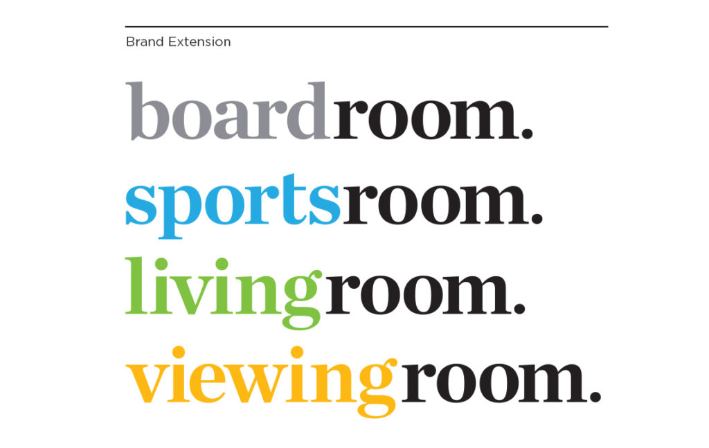
Newsroom is divided up into different information stations. We fine-tuned individual wordmarks for viewingroom, livingroom, sportsroom and boardroom, introducing colour identifiers for each brand extension.”


See more from Sanders Design at: www.sandersdesign.co.nz


