Fresh from the Field — Aunt Jean’s Dairy
Second up for 2017, we feature new work from Voice for Aunt Jean’s Dairy — design inspiration for our Fresh from the Field series.


CHALLENGE
When you release a new dairy product into New Zealand’s competitive consumer dairy market you need to show commitment, pointy differentiation and a strong pathway to launch. The client, a Nelson family with a strong farming heritage came to Voice to help them realise their new product idea – ‘fresh from the farm’ A2-tested cows’ milk sold in glass bottles.
MARKET STRATEGY
The result of consumer research conducted on milk sold in glass bottles was stand-out. Customers believed milk in glass looked better, tasted better and was even better for you. Add to this commercial picture an industry that has grown from 700,000 to well over 7,000,000 units in just over three years. Within this compelling opportunity, Voice worked together with Raine farms and O-I Glass NZ to develop the brand and help them understand the nature and forces at play in the premium milk industry, where the Aunt Jean’s Dairy product should best be positioned, and what, of its many benefits, should bubble to the top.
Traceability to source, a fresh, minimally processed product and the sustainability of glass packaging became the hero features that would take the product to market.
DESIGN RESPONSE
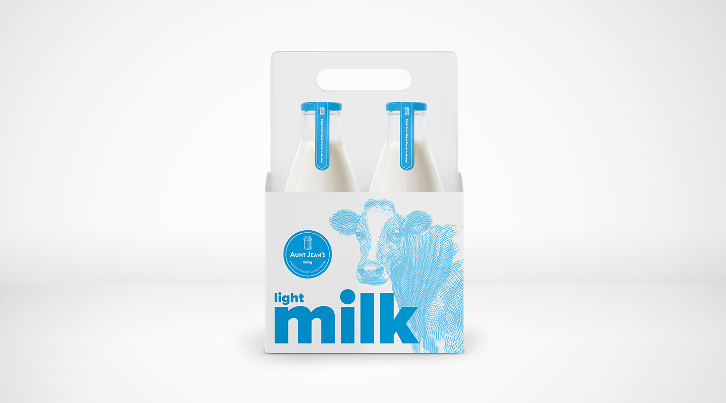
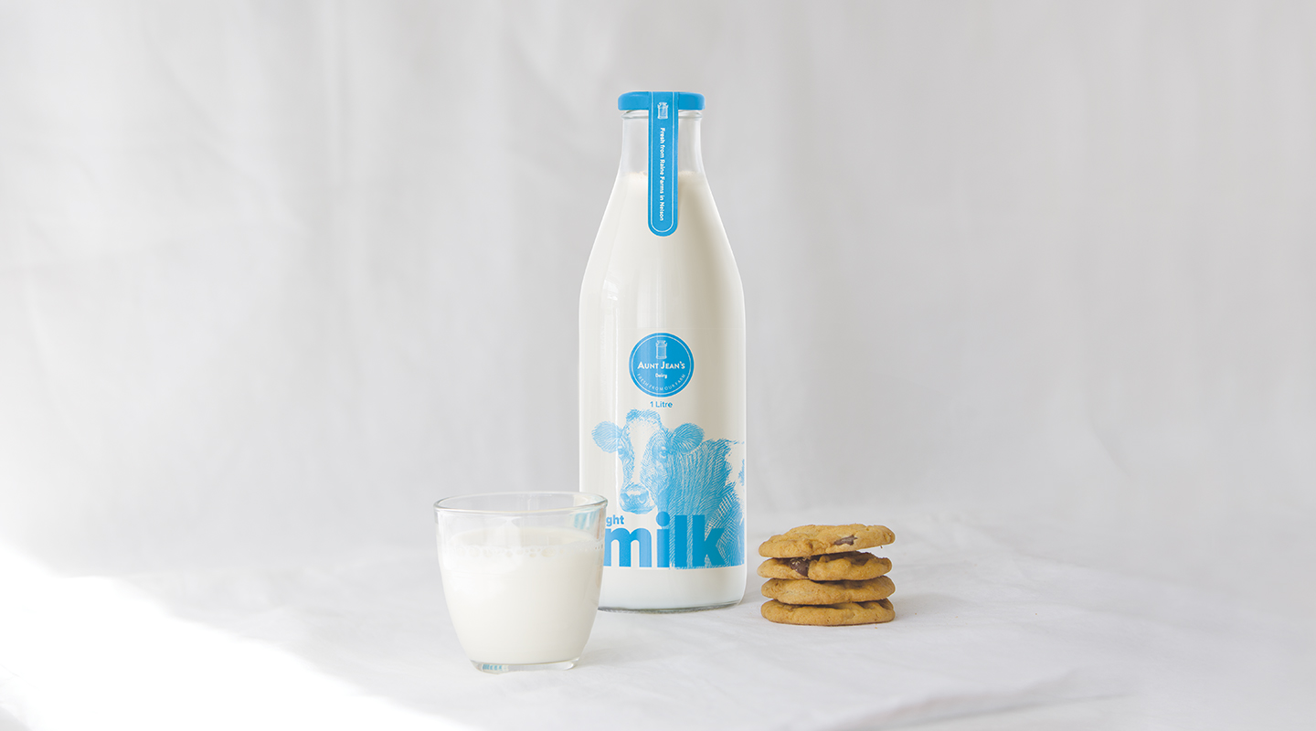
The ‘hero’ features of the product were leveraged to create a contemporary design that evokes the nostalgia of NZ life in the 50’s. FARM fresh PURE milk in GLASS bottles.
It was important to differentiate Aunt Jean’s Dairy on-shelf, to clearly stand apart from competitors in the premium milk sector. To do this we used the two primary visual elements on the bottle – the cow illustration and the ‘milk’ wordmark.
The cow was illustrated in a graphic ‘scraper’ style to allow the milk to show through and was used on the bottle as large as technically possible. The word ‘milk’ was elevated from the product descriptor to become a simple and strong graphic element. Together these two bold features convey Aunt Jean’s Dairy ‘farm fresh’ origins.
CUSTOMER
Aunt Jean’s Dairy
CREATIVE TEAM
Jonathan Sagar – Executive Creative Director
Manolo Garcia – Design Director
Matt Chinn – Designer
Ethan Sagar – Designer
Ricardo Martinez – Illustrator (Spain)
John Crawford – Photographer
voice.co.nz
If you’ve got new work that you’d like to share with our Design Assembly audience this year, email Zoë for details.