Fresh From The Field: Henderson’s – By Onfire Design
Onfire Design is bringing home the bacon. A fresh new look for Henderson’s, sizzling with character and served with no shortcuts.
Fresh from the Field is a weekly article series sharing fresh and inspiring work from the Design Assembly community. Want to submit your work to Fresh From The Field? Fill out the form here.
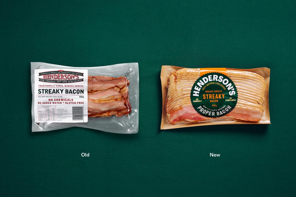
The brief
Henderson’s, a New Zealand family brand founded on doing food properly, pioneered chemical-free bacon. But as “clean eating” became mainstream, the brand needed to stand for more than what it left out. The rebrand repositions Henderson’s as a modern classic – natural, honest and seriously delicious.
Centred on the idea “Delicious starts with good,” the new identity celebrates simplicity done well. Just pork, sea salt and brown sugar – honest ingredients elevated through craft and care. The design reintroduces Henderson’s as a confident, modern heritage brand: warm, trustworthy and unmistakably Kiwi.
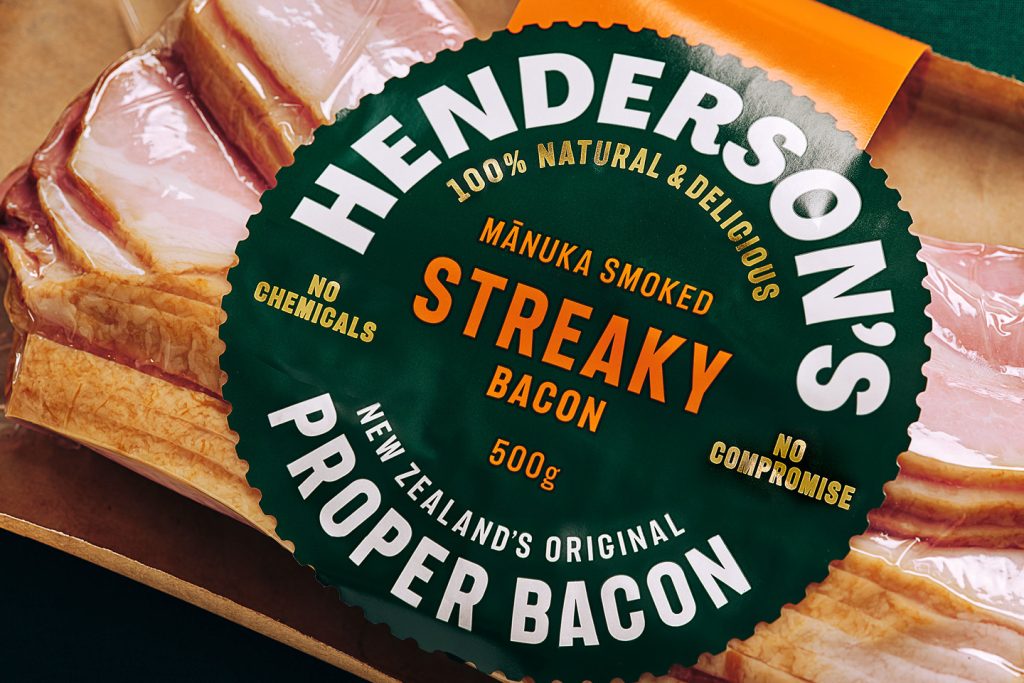
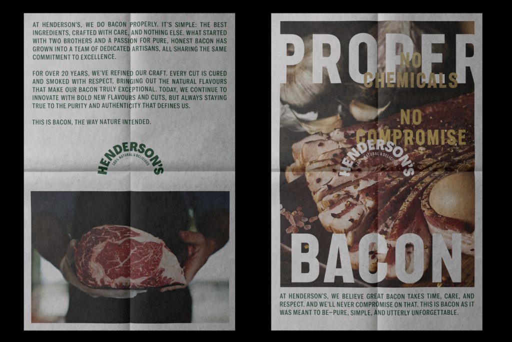
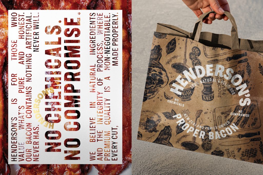
The design response
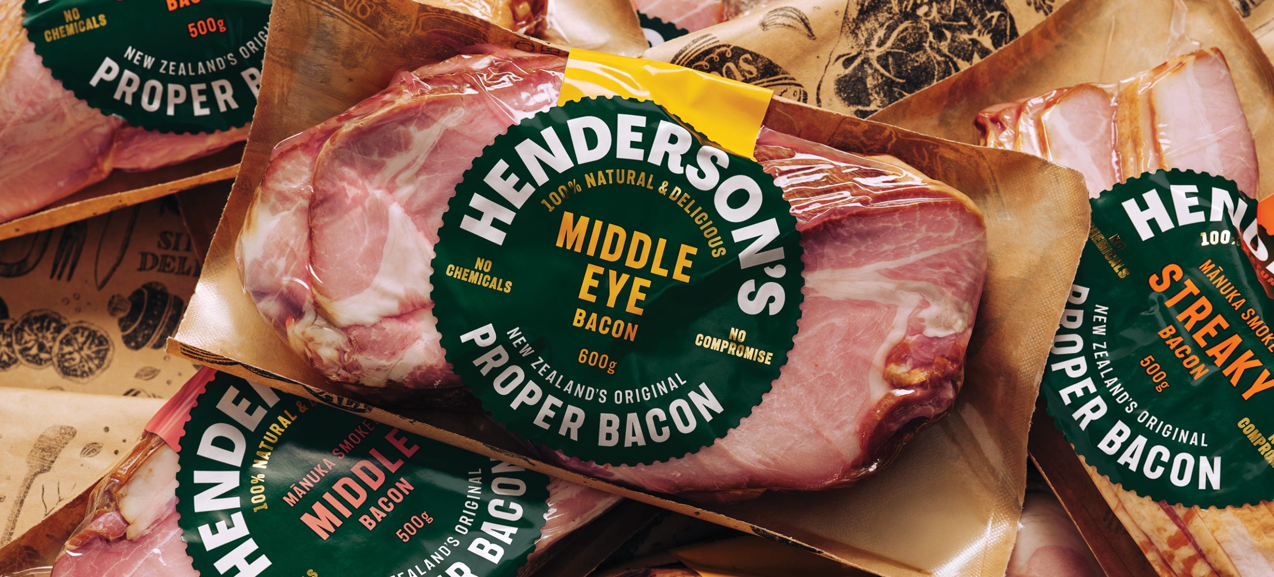
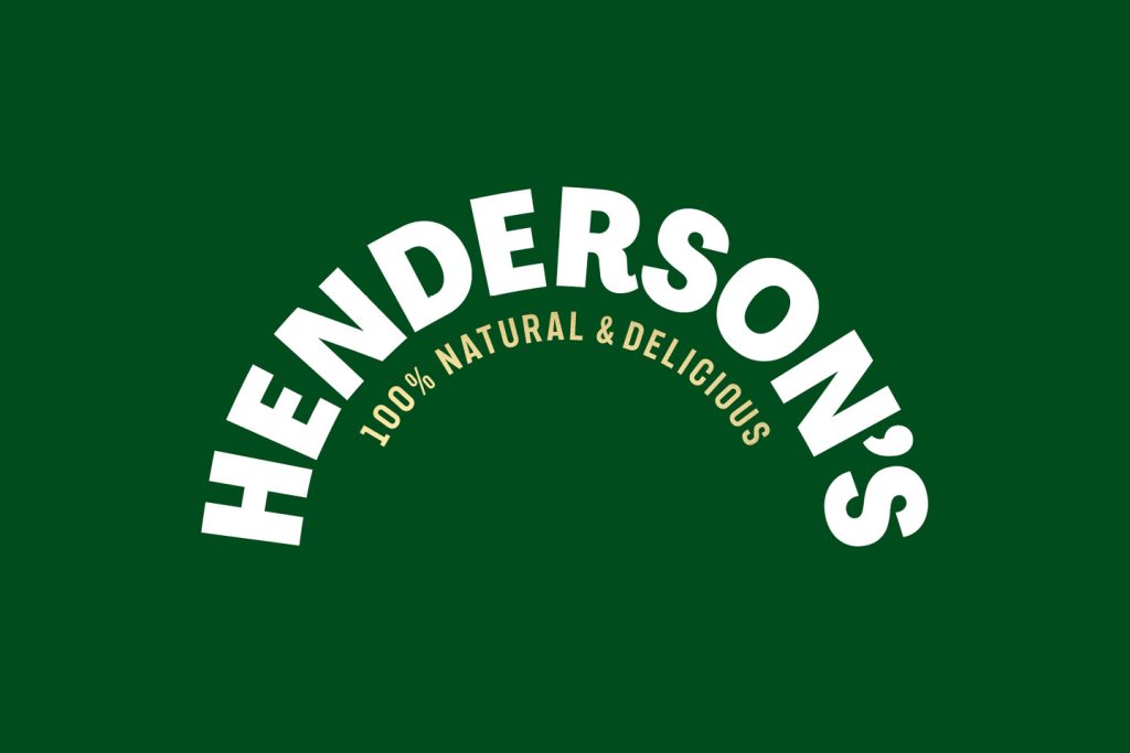
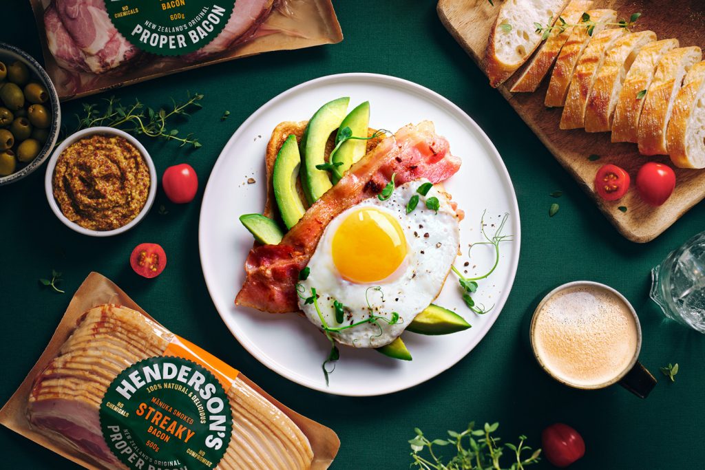
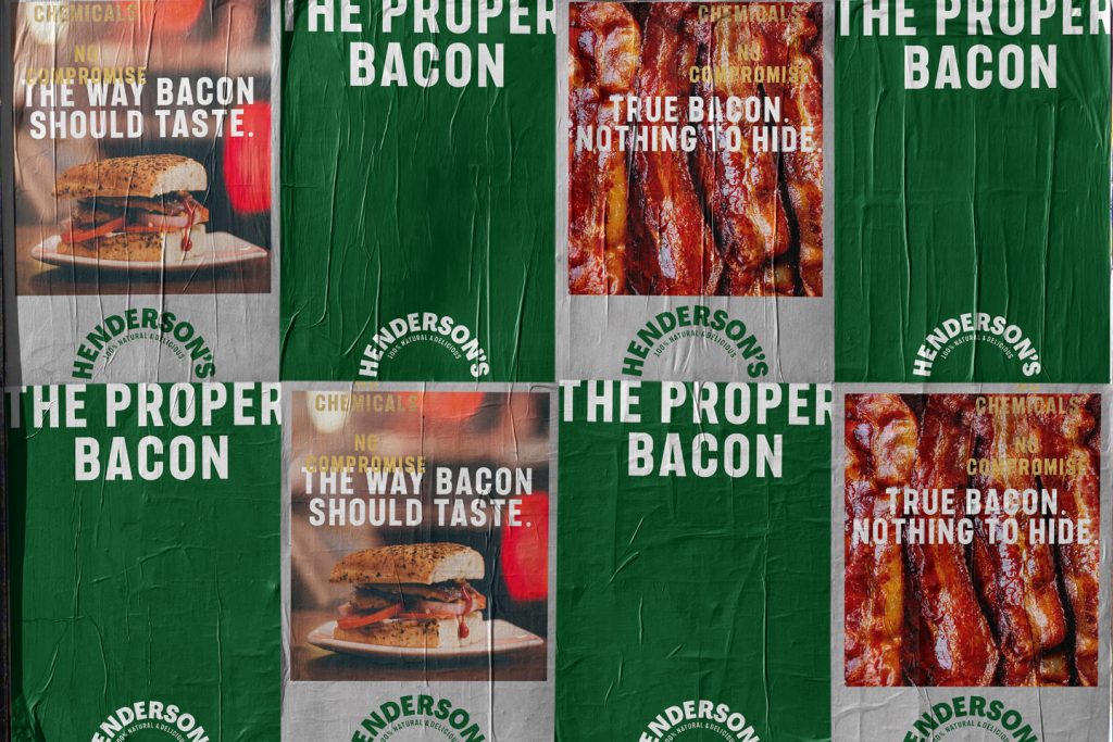
A distinctive circular typographic-led label, inspired by traditional beer labels and mid-century butchers shop signage where craft was honoured, wraps around each bacon variant acknowledging that proper bacon is at the centre of everything they do. The distinctive round form, with butchery-tool teeth dieline details, builds a strong sense of craftsmanship. Deep heritage green, taken from the previous brand, is used as a brand block, while bright accents bring clarity and energy across the range.
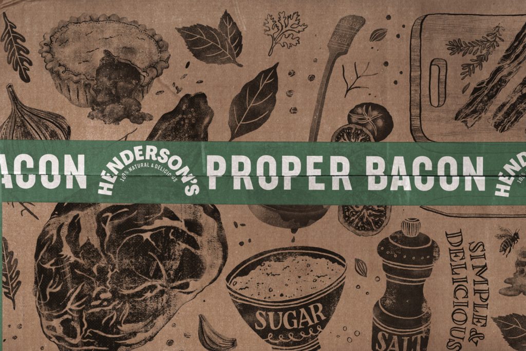
Material choices reinforce the “nothing to hide” ethos, standard glossy plastic replaced with tactile, uncoated stock for a paper-wrapped feel. In contrast to the utilitarian typography of the front, hand-rendered illustrations on the back of packs highlight the minimal ingredients, the bigger cuts from where the slices came from, and the maker’s touch.
Copywriting proudly reflects Henderson’s “no shortcuts” mentality – confident, authentic and optimistic. From pack to platform, the redesign unites an extended family of products under one simple purpose: helping people live well and live long through honest, seriously delicious food.
The design team
https://www.weareonfire.co.nz/
Instagram: @onfiredesign
Facebook: https://www.facebook.com/onfiredesign
Linkedin: linkedin.com/company/onfire-design/
The client team
Source and Supply