Fresh From The Field: Action Ed Rebrand — By Spruik
Inspired by mid-20th-century animation, retro cartoon-style illustrations speak to Action Ed’s history, creativity and playful energy.
Fresh from the Field is a weekly article series sharing fresh and inspiring work from the Design Assembly community. Want to submit your work to Fresh From The Field? Fill out the form here.
The Brief
Action Ed is Aotearoa New Zealand’s leading arts-based youth development organisation, structured around the medium of spoken word poetry. A not-for-profit with a passionate team of change-makers who work to inspire and facilitate life-changing experiences.
The team first approached our Friends at Spruik in 2023 with a brand positioning brief.
As an established organisation, Action Ed had evolved over time to deliver a wide variety of programmes to multiple audiences. As a result, the organisation, and its community, had grown. Their identity and messaging were no longer aligned with the trajectory of the organisation – they needed to rebrand.
Spruik started the process with a Discovery workshop which established that Action Ed had a strong sense of who they were, they just needed to communicate and visualise it.
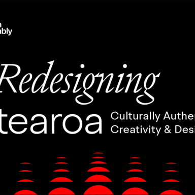
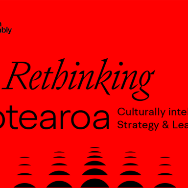
Once brand positioning and audiences were developed, Spruik identified the need to partner with Māori cultural advisors, Maurea, to authentically translate their values and tagline. Carefully crafting a shared vocabulary and signature phrases designed to be motivational, potent and memorable.
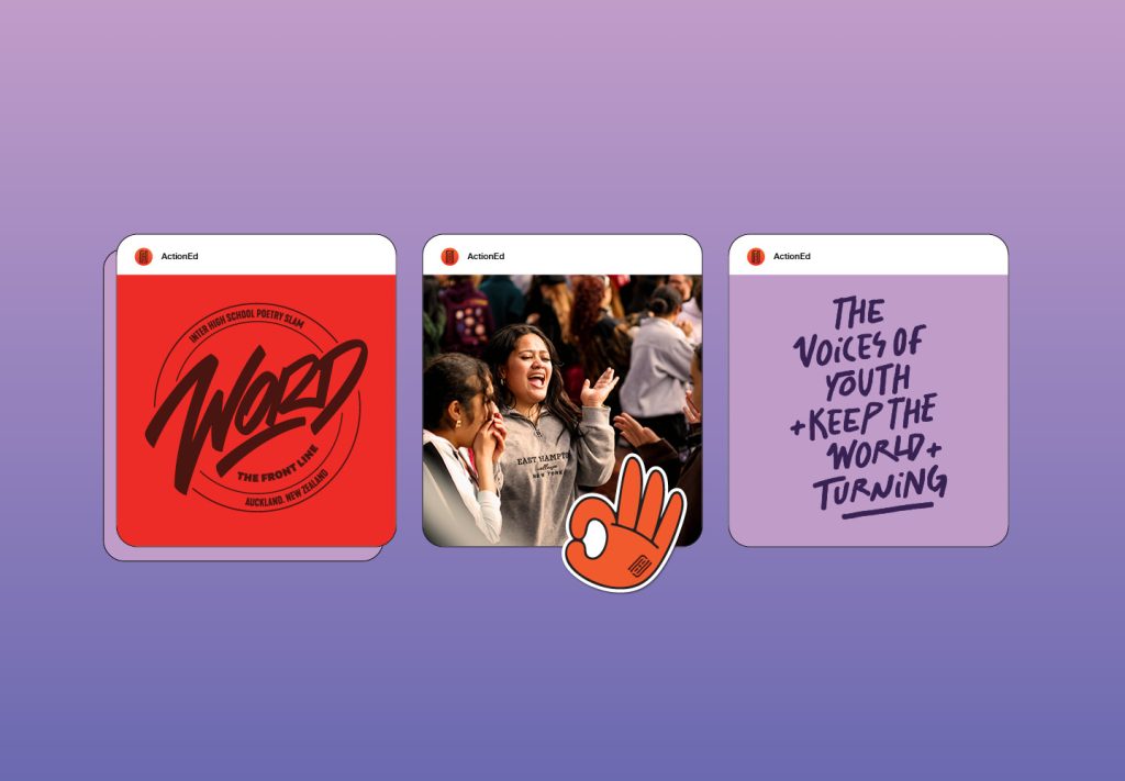
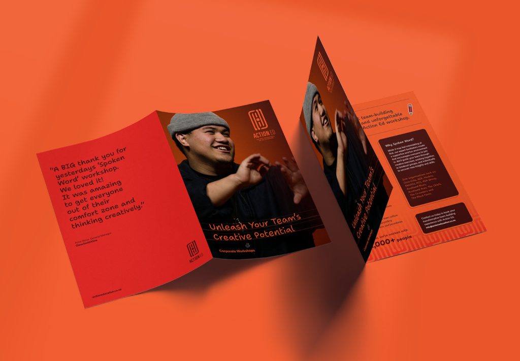

The Design Response
Action Ed have a saying, “The point is the poetry. And when we say poetry, we mean the people.”
With cultural and community at its core, Action Ed deserved a visual identity, rooted in meaning and symbolism.
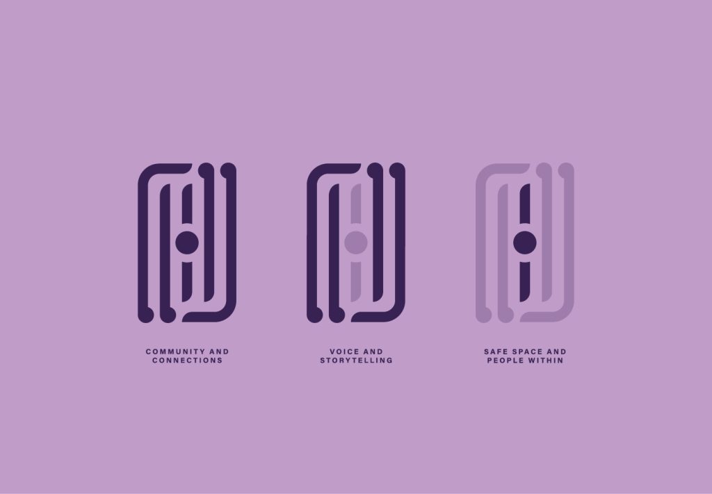
Spruik developed ‘The Loop’. A logo containing a symbol to reflect the essence of their community, fostering a safe space where every voice is heard, respected and uplifted. Where individual talents are nurtured, and the legacies of past generations are honoured. This wordmark stands tall as a symbol of strength for current and future generations.
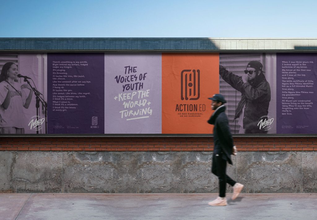
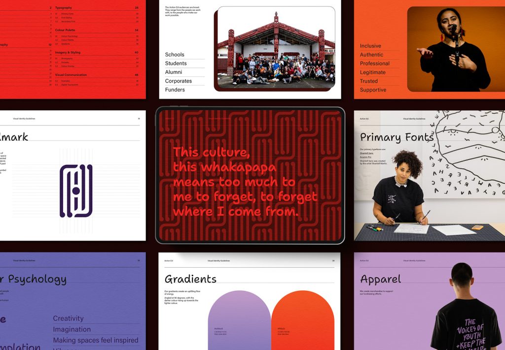
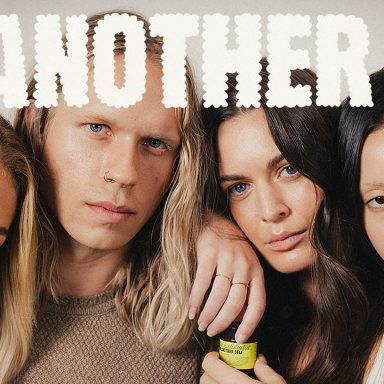
Colour psychology played an important role to balance implemented creative processes, with the impact and amplified emotional outcomes of their work. Colours were carefully selected to stimulate imagination, enthusiasm and warmth. While gradients provide a visual link to their uplifting flow of energy.
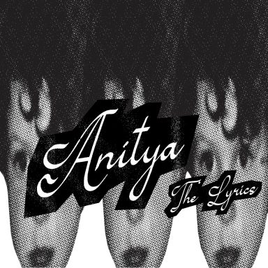
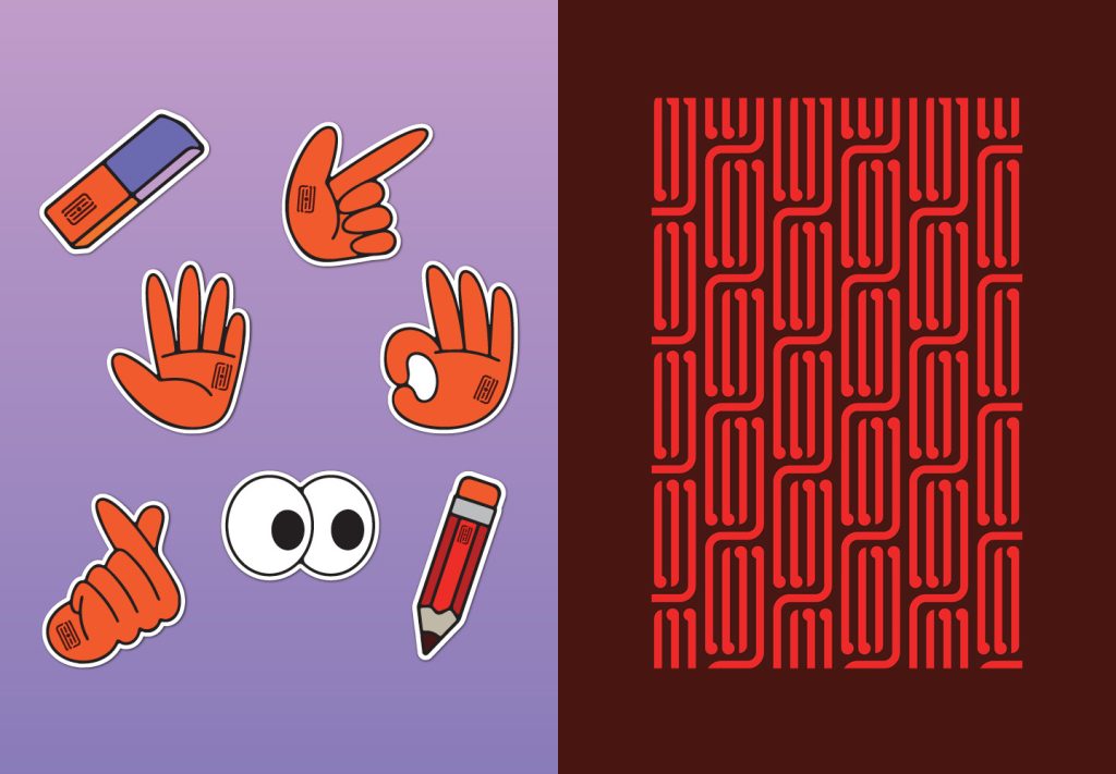
Inspired by mid-20th-century animation, retro cartoon-style illustrations speak to Action Ed’s history, creativity and playful energy.
Working together with their client, Spruik pinpointed the anchors of the culture, values and behaviours, to proudly emerge with a vision and identity that looks to create true advocates both inside and outside the organisation.
Action Ed is now poised to navigate one of the most challenging funding climates ever experienced. If you would like to support their work you can do so here.

The Design Team
Jon Dunn, Managing Director
Kathryn Dunn, Business Director
Stacey Morrissey, Creative Director
Nick Walker, Senior Designer
https://spruik.com
https://www.facebook.com/spruiknz/
Insta: @spruiknz
https://www.linkedin.com/company/spruiknz
https://www.youtube.com/@spruik
The Client Team
https://www.facebook.com/actioneducationinc
https://www.instagram.com/actioneducationnz/
https://www.youtube.com/c/actioneducation
https://www.actioneducation.co.nz
Collaborators
Maurea – Te Reo Translation
Fresh from the Field is a weekly article series sharing fresh and inspiring work from the Design Assembly community. Want to submit your work to Fresh From The Field? Fill out the form here.

