Fresh From The Field: Bowie—By Studio South
Fresh from the Field is a weekly article series sharing fresh and inspiring work from the Design Assembly community. Want to submit your work to Fresh From The Field? Fill out the form here.
The brief
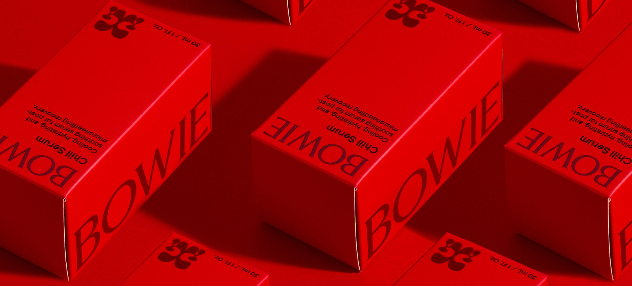
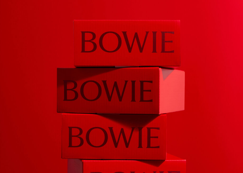
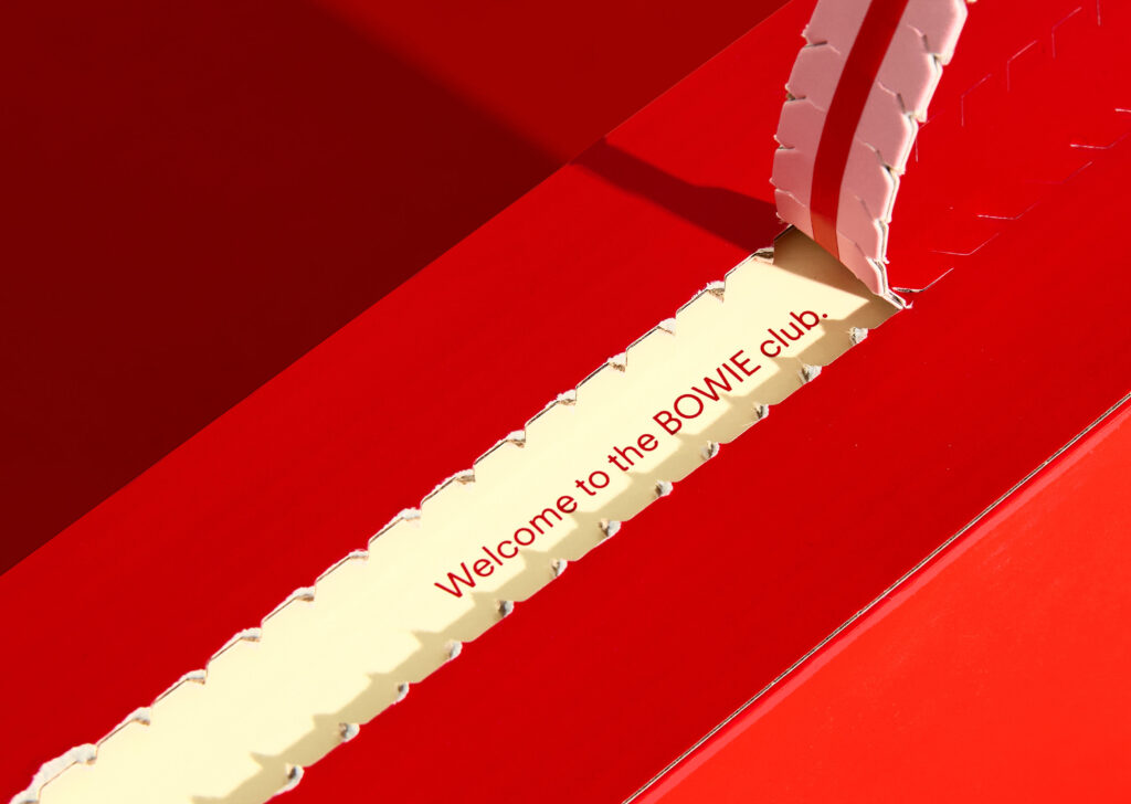
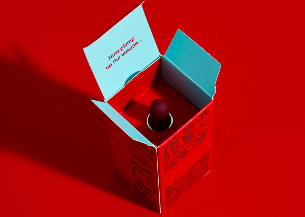
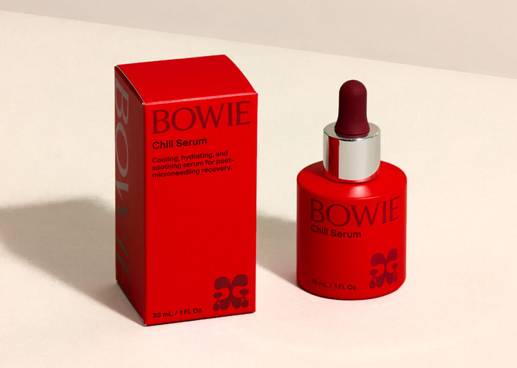
Bowie is a microneedling skincare brand built around transformation. When Bowie approached Studio South they had a broad target audience and a loose vision but needed a fully realised brand system and a custom-designed tool to match.
The Design Response
Studio South focused on two key ideas: transformation, and the contrast within Bowie’s audience. These themes shaped both the visual identity and tone of voice. Typographically they paired a playful, jelly-like typeface with one featuring sharp, needle-like points – reflecting the balance between softness and precision. The logo mark, an abstract butterfly, reinforces the idea of transformation.
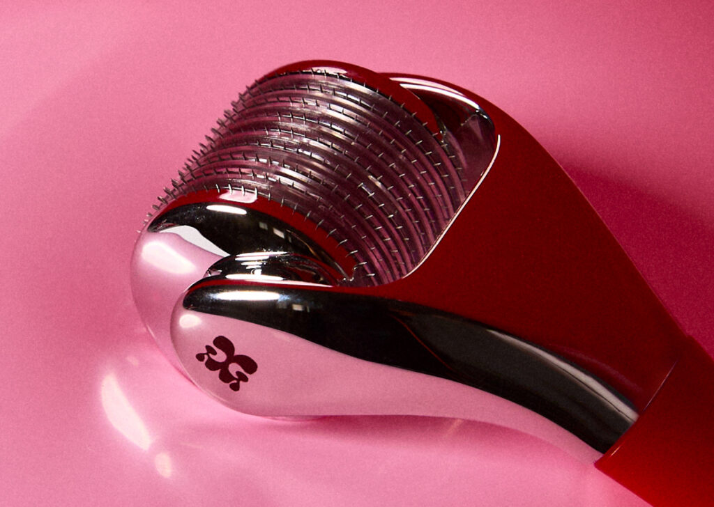
Collaborating closely with product designers, Studio South crafted Bowie’s bespoke microneedling tool, which features a handle that aligns with the brand’s aesthetic in shape while remaining intuitive.
A content shoot with Mark by South brought the brand to life. Unique art direction involved pressing the tool into balloons to evoke plump, hydrated skin and the tension of the microneedling process.
The Design Team
Sam Southwell: Creative Director
Mihi Riesterer: Lead Designer
Erin Joyce: Designer
Maisie MacDonald: Motion Designer
Clara-Jane Follas: Photographer
Catriona Colven: Producer.
Website: https://www.studiosouth.co.nz/
Facebook: studiosouthnz
Instagram: @studiosouthnz
LinkedIn: Studio South
Collaborators
Mark by South: Content
The Client
Bowie.
Claire Barnes, Matt Barnes
and Kate Hemus
Instagram: @lifeisbowie
Fresh from the Field is a weekly article series sharing fresh and inspiring work from the Design Assembly community. Want to submit your work to Fresh From The Field? Fill out the form here.