Fresh From The Field — Te Kaunihera Rata o Aotearoa – Cultural Identity – By MSO Design
Fresh from the Field is a weekly article series sharing the fresh and inspiring work of our Aotearoa Design Assembly community.
MSO Design take us through their recent work developing the cultural identity for Te Kaunihera Rata o Aotearoa.
Want to submit your own work to Fresh From The Field? Fill out the FFTF form here.
The brief
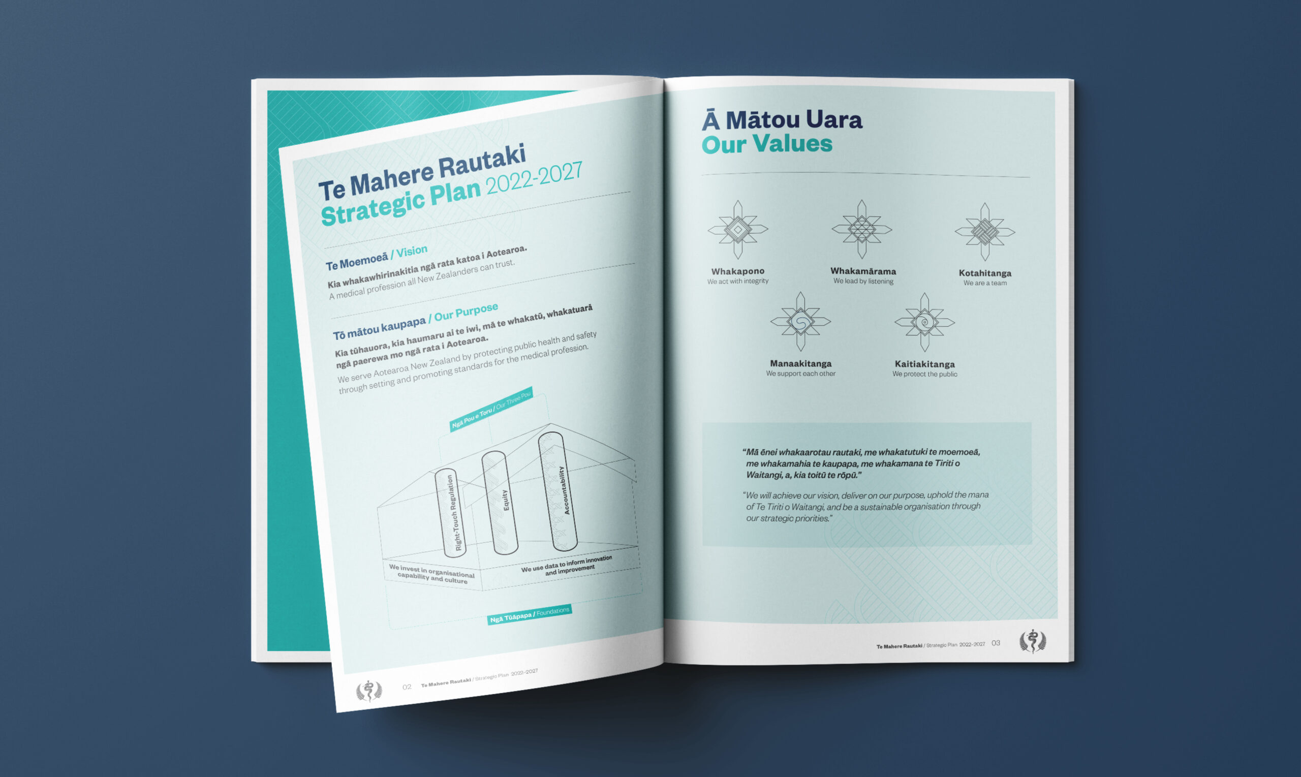
Our task was to develop a compelling cultural identity for Te Kaunihera Rata o Aotearoa – Medical Council of New Zealand, with the primary aim of safeguarding public health and safety by establishing and promoting medical profession standards. The design had to embody the organisation’s three Pou, Values, and Foundations while aligning with existing brand guidelines and tikanga Māori. Our audience included the Medical Council, All of Government partners, private partners, and the general public.
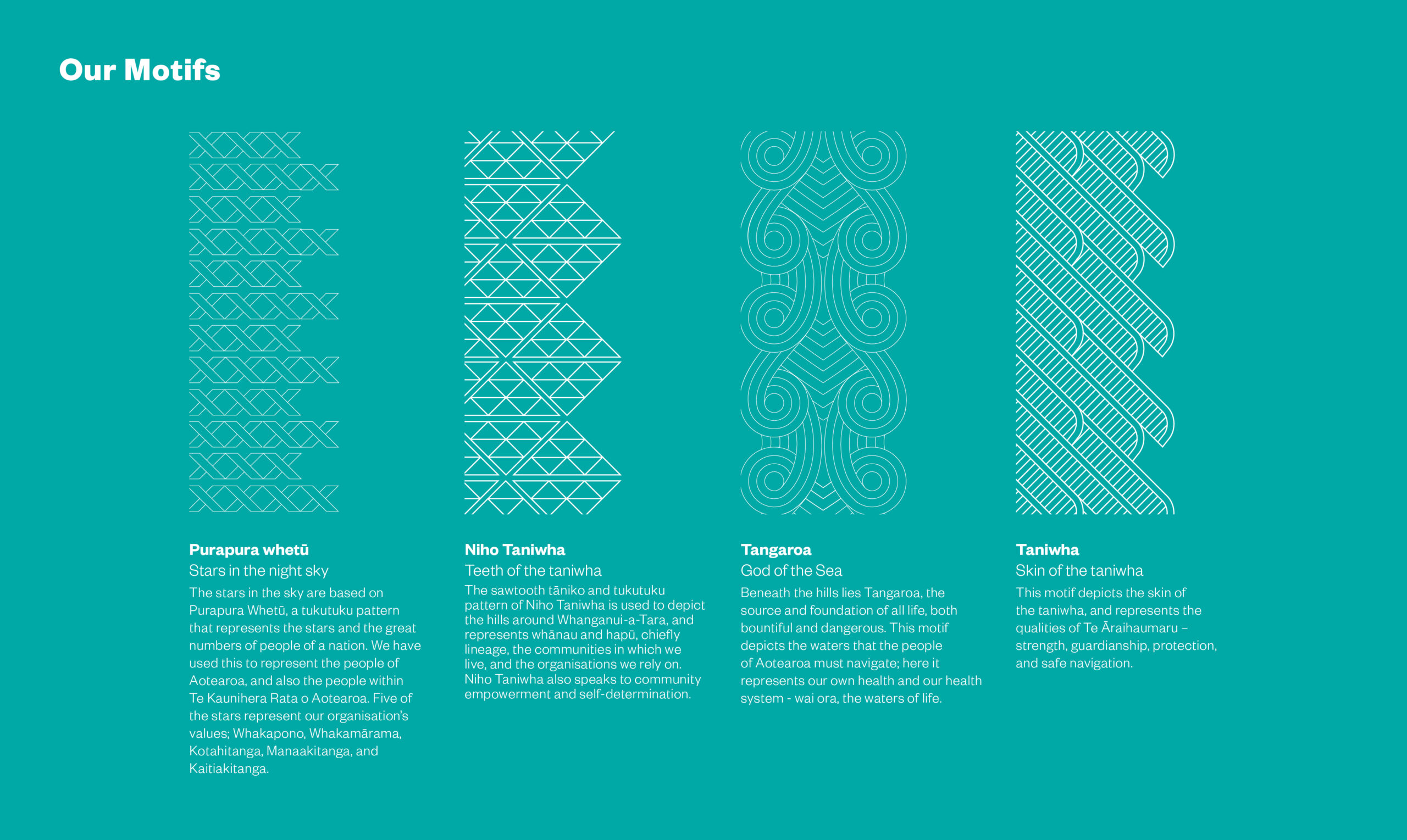
The narrative we chose needed to allow for the creation of a versatile asset toolbox. This toolbox would encompass the design as a whole, ideal for illustrating the big picture and organisational vision through storytelling. Additionally, it should comprise smaller components that would represent their foundations, values, and aspirations. The design should ideally have enough depth to translate into motifs, icons, and other graphic assets as needed.


The Design Response
Our team collaborated closely with the key stakeholders at Te Kaunihera Rata o Aotearoa to create a comprehensive solution applicable across various levels and contexts, including a cultural narrative and a visual interpretation aligned with the Council’s Strategic Plan.
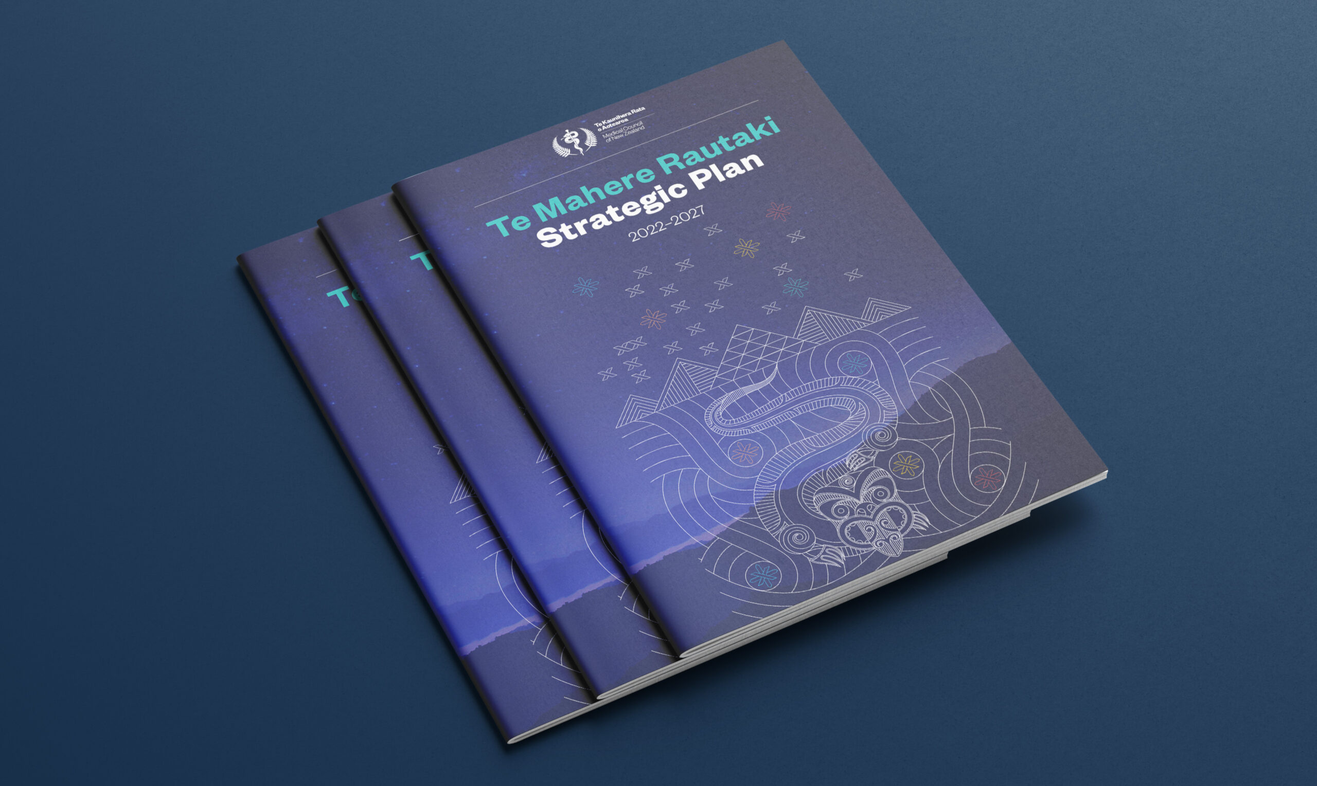
We developed a versatile suite of assets, featuring the ‘Te Āraihaumaru’ illustration, four motifs, and a set of value icons. The ‘Te Āraihaumaru’ illustration beautifully portrays the taniwha, the Defender of Safety, symbolising Te Kaunihera Rata o Aotearoa /Medical Council of New Zealand as the guardian and protector of the people. The taniwha swims beside the reflection of Purapura Whetū in the sea of Tangaroa, guiding people safely through with the stars aiding navigation. Each star represents one of the organisation’s values, showcasing its unique narrative and pattern.
We recognise the significance of a strong visual identity in making a lasting impact within any industry. Working on this project has been a source of pride for us, and we firmly believe that the final result effectively captures the cultural narrative in a distinctive and compelling way and helps build mana and integrity within the organisation.



The Design Team
Kellie Robins, Creative Director
Dan Brown, Cultural Advisor
Scott Irvine, Designer/Illustrator
https://msodesign.com/
https://www.instagram.com/mso_design/
https://www.facebook.com/MSOdesign/
The Client Team
Te Kaunihera Rata o Aotearoa – Medical Council of New Zealand
Client details
https://twitter.com/MedCouncilNZ
https://www.linkedin.com/company/medical-council-of-new-zealand/
https://www.mcnz.org.nz
Collaborators
Richard K. Tankersley – Kaitiaki Mana Māori/Chief Māori Adviser – Te Kaunihera Rata o Aotearoa
Kiri Rikihana – Deputy Chief Executive Officer – Te Kaunihera Rata o Aotearoa

